The network for creativity
Join 1.25M professional creatives like you
Connect with clients, get discovered, and run your business 100% commission-free
Creatives on Contra have earned over $150M and we are just getting started
Back to feedPost

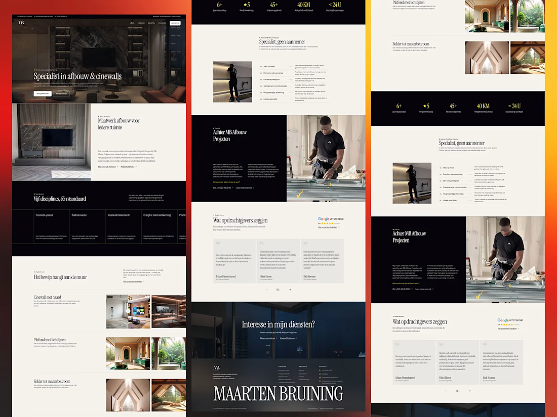
What if a contractor's website could feel as premium as the spaces they create?
This was the challenge behind my MB Afbouw Projecten website redesign concept.
MB Afbouw specializes in custom interior finishing, cinewalls, suspended ceilings, attic renovations, and bespoke carpentry. Their craftsmanship is premium — but the challenge was making the digital experience communicate that same level of quality.
So I didn't approach this as simply a website redesign.
I approached it as a digital sales experience.
What I focused on:
01 — Make the work speak first
Instead of leading with long descriptions, I put craftsmanship and completed projects at the center of the experience through large, immersive imagery.
02 — Position them as a specialist
The visual direction moves away from the typical contractor website and toward the feeling of a premium interior/architectural studio.
03 — Make expertise easy to understand
Services, capabilities, and processes are structured into clear sections so visitors can quickly understand what MB Afbouw does and why they're different.
04 — Build trust throughout the journey
Experience metrics, project proof, testimonials, process details, and the founder story are strategically placed to answer the question every potential client has: "Can I trust them with my project?"
05 — Design for conversion
Clear quote CTAs, consultation sections, contact options, and project-focused storytelling guide visitors from inspiration → trust → action.
The biggest lesson from this project:
A premium website isn't just about looking premium.
It's about making the quality of the business visible, understandable, and believable.
The goal was to create a digital experience that doesn't just say "we do quality work." It shows it.
Designed in Figma.
I'd love to know:
If you were redesigning a website for a premium construction/interior brand, what would you prioritize first — branding, portfolio, or conversion?

The network for creativity
Join 1.25M professional creatives like you
Connect with clients, get discovered, and run your business 100% commission-free
Creatives on Contra have earned over $150M and we are just getting started
Challenges
View all


Related posts


I am gathering cool references for my own work as a Motion Designer, and this one caught my eye this week.
Day 3 of 60-days-collecting-awesome-motion-design-references
I love the way this is designed, based on abstract shapes and concepts with a coding visual language that we are all already familiar with. This is a great reference in this modern era where we deal more and more with products and services that live on the internet, not on a physical product.
This animation was created by Odd Fellows in collaboration with Figma.


60 days of references is a serious commitment. Curious, are you mostly drawn to the same visual language each time, or does it shift a lot depending on the day?

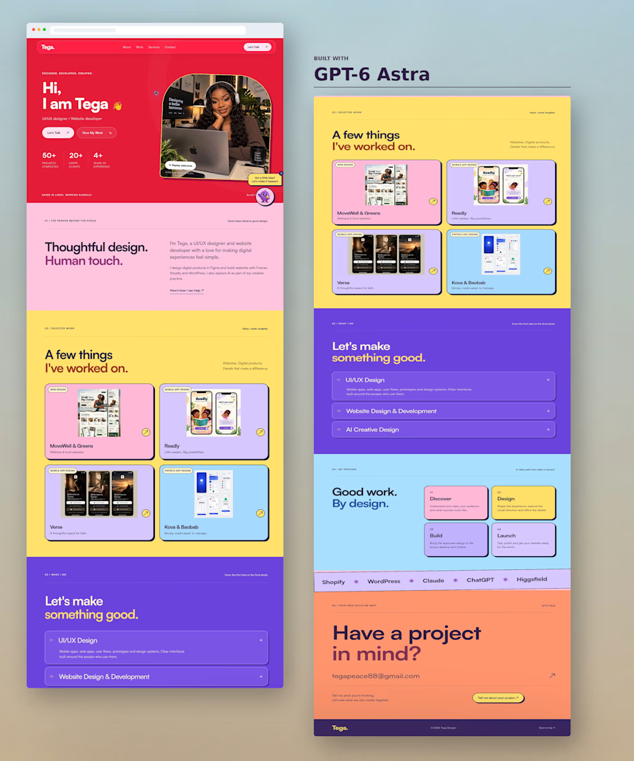
GPT-6 Astra one-shotted my portfolio website 👇
I posted it across my socials and it came with mixed reactions 😂
Now I’m curious what the creative community here on Contra thinks.
What do you think of the design and the Soft Neo-Brutalist style?
Hit or miss? 👀
#gpt6astra #uiuxdesigner #neobrutalism

A hit for me