The network for creativity
Join 1.25M professional creatives like you
Connect with clients, get discovered, and run your business 100% commission-free
Creatives on Contra have earned over $150M and we are just getting started
Back to feedPost

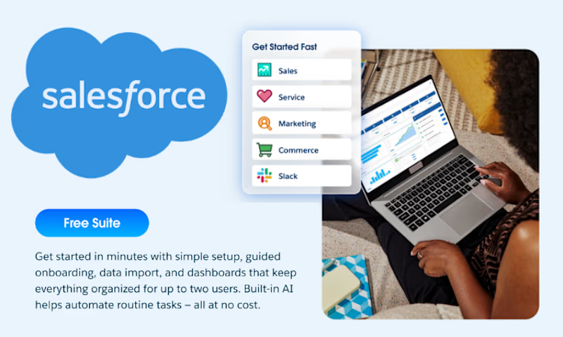
Did you know Salesforce has a free version of its CRM?
No licenses.
No monthly cost.
Just the essential tools to start organizing your business.
With Salesforce Free CRM, you can access basic features for:
✅ Sales
✅ Customer Service
✅ Marketing
✅ Contact and lead management
✅ Reports and business tracking
It’s a great starting point for small businesses, freelancers, and entrepreneurs who want to manage their clients and opportunities in a more professional way.
I can help you set it up, customize it for your business, and make sure it’s ready to use.

The network for creativity
Join 1.25M professional creatives like you
Connect with clients, get discovered, and run your business 100% commission-free
Creatives on Contra have earned over $150M and we are just getting started





Related posts

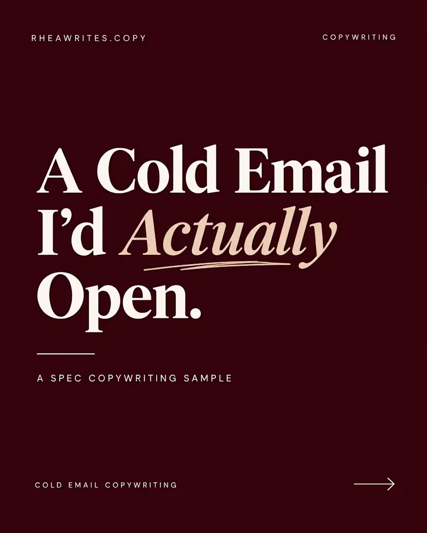
A good cold email give people a reason to reply 📨
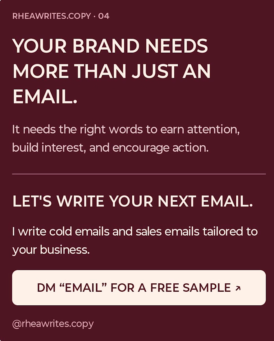
I write cold email and sales email tailored to your business
Want a free sample for your brand?👀
Dm "ME" to get started...let's grow together...!!
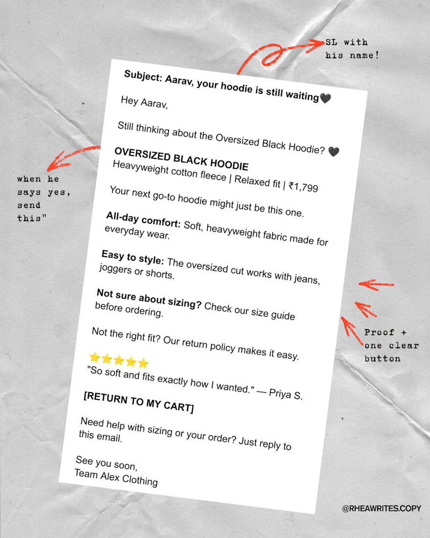
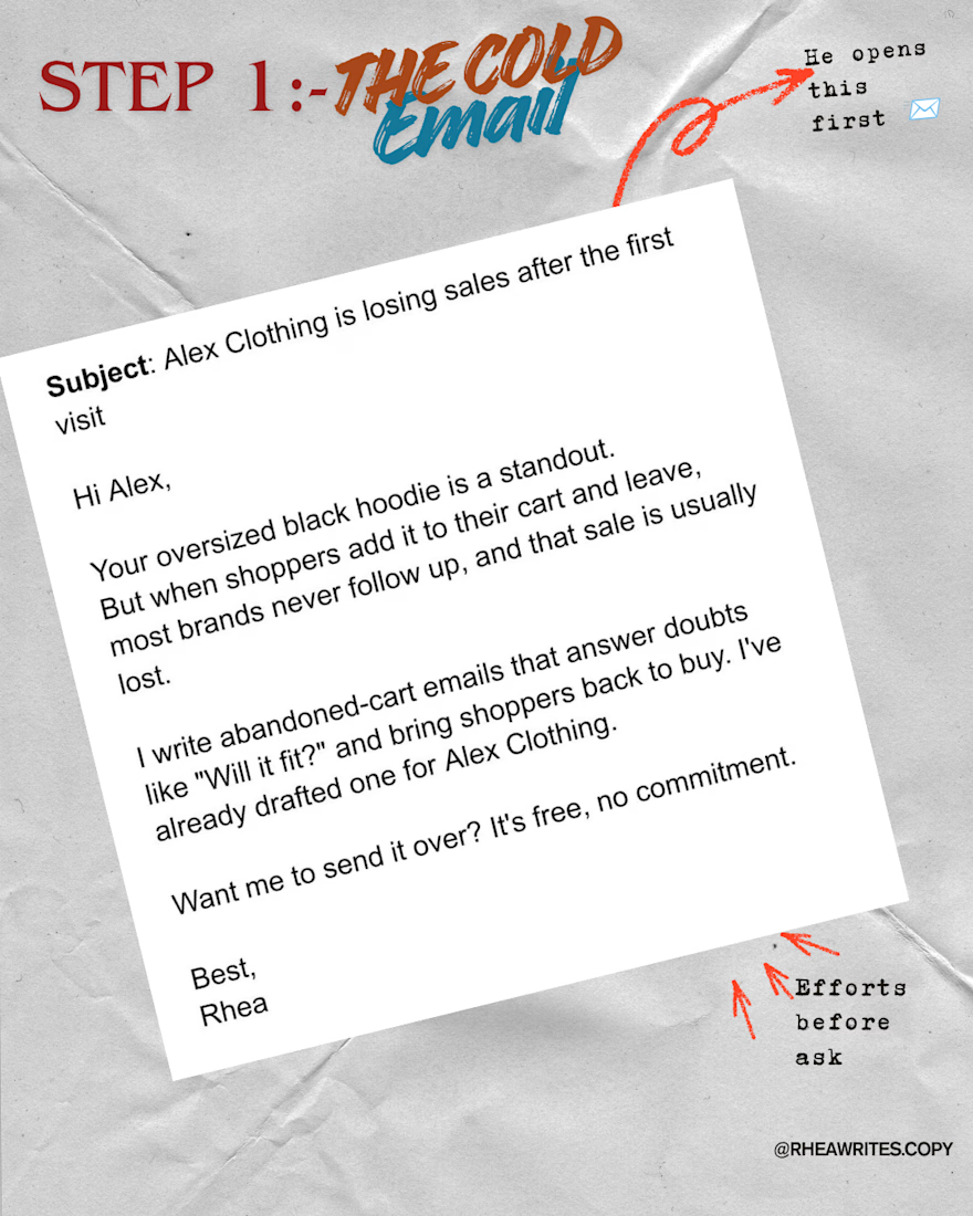

Exactly. Personalized emails with a clear reason to reply make outreach much more effective.

SaaS Launch Promo Video: Story-Driven Edit with Sound Design
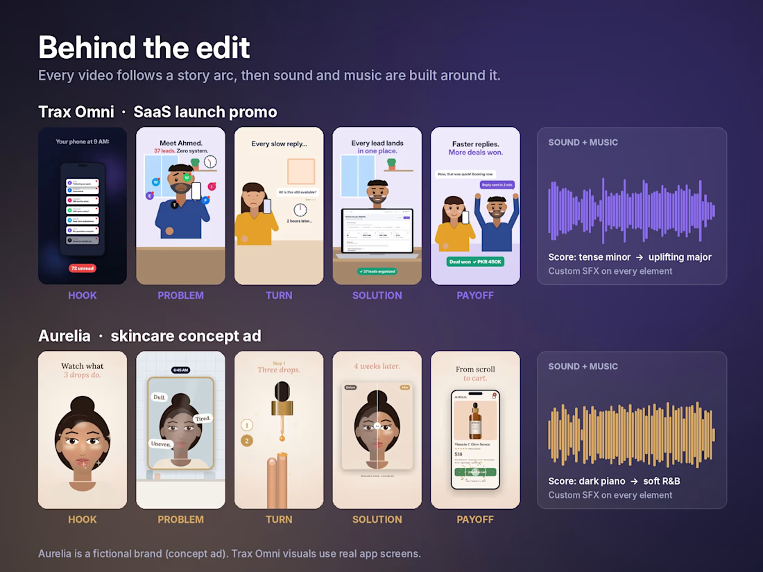
A launch promo for Trax Omni, a CRM, built around one simple story.
Ahmed runs a business with 37 leads and no system. His phone is buzzing, replies go out late, and a customer books with someone else. Then Trax Omni arrives: every lead in one place, deals moving forward, replies sent in minutes, and the deal comes back.
What went into the edit:
• A 2-second hook (a buzzing phone with notifications piling up)
• Problem → turn → payoff story structure
• Illustrated characters and real app screens
• Kinetic typography and motion graphics
• Sound design: every pop, swipe, click and notification has its own sound
• A custom score that moves from tense to uplifting with the story
Delivered in 9:16 for Reels, TikTok and Shorts, and 4:3 for websites and LinkedIn.
Need a promo that explains your product and keeps people watching? Let’s talk.



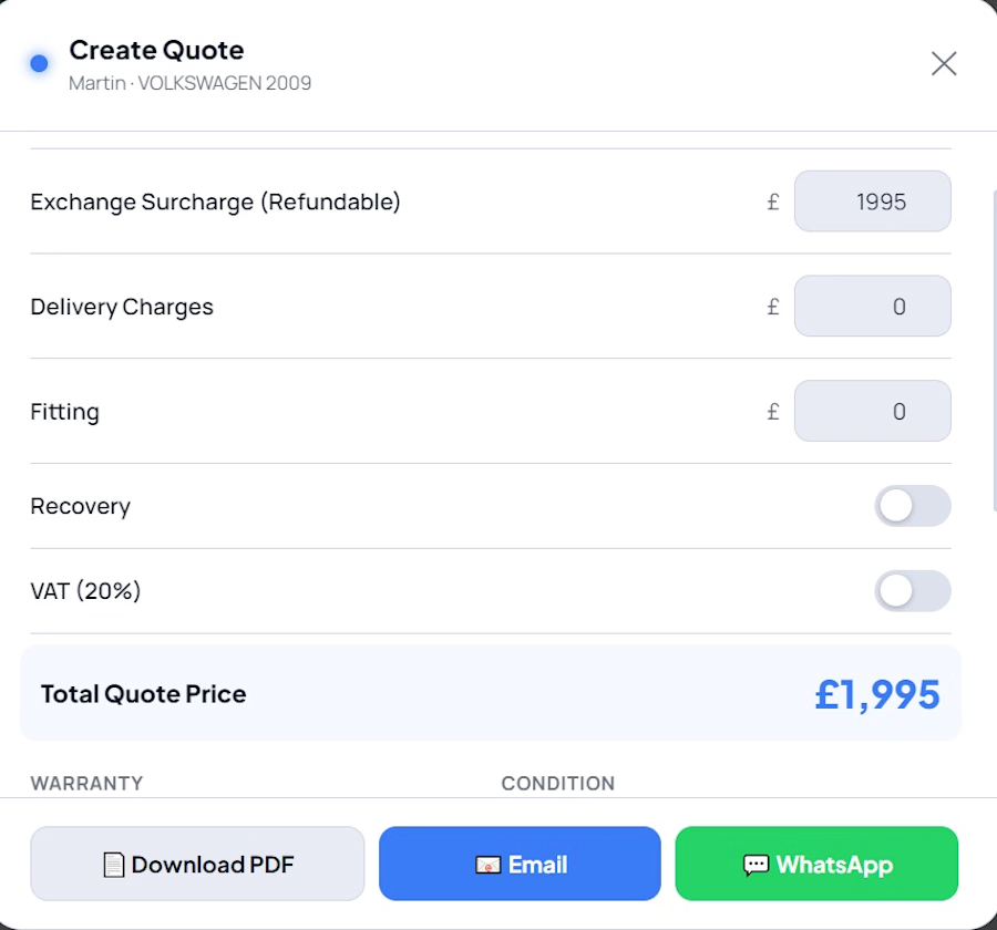
A centralized Lead Intelligence Platform that automatically collects leads from multiple channels into one dashboard, helping sales teams organize, prioritize, track, and manage every opportunity efficiently.