The network for creativity
Join 1.25M professional creatives like you
Connect with clients, get discovered, and run your business 100% commission-free
Creatives on Contra have earned over $150M and we are just getting started
Back to feedPost

Day 4 🏗️ of #FramerBuild — Feature Bento Grid
This style has one rule: if it doesn’t need to be there, it isn’t.
No gradients. No shadows. No color accents. Just a grid, tight typography, and a lot of intentional empty space. The whitespace isn’t laziness — it’s the design.
What I built:
— A mixed-size bento grid with 9 cards
— Stat cards with oversized numbers (99.9% uptime, <2ms latency)
— A pull quote spanning two columns
— A terminal/code card in Syne Mono
— A ghost grid texture card with a watermark
Live Preview

The network for creativity
Join 1.25M professional creatives like you
Connect with clients, get discovered, and run your business 100% commission-free
Creatives on Contra have earned over $150M and we are just getting started





Related posts


Which one grabs your attention and should be the main visual for a framer template thumbnail?
7 voted
50%
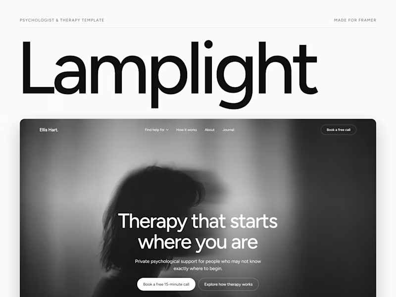
7 voted
50%
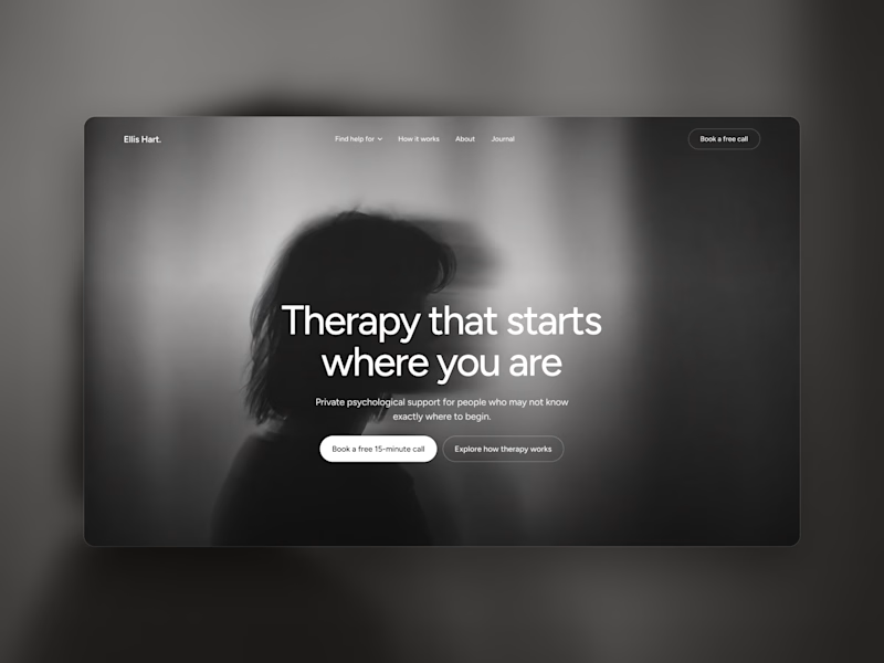
14 votes
Closed

Both works are great; it's hard to choose

Designed for people who want the journey to feel as good as the destination.
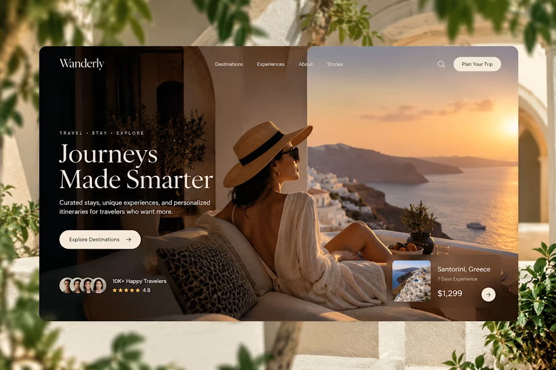
Created a premium travel website concept for Wanderly, combining cinematic imagery with an editorial-style digital experience.
The goal was to make the website feel less like a typical travel booking platform and more like a luxury travel magazine you can interact with.
What I focused on:
• Premium travel brand direction
• Cinematic hero experience
• Editorial typography
• Destination and experience cards
• Strong visual storytelling
• Clear booking-focused CTA
• Social proof and traveler ratings
• Responsive web layout
• Luxury hospitality-inspired UI
The design uses warm neutrals, deep shadows, soft typography, and immersive imagery to create a sense of escape before the user even starts planning the trip.
Designed with a strong Figma + Framer-style approach, focusing on visual hierarchy, interaction, and conversion.
#WebDesign #TravelDesign #Figma #Framer #UIUX #LandingPage #LuxuryTravel #BrandDesign #WebDesignInspiration #Contra


Elegance hero


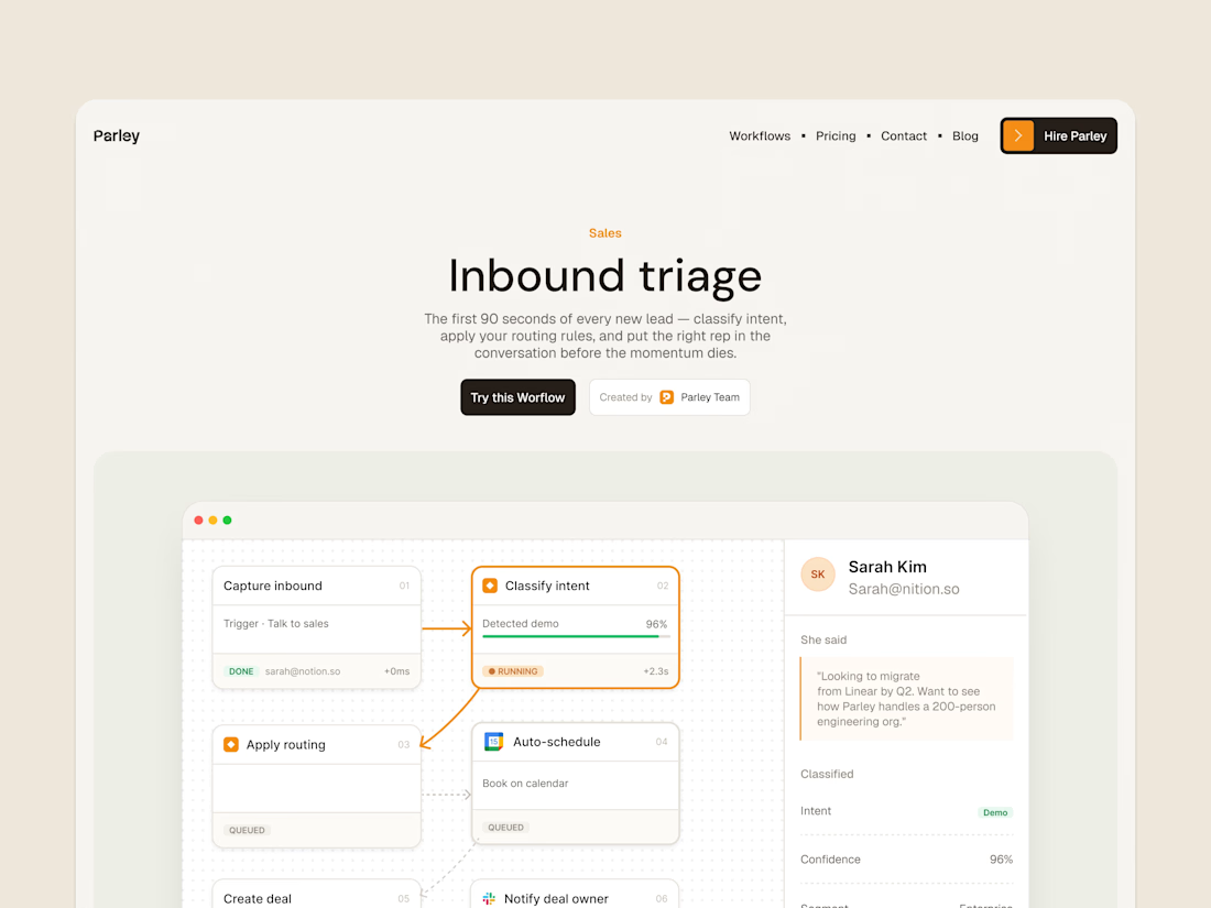
parley’s inbound triage page, with the workflow laid out below the introduction.
get it free now → https://framer.link/s1Llkdh

Nice work!