The network for creativity
Join 1.25M professional creatives like you
Connect with clients, get discovered, and run your business 100% commission-free
Creatives on Contra have earned over $150M and we are just getting started
Back to feedPost


Fashion E-Commerce Website Design ✦ Zanvexa

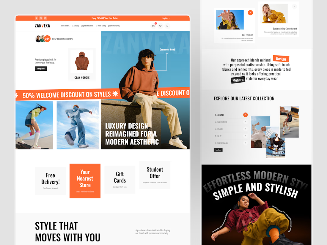

This is smooth and premium. Love how the layout feels fresh without losing clarity. Great work Sahil 🔥
Thank you !!
The network for creativity
Join 1.25M professional creatives like you
Connect with clients, get discovered, and run your business 100% commission-free
Creatives on Contra have earned over $150M and we are just getting started





Related posts


Consistency means every touchpoint feels like it belongs to the same brand. Uniformity means every touchpoint looks identical. The first builds trust. The second kills flexibility.
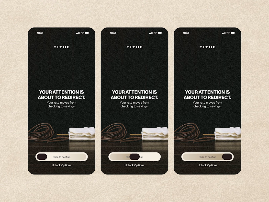
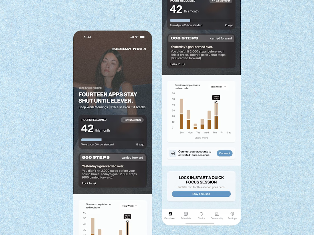
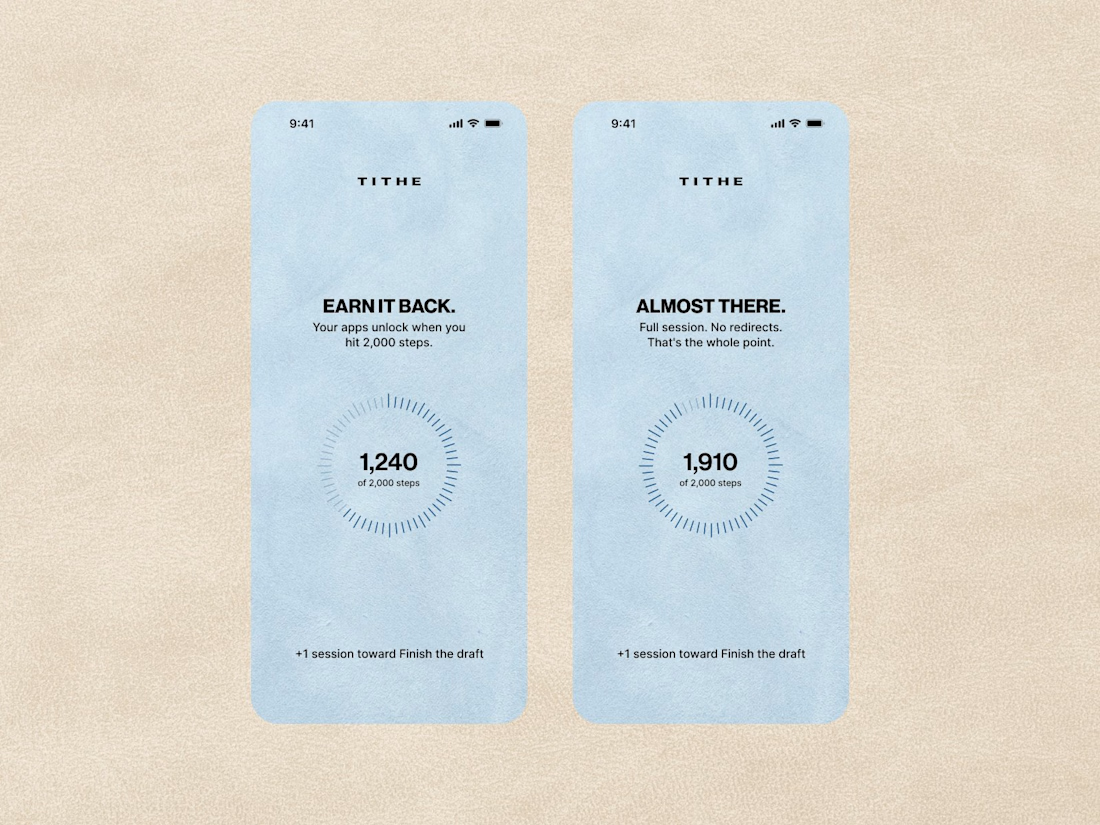

Your shot is exceptional. I'm overwhelmed with the quality of work!


New Brand Identity project alert! 🚨
GATE108 is a forward-thinking ecosystem bringing together people, ideas, experiences and new ways of living, working and connecting.
We’ve been their long-term design partner, shaping and continuously evolving a flexible visual ecosystem across visual strategy, brand identity, creative direction, digital experiences, event assets, 3D motion and social media.
Inspired by the idea of GATE108 as a gateway into a multidimensional world of people, ideas and possibilities, we’ve built a brand system designed to move, adapt and grow across physical and digital spaces.
As the brand evolves, we continue to create new expressions while keeping the wider ecosystem cohesive, recognisable and ready for what’s next.


Website redesign complete 🚀
Can’t wait to share the full site. Until then, here’s my personal favorite interaction from the project.
Industry: Data / Crypto


Really clean design.


