The network for creativity
Join 1.25M professional creatives like you
Connect with clients, get discovered, and run your business 100% commission-free
Creatives on Contra have earned over $150M and we are just getting started
Back to feedPost

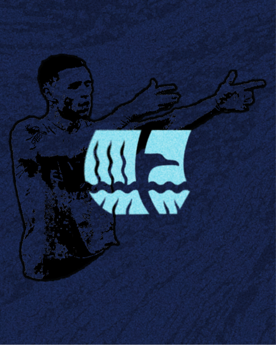
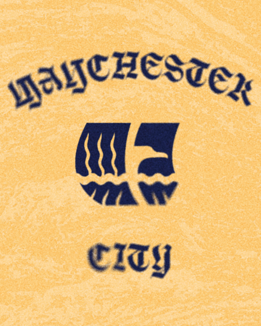
Logo re design for Manchester City
I got very inspired by looking at their badges through out history and grabbed symbolism from my favourites to combine and reinterpret those my way.
The eagle silhouette represents strength and tenacity. The boat like shape represents the city of Manchester is a reference to Manchesters Ship Canal, opened in 1894.
In the negative space of the logo we can also find a reference to the England flag.
For the typography I wanted to experiment with very expressive type, adding a bit of a classic/heritage vibe.
Overall I'm happy with the outcome.
I will always find an excuse to merge football and design to create projects like these.


The network for creativity
Join 1.25M professional creatives like you
Connect with clients, get discovered, and run your business 100% commission-free
Creatives on Contra have earned over $150M and we are just getting started


Trending


Notion
Notion isn’t just where you work, it’s starting to work for you. What agents are you building?
portfolioreview
The best portfolios tell a story, not just show a grid. Share yours for feedback.
brandguidelines
Brand guidelines are becoming living systems, not static documents. What are you building for your clients?
aivideo
AI video tools are moving at warp speed. Which ones are you experimenting with?
freelancerlife
Freelancer life is wins, pivots, and everything in between. What’s yours right now?