The network for creativity
Join 1.25M professional creatives like you
Connect with clients, get discovered, and run your business 100% commission-free
Creatives on Contra have earned over $150M and we are just getting started
Back to feedPost
Taste Test
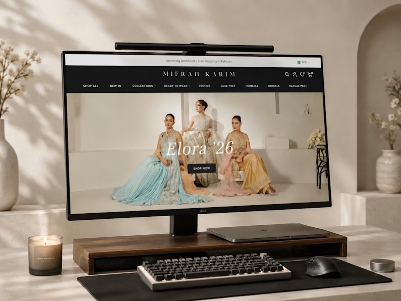
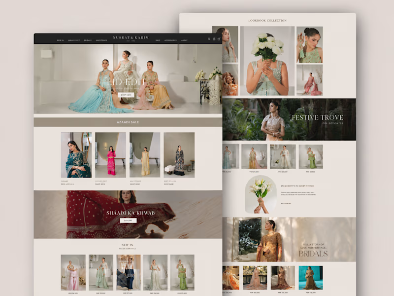
Taste testing two directions for a fashion e-commerce brand.
Which layout feels more premium to you — A or B?
2 votes
Ends in 19h

Option B feels more premium to me. The warm setting and larger hero presentation give the fashion imagery more of an editorial, luxury feel. A shows the overall system better, but B sells the brand mood instantly.


Really appreciate this, That line about B selling the brand mood instantly while A shows the system better is such a clean way to put it. Leaning B for the hero now.

The single hero shot on the monitor feels more like an editorial spread, the grid on the other reads closer to a product catalog than a premium brand site.
Love this, thank you! Editorial spread vs product catalog is exactly the distinction I was struggling to name. Really helpful

Fantastic work !
Thank you, Sahil, means a lot!
The network for creativity
Join 1.25M professional creatives like you
Connect with clients, get discovered, and run your business 100% commission-free
Creatives on Contra have earned over $150M and we are just getting started


Trending
retrofuturism
Share your favorite designs from the past exploring the distant future. Or your own take on the aesthetic 🚀
halftone
Dots. Texture. Grain. Let's see your designs using the halftone technique.

Midjourney
Creatives are showing off what they're making with Midjourney.
colorgrade
Video editors sound off: How do you enhance the mood of your video in color grading?
Related posts

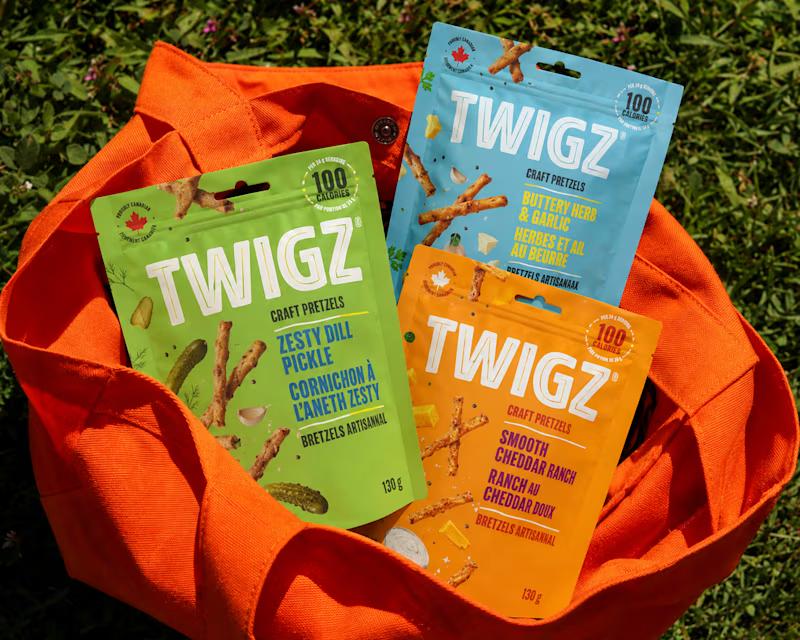
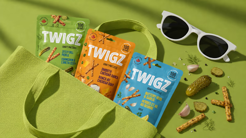
Which TWIGZ Product Mockup Direction Do You Prefer?
18 voted
67%
9 voted
33%
27 votes
Closed


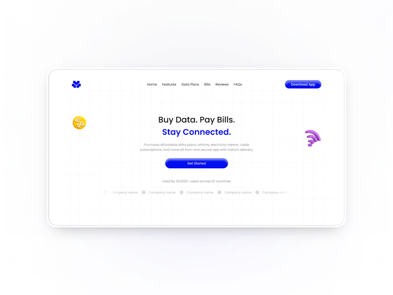
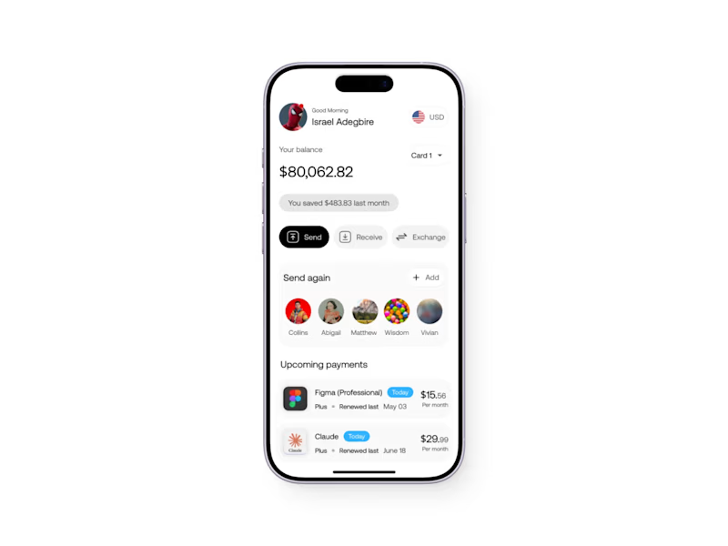
Check my profile and choose which do you think I design better in ?
4 voted
57%
3 voted
43%
7 votes
Closed

Both are great, Isreal.
I prefer the Mobile app more

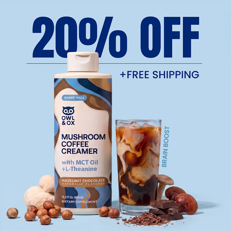
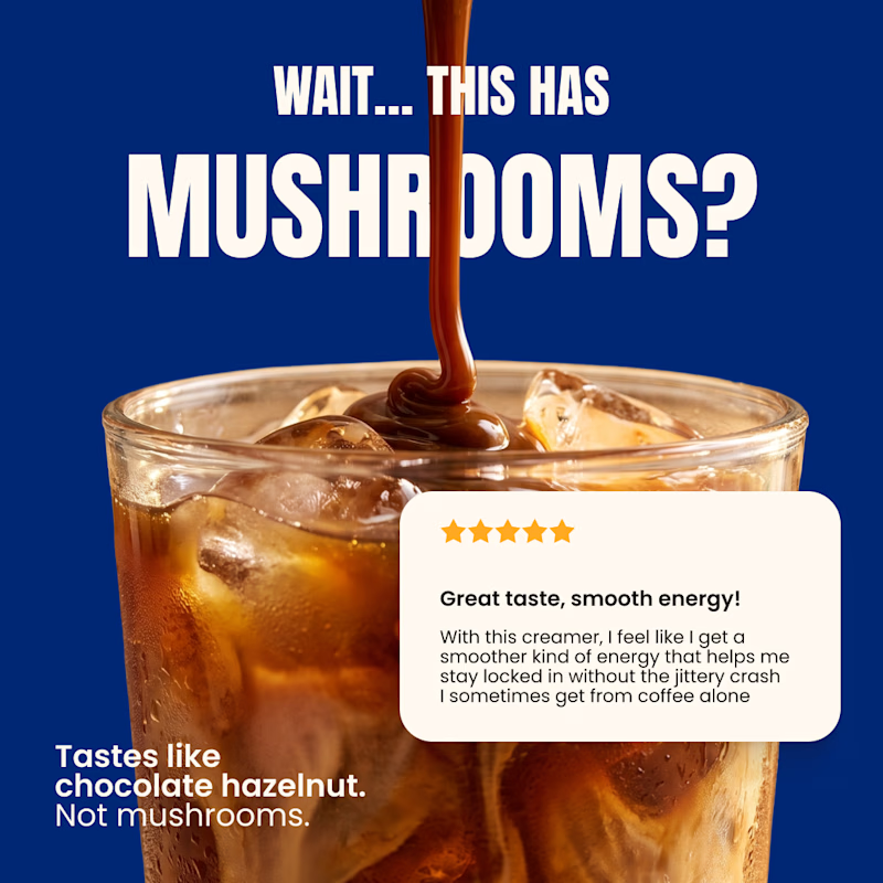
Which one would you test first on cold traffic?👀
A) Offer 20% OFF + Free Shipping
B) Curiosity + Taste Objection
Same product. 2 completely different angles:)
Which one gets your click A or B?
[ Performance focused Meta creatives for DTC brands & agencies ]
38 voted
40%
56 voted
60%
94 votes
Closed

Curiosity for the win!