The network for creativity
Join 1.25M professional creatives like you
Connect with clients, get discovered, and run your business 100% commission-free
Creatives on Contra have earned over $150M and we are just getting started
Back to feedPost

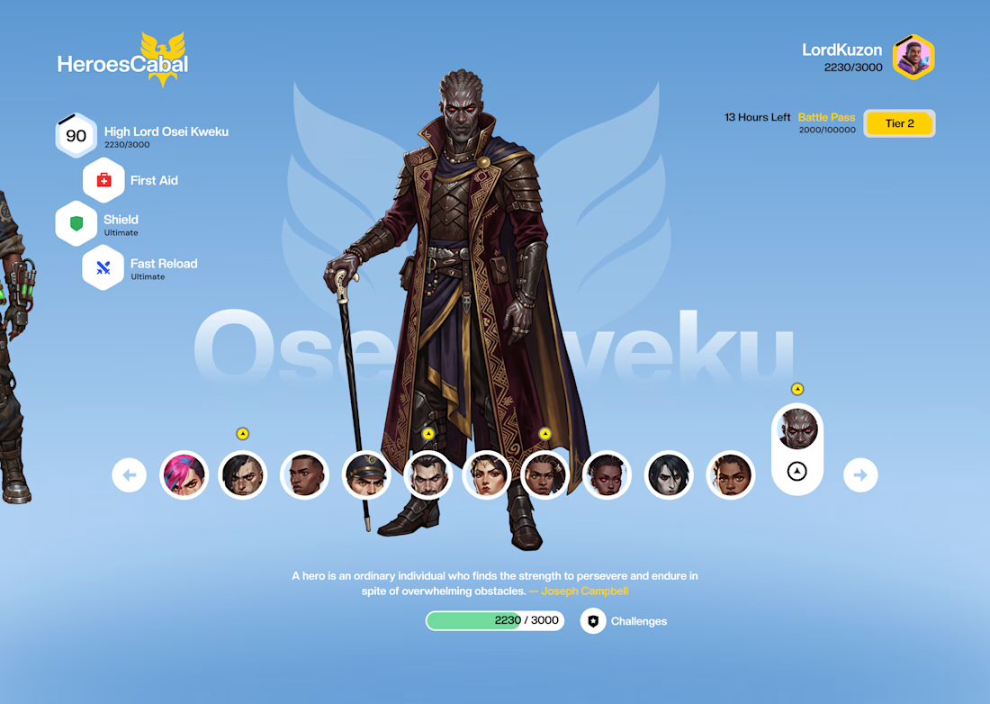


Thank you so much. I appreciate the feedback. I would work on that. Initially I felt the space was too much and it made the selectors look somehow. But yeah I would adjust the spacing bit. 🚀
Yeah True. 😊 👍
The network for creativity
Join 1.25M professional creatives like you
Connect with clients, get discovered, and run your business 100% commission-free
Creatives on Contra have earned over $150M and we are just getting started





Related posts

From an error screen to a character with personality. That's a pretty good glow-up.
Love the creativity behind this!


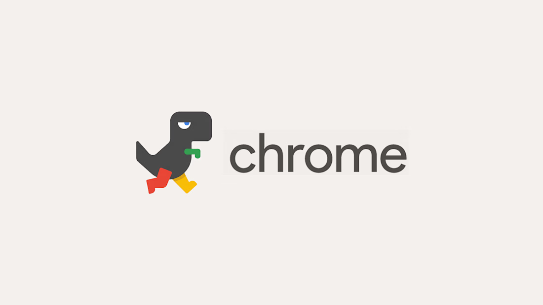
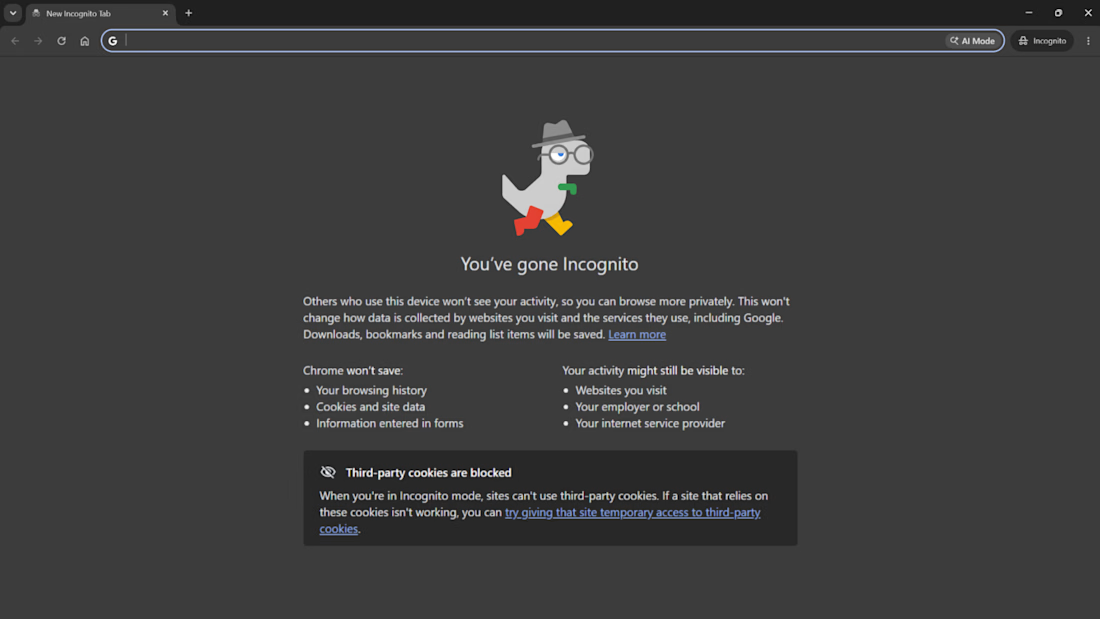
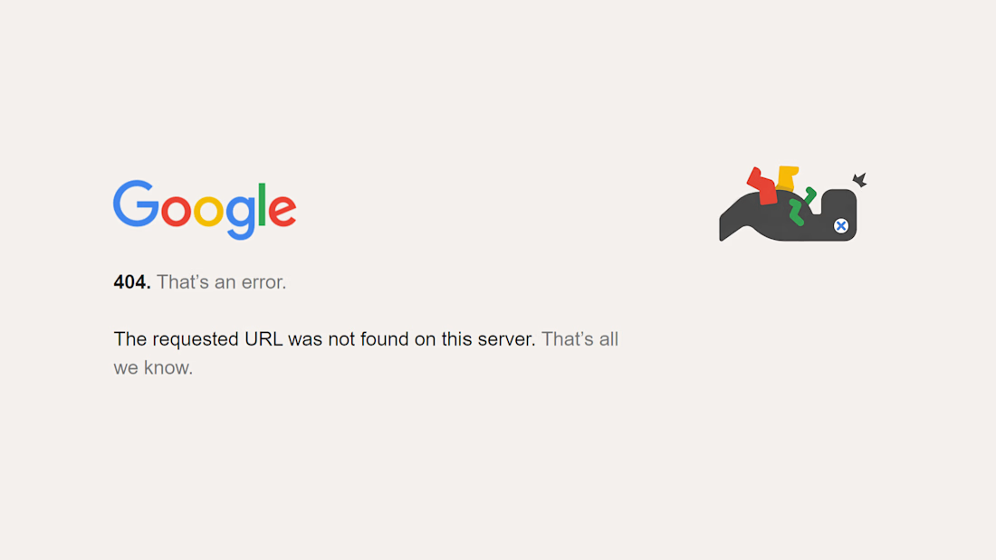
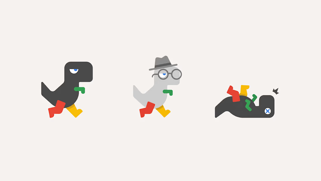
Firefox has a fox, so why doesn’t Chrome have a mascot? 🦊
Well…it kinda does. The offline dino, the one that only shows up when everything is broken (who didn't rage on the game too lol)
So I gave it the glow up it deserves: flat Google shapes, Chrome colors on the legs and arm,...

thank you for reposting!!!

A little creative experiment I'm working on ✳️
Playing with bold typography, playful motion, and unexpected interactions for a UGC creator portfolio.
Still a work in progress, but having way too much fun with this one.


The big stacked WORK / RESULTS / RATES menu next to the loose purple stickers keeps the portfolio playful while the navigation stays easy to scan. Do the stickers react on hover, or are they tied to scroll?

Which navigation do you prefer more? With side or floating action?
11 voted
48%
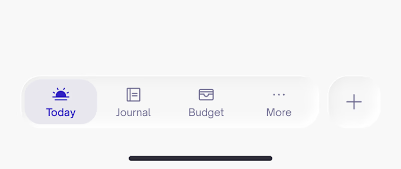
12 voted
52%
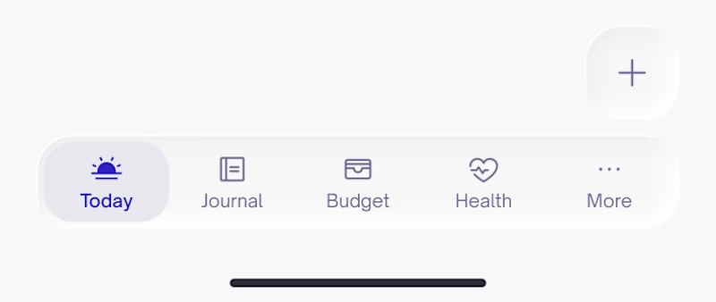
23 votes
Closed

Depends on the product and how data heavy it is. For example, an app for insurances and alot of document handling the FAB works best 👌