The network for creativity
Join 1.25M professional creatives like you
Connect with clients, get discovered, and run your business 100% commission-free
Creatives on Contra have earned over $150M and we are just getting started
Back to feedPost

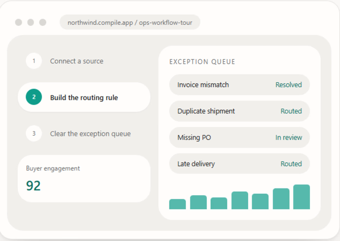
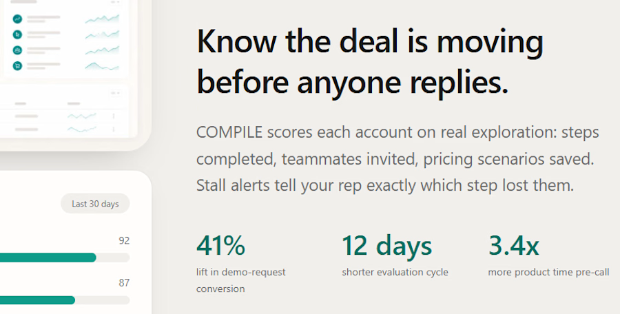
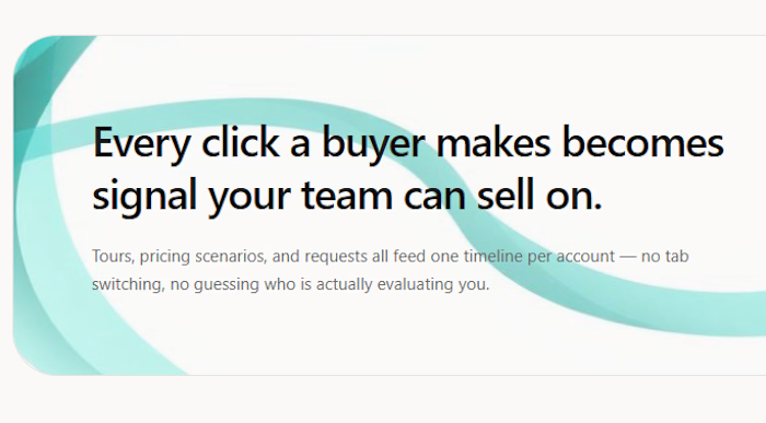
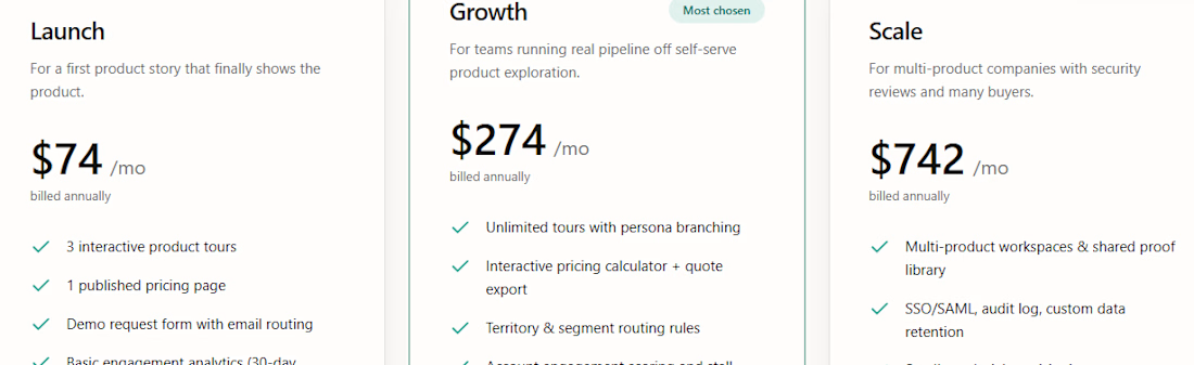
COMPILE is a product experience platform that turns software into something buyers can click through, price out, and share internally — replacing static demos and sales calls with interactive, self-serve product tours that help buying teams say yes faster.
A B2B SaaS landing page for an interactive product-tour platform — helping software companies let buyers explore, price, and evaluate products on their own.
READY TO SELLL.....


The network for creativity
Join 1.25M professional creatives like you
Connect with clients, get discovered, and run your business 100% commission-free
Creatives on Contra have earned over $150M and we are just getting started





Related posts

Just finished building a Salon Booking Management System!
The goal was simple: make appointment management easier for salon owners and reduce the manual work involved in handling bookings and reminders.
The system connects the complete workflow in one place:
1 Customer makes a booking
2 Booking gets confirmed
3 Owner sees it on the dashboard
4 Upcoming appointments are organized clearly
5 Reminders help the owner stay on top of appointments
One of the key things I focused on was making the experience simple, clean, and easy to understand, while keeping the workflow practical for a real business.
This project helped me think beyond just building screens — and focus more on the actual business problem, user flow, and overall product experience.
Excited to keep improving it and turn it into an even more polished product.
#BuildInPublic #SaaS #WebApp #BookingSystem #SalonManagement #ProductDesign #MVP #NoCode #Entrepreneurship


Good work

Designing for therapists means prioritizing what matters in the next few minutes, not just what looks good on a dashboard.
I explored two layout directions for a mental health practice management web app that helps psychologists manage sessions, patients, documentation, tasks, and follow-ups.
Both concepts use the same core widgets, but with different positioning and visual hierarchy. The goal was to make daily priorities easier to scan and act on.
Which option feels more intuitive - A or B? 🤔
17 voted
68%
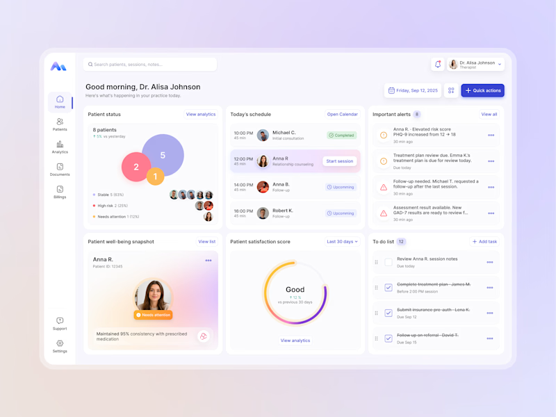
8 voted
32%
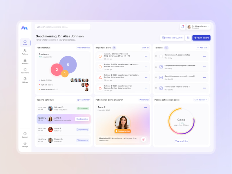
25 votes
Closed


My feed on X is full of impressive motion videos made with Claude, so I decided to try Opus 5.5 for the FTCG project. I asked it to create a dynamic video inspired by the FTCG game. The initial prompt was incredibly simple, and it took only an hour or two of experimentation to refine the result and add sound as the finishing touch. Not bad at all.

turning the actual landing page into a promo is a cool idea. did Claude handle the rendering too, or did you export it through another tool?