The network for creativity
Join 1.25M professional creatives like you
Connect with clients, get discovered, and run your business 100% commission-free
Creatives on Contra have earned over $150M and we are just getting started
Back to feedPost
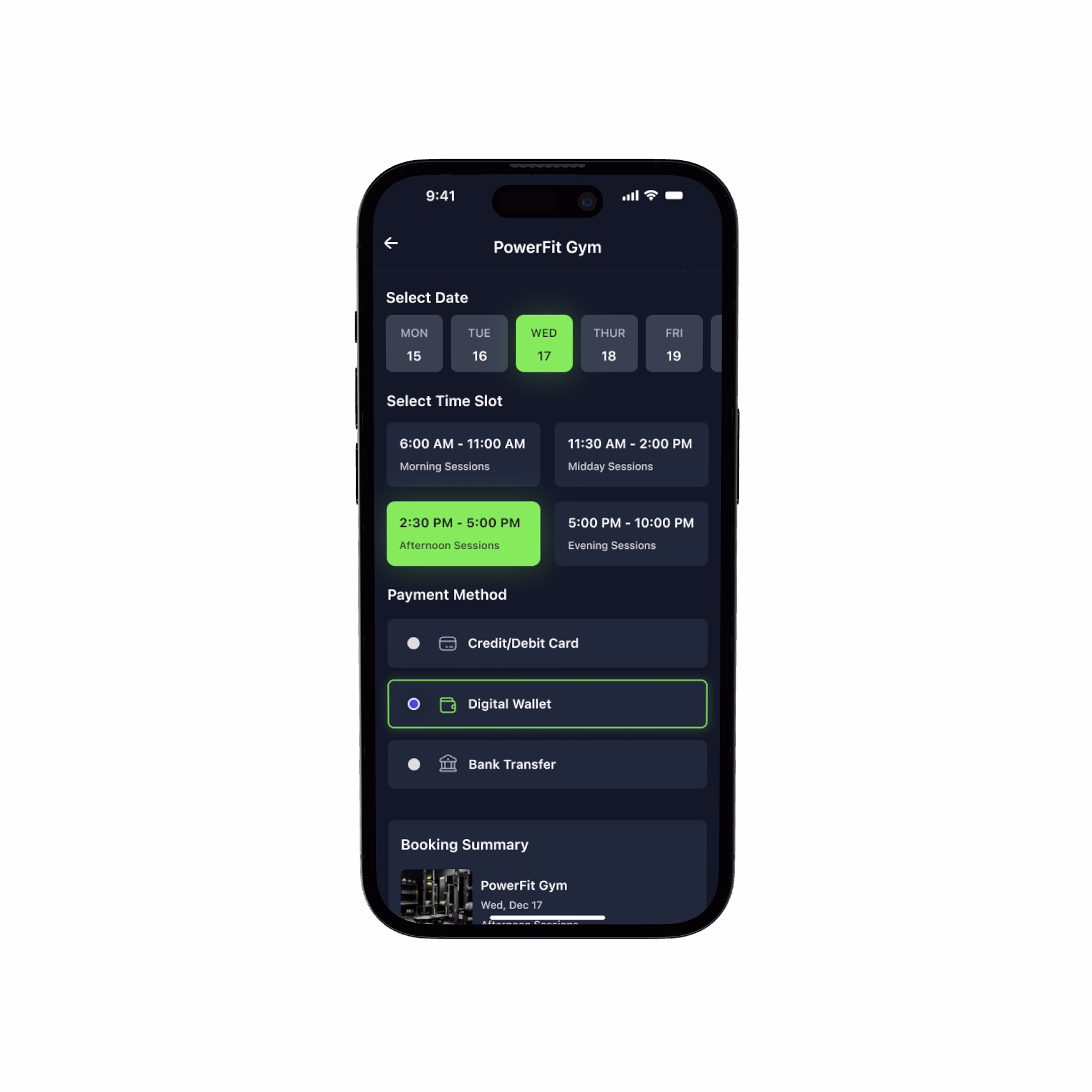
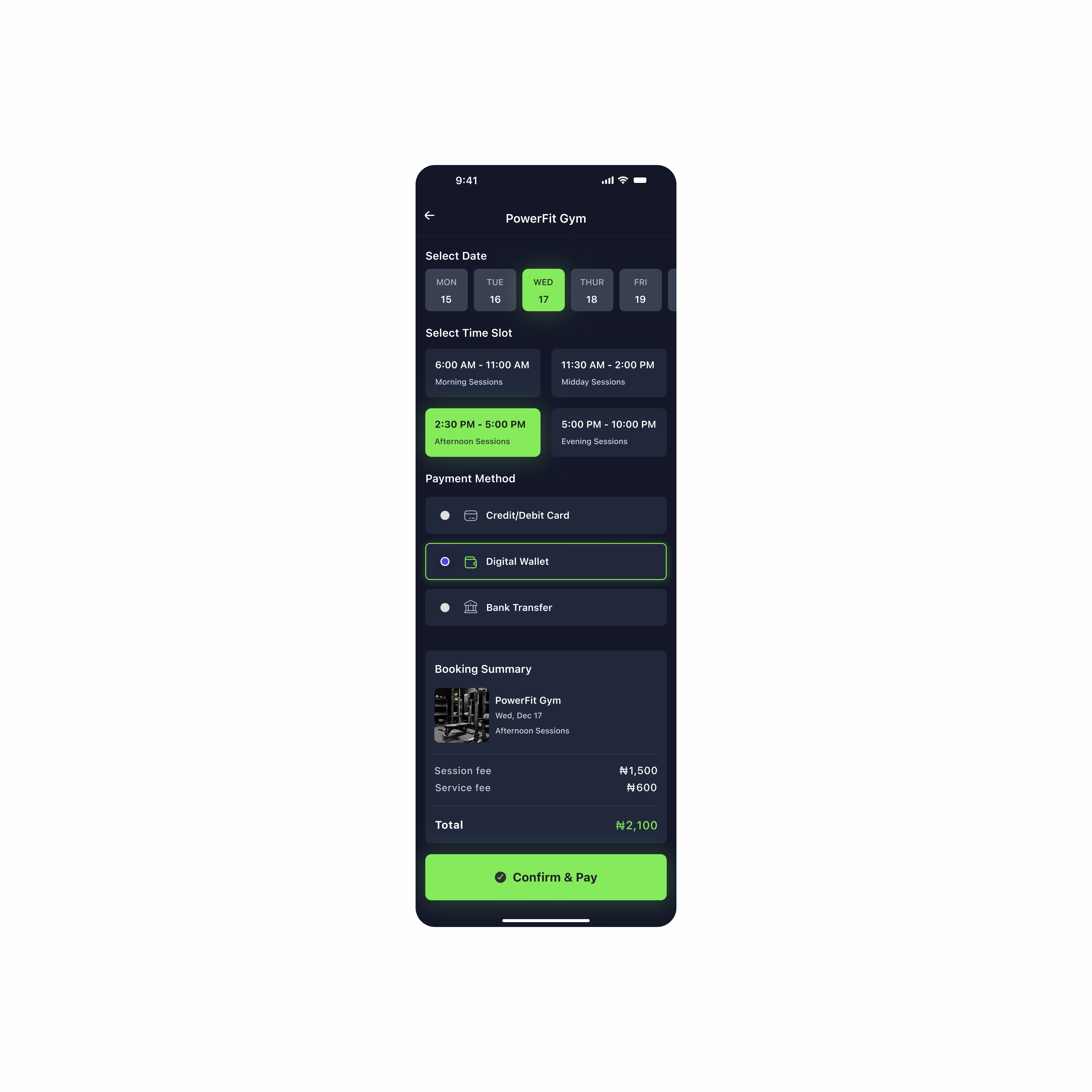
Day 08: Booking & Confirmation Screen (FitSpot) 🏋🏾♂️
For this screen, my goal was clarity. No stress. No confusion. Just a smooth, confidence-boosting flow from “I want to book” to “Payment complete.”
-I kept the layout straightforward:
-A clear date selector
-Easy time-slot options
-Simple payment methods
-And a clean booking summary showing users exactly what they’re paying for
The bright green CTA? That’s intentional. It stands out against the dark theme to reassure users that they’re taking the final step; not guessing, not doubting.
Every element here is meant to reduce friction and help users book their gym sessions without thinking twice. Because good UX should feel invisible… just smooth.
The network for creativity
Join 1.25M professional creatives like you
Connect with clients, get discovered, and run your business 100% commission-free
Creatives on Contra have earned over $150M and we are just getting started
Trending
Claude
Claude has entered the design space. How are you using Claude Design?
Contra University
Learn from expert creatives how to earn more using next-gen AI tools.
creativeaiflow
Creative AI workflows are evolving. What tools do you use, and what are their strengths and weaknesses?
portfolioreview
The best portfolios tell a story, not just show a grid. Share yours for feedback.
freelancerlife
Freelancer life is wins, pivots, and everything in between. What’s yours right now?