The network for creativity
Join 1.25M professional creatives like you
Connect with clients, get discovered, and run your business 100% commission-free
Creatives on Contra have earned over $150M and we are just getting started
Back to feedPost

Really solid work here 👏
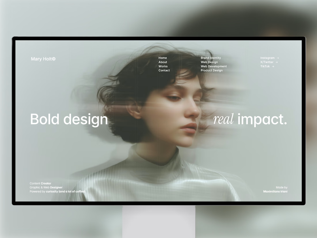
Love how this Framer website template connects design with real marketing intent especially the focus on turning attention into sustainable growth.
Great execution, @Ozenua Forx Studio 🔥
As a creative design agency, we’re always exploring how web design, UX, and messaging come together to drive results not just visuals.
Always learning from work like this.
Curious to hear from others here 👇
What do you think makes a marketing website truly effective design clarity or conversion strategy?

The network for creativity
Join 1.25M professional creatives like you
Connect with clients, get discovered, and run your business 100% commission-free
Creatives on Contra have earned over $150M and we are just getting started











Related posts

i built this portfolio template in framer a few months ago, and it’s been exciting to see how much traction it’s been gaining lately!
it’s now #81 overall and #25 in the designer category on the framer marketplace, bringing in more views, reach, and commissions along the way.
sharing the case study here if you want to take a closer look at the project and see how it came together! 🙌


Huge congrats Max! #81 overall and #25 in designer category on Framer marketplace is no small feat 🚀 Framer templates that actually get traction + commissions is the dream. Well deserved!

As a graphic designer, exploring web design has been an exciting new learning experience!
Here’s a newsletter page I designed in Framer. Always fun to explore beyond my usual design work and learn something new. ✨
I’d love to hear your thoughts! What would you improve or optimize?


Feed the blob is such a fun concept for a newsletter page. The big yellow blob character against that deep blue is impossible to scroll past, and one great find on Friday makes the promise crystal clear. Since you asked what I would optimize, honestly the only thing I notice is...

Working on my next client project, designing and building a website in Framer. Excited to bring another idea to life!
Always happy to connect with fellow creatives and collaborate on interesting projects here.
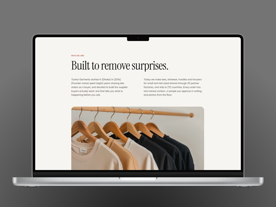
Built to remove surprises is a great headline for a garment brand, it says craft and honesty in four words. The two-column editorial layout with the rail of clothes underneath feels like a magazine spread. Is this the about page or the homepage? Either way the serif is doing a lot of heavy lifting.