The network for creativity
Join 1.25M professional creatives like you
Connect with clients, get discovered, and run your business 100% commission-free
Creatives on Contra have earned over $150M and we are just getting started
Back to feedPost
Taste Test

Hey everyone! Between these two logo options, which one would you recommend presenting to the client? There’s a subtle refinement in the ‘M’ between the versions. I’d love to hear your thoughts. Thank you.
Meezab is a Canadian fashion and personal style brand.
0 voted
1%
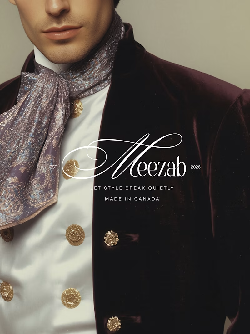
0 voted
1%
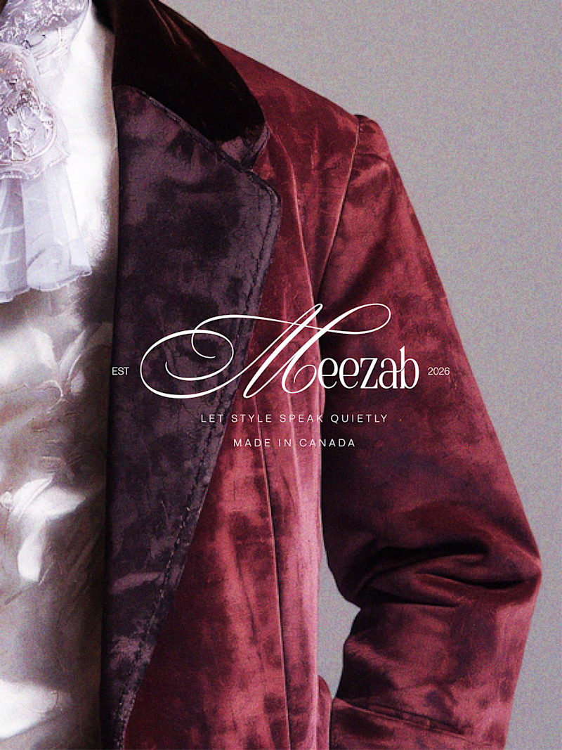
0 votes
Closed

I will pick option B
The network for creativity
Join 1.25M professional creatives like you
Connect with clients, get discovered, and run your business 100% commission-free
Creatives on Contra have earned over $150M and we are just getting started









