The network for creativity
Join 1.25M professional creatives like you
Connect with clients, get discovered, and run your business 100% commission-free
Creatives on Contra have earned over $150M and we are just getting started
Back to feedPost
Taste Test



Thanks

A looks amazing!
Thanks

Definitely A
The font, image and layout all compliment the design
Thanks

Which tool did you use for this . It's clean

I went with A. The multiple instances of the solid color in B make the visuals heavy on the eyes unlike A. However, I do feel like A is still text-heavy and could use some more white space between elements.

Option A. It looks clean

B looks more professional somehow

The overall design language is super consistent 🔥
The network for creativity
Join 1.25M professional creatives like you
Connect with clients, get discovered, and run your business 100% commission-free
Creatives on Contra have earned over $150M and we are just getting started





Related posts

3D Motion Design - A vs B Poll - Minimal White vs Premium Detailed Copper coins with F logo flowing in spiral. Which feels more premium? Rendered in Blender 4.2, 4:3 (1600x1200), 98% photoreal.
2 voted
13%
13 voted
87%
15 votes
Closed

My first preloader code component for Framer became a huge hit and ranked #1 in the paid Loaders category on the Framer Marketplace. I received so many sales from it in just a few days, so I decided to create another one.
As usual, I packed multiple options into a single code component. This time, you can choose from 4 different preloader styles.
These are 2 of the 4 options. Which one is your favorite? Check out the live preview here
14 voted
50%
14 voted
50%
28 votes
Closed

Wave on image is svg filter ?


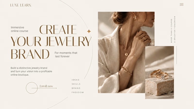
Same course. Same content. But two completely different feelings ✨
Which version would you choose?
27 voted
59%

19 voted
41%
46 votes
Closed

Option 2 is more practical ❤️❤️