The network for creativity
Join 1.25M professional creatives like you
Connect with clients, get discovered, and run your business 100% commission-free
Creatives on Contra have earned over $150M and we are just getting started
Back to feedPost
𝗬𝗼𝘂𝗿 𝘄𝗲𝗯𝘀𝗶𝘁𝗲 𝗽𝗿𝗼𝗯𝗮𝗯𝗹𝘆 𝗱𝗼𝗲𝘀𝗻’𝘁 𝗻𝗲𝗲𝗱 𝗮 𝗿𝗲𝗱𝗲𝘀𝗶𝗴𝗻.
It needs clarity.
Most founders think their problem is:
“We need a better-looking website.”
But the real problem is usually this:
Visitors land on the homepage… and leave confused.
That means no matter how modern the UI looks, your website is silently killing conversions.
Here are 3 things you should fix BEFORE redesigning your website 👇
𝟭. 𝗙𝗶𝘅 𝘆𝗼𝘂𝗿 𝗺𝗲𝘀𝘀𝗮𝗴𝗶𝗻𝗴 𝗳𝗶𝗿𝘀𝘁
If people can’t understand what you do in 5 seconds, they leave.
Your homepage should instantly answer:
𝗪𝗵𝗮𝘁 𝗱𝗼 𝘆𝗼𝘂 𝗱𝗼?
𝗪𝗵𝗼 𝗶𝘀 𝗶𝘁 𝗳𝗼𝗿?
𝗪𝗵𝘆 𝘀𝗵𝗼𝘂𝗹𝗱 𝘀𝗼𝗺𝗲𝗼𝗻𝗲 𝗰𝗮𝗿𝗲?
Most websites try too hard to sound “innovative” instead of being clear.
Clarity converts more than cleverness.
𝟮. 𝗙𝗶𝘅 𝘁𝗵𝗲 𝘂𝘀𝗲𝗿 𝗷𝗼𝘂𝗿𝗻𝗲𝘆
Many startup websites look beautiful but feel frustrating to use.
Too many buttons.
Too many sections.
No clear direction.
A good website guides visitors naturally:
𝗣𝗿𝗼𝗯𝗹𝗲𝗺 → 𝗦𝗼𝗹𝘂𝘁𝗶𝗼𝗻 → 𝗧𝗿𝘂𝘀𝘁 → 𝗔𝗰𝘁𝗶𝗼𝗻
If users have to “figure things out,” you already lost them.
𝟯. 𝗙𝗶𝘅 𝘆𝗼𝘂𝗿 𝗼𝗳𝗳𝗲𝗿 𝗽𝗼𝘀𝗶𝘁𝗶𝗼𝗻𝗶𝗻𝗴
Sometimes the design isn’t the issue at all.
The offer itself is unclear.
You might be talking too much about:
Features
Tools
Technology
Instead of:
Outcomes
Benefits
Transformation
𝗣𝗲𝗼𝗽𝗹𝗲 𝗱𝗼𝗻’𝘁 𝗯𝘂𝘆 “𝗱𝗲𝘀𝗶𝗴𝗻.”
𝗧𝗵𝗲𝘆 𝗯𝘂𝘆 𝗴𝗿𝗼𝘄𝘁𝗵, 𝘁𝗿𝘂𝘀𝘁, 𝘀𝗶𝗺𝗽𝗹𝗶𝗰𝗶𝘁𝘆, 𝗮𝗻𝗱 𝗿𝗲𝘀𝘂𝗹𝘁𝘀.
So before spending thousands on another redesign, ask yourself:
“Is my website actually communicating clearly?”
If not, start there first.
The network for creativity
Join 1.25M professional creatives like you
Connect with clients, get discovered, and run your business 100% commission-free
Creatives on Contra have earned over $150M and we are just getting started
Related posts
𝐃𝐚𝐲 𝟔𝟖 𝐨𝐟 𝐦𝐲 𝐜𝐡𝐚𝐥𝐥𝐞𝐧𝐠𝐞 𝐭𝐨 𝐫𝐞𝐚𝐜𝐡 𝟏,𝟎𝟎𝟎 𝐟𝐨𝐥𝐥𝐨𝐰𝐞𝐫𝐬
Recently someone told me: “you only show wins.”
So today 𝐈’𝐦 𝐛𝐫𝐢𝐧𝐠𝐢𝐧𝐠 𝐲𝐨𝐮 𝐬𝐨𝐦𝐞𝐭𝐡𝐢𝐧𝐠 𝐝𝐢𝐟𝐟𝐞𝐫𝐞𝐧𝐭 𝐚 𝐫𝐞𝐚𝐥 𝐟𝐚𝐢𝐥𝐮𝐫𝐞 😶🌫️😭 that was silently holding my profile back 👇
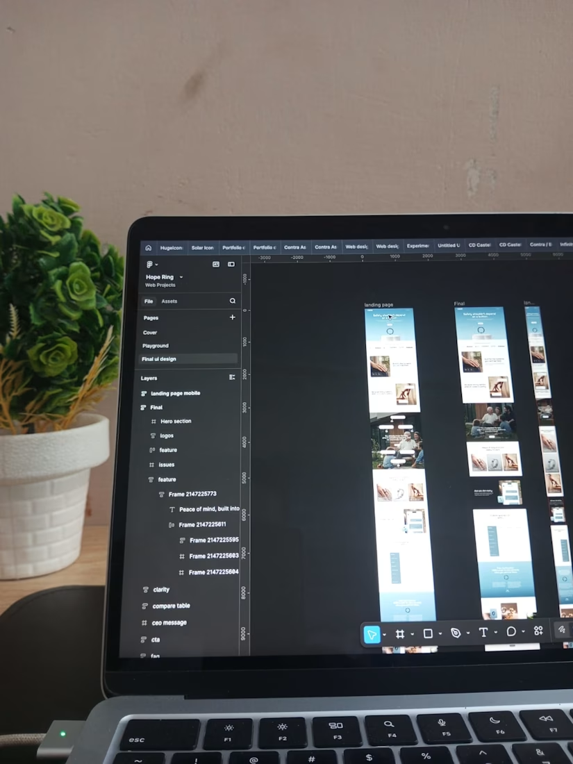
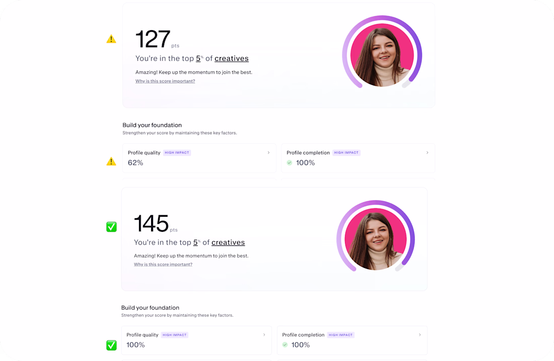
Check before / after screenshots first
My Discovery score jumped from 127 → 145 And Profile quality went from 62% → 100%
And here’s what actually happened:
I didn’t “grow overnight” I fixed something I didn’t even know was broken
You can actually reduce your score if your case studies are not structured correctly.
In my case, my work cases were silently underperforming, and I had no idea 😳
⚠️✅ Here’s what I learned (so you don’t repeat this):
📌 𝐈𝐟 𝐲𝐨𝐮 𝐮𝐬𝐞 𝐚 𝐁𝐞𝐡𝐚𝐧𝐜𝐞-𝐬𝐭𝐲𝐥𝐞 𝐜𝐚𝐬𝐞 𝐬𝐭𝐮𝐝𝐲 → don’t just place visuals → add short text blocks between sections (context matters)
📌𝐈𝐟 𝐲𝐨𝐮 𝐮𝐬𝐞 𝐃𝐫𝐢𝐛𝐛𝐛𝐥𝐞-𝐬𝐭𝐲𝐥𝐞 𝐬𝐡𝐨𝐭𝐬 → don’t upload single images only → add at least 2 visuals + description text
📌 𝐄𝐯𝐞𝐫𝐲 𝐜𝐚𝐬𝐞 𝐦𝐮𝐬𝐭 𝐡𝐚𝐯𝐞: → at least ~150 characters of description → clear structure → no “empty” uploads
If you have Contra Pro — you’ll see warnings about what’s wrong. If not — you might not even notice that score reduced
I honestly wish I knew this earlier.
✅ So I fixed it → and this is the result above.
Also, I’m currently at 𝟒𝟒𝟔 / 𝟏,𝟎𝟎𝟎 𝐟𝐨𝐥𝐥𝐨𝐰𝐞𝐫𝐬 still building this challenge step by step.
And now a small ask:
If you like my work please support my new submission in the #Wonderchallenge 🙏❤️ https://on.contra.com/PdDPjB ❤️ Let’s continue building and learning in public.
🐐 + 💬 = ❤️
Cool😊
I designed a website and 3d animations for Ngen.
This is mesmerizin 🔥
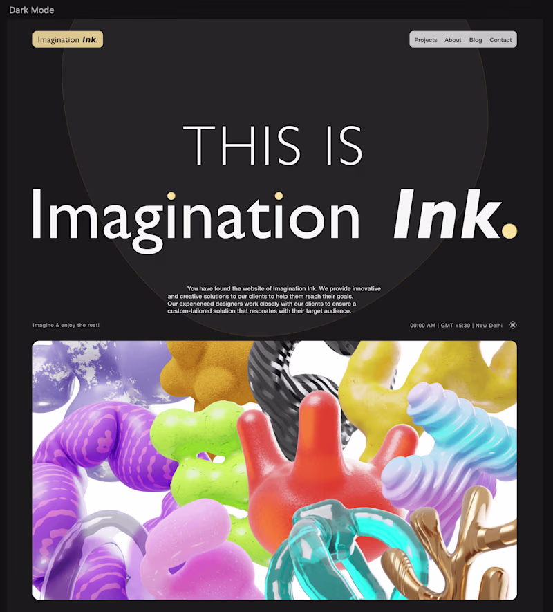
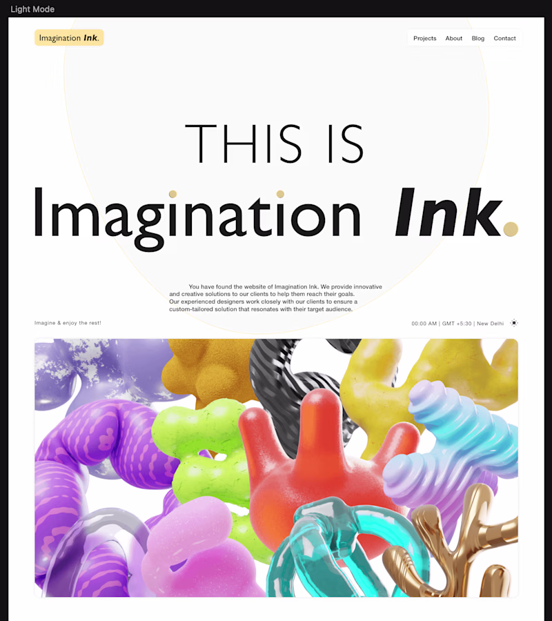
A hero section design I did 5 years back in Sketch 💎
Are you on the dark or light side? 👀
25 voted
48%
27 voted
52%
52 votes
Closed
Dark side for me, that white "Imagination Ink" wordmark just glows more against black, and the illustration colors pop harder too. Wild that this is 5 years old, it doesn't feel dated at all. What made you want to revisit it now, are you seeing this style trend back?
Challenges
View allTrending
Claude
Claude has entered the design space. How are you using Claude Design?
Contra University
Learn from expert creatives how to earn more using next-gen AI tools.
fifaworldcup2026
The World Cup is here and the whole world's watching. How are you designing for the world stage?
creativeaiflow
Creative AI workflows are evolving. What tools do you use, and what are their strengths and weaknesses?
freelancerlife
Freelancer life is wins, pivots, and everything in between. What’s yours right now?