The network for creativity
Join 1.25M professional creatives like you
Connect with clients, get discovered, and run your business 100% commission-free
Creatives on Contra have earned over $150M and we are just getting started
Back to feedPost

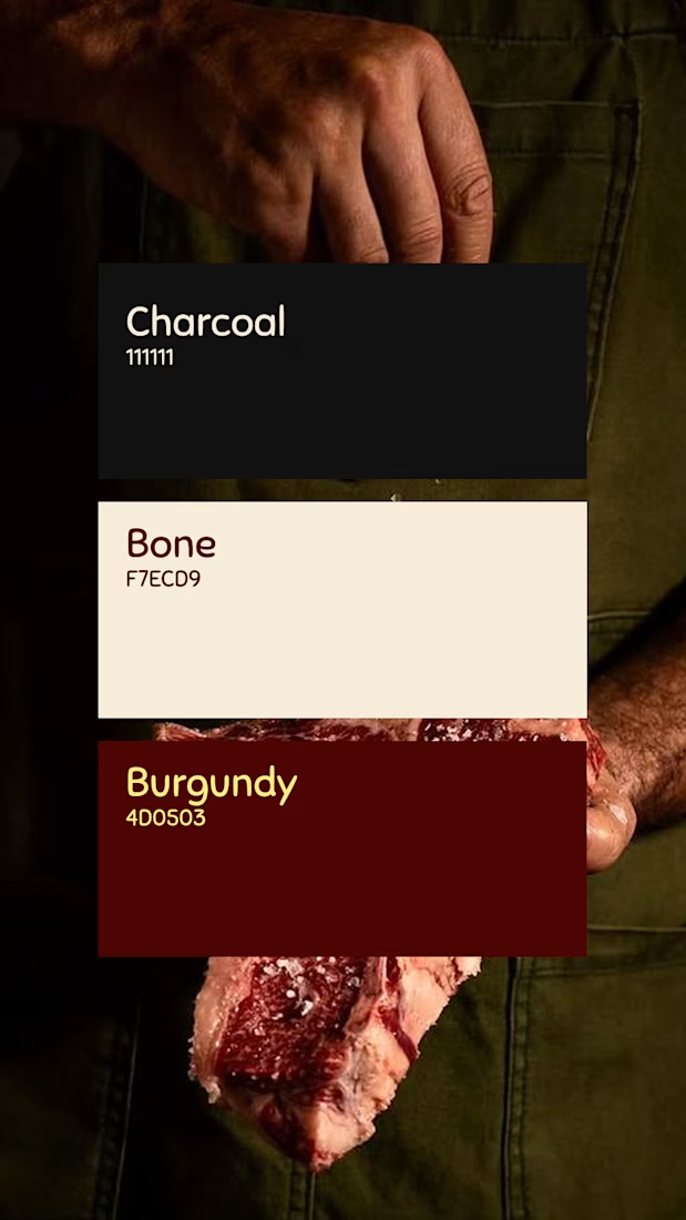
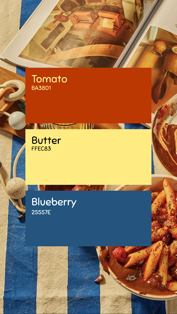
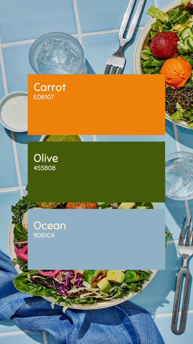
I explored three color palette options designed for different types of food businesses: a cozy and inviting palette for a pasta restaurant, a bold and refined combination for a steakhouse, and a fresh, natural palette for a healthy food brand.
Each option was created to reflect the essence of its concept, strengthen the visual identity, and create an appealing and memorable experience for the audience.
Which palette would you choose for your brand?
The network for creativity
Join 1.25M professional creatives like you
Connect with clients, get discovered, and run your business 100% commission-free
Creatives on Contra have earned over $150M and we are just getting started

Related posts

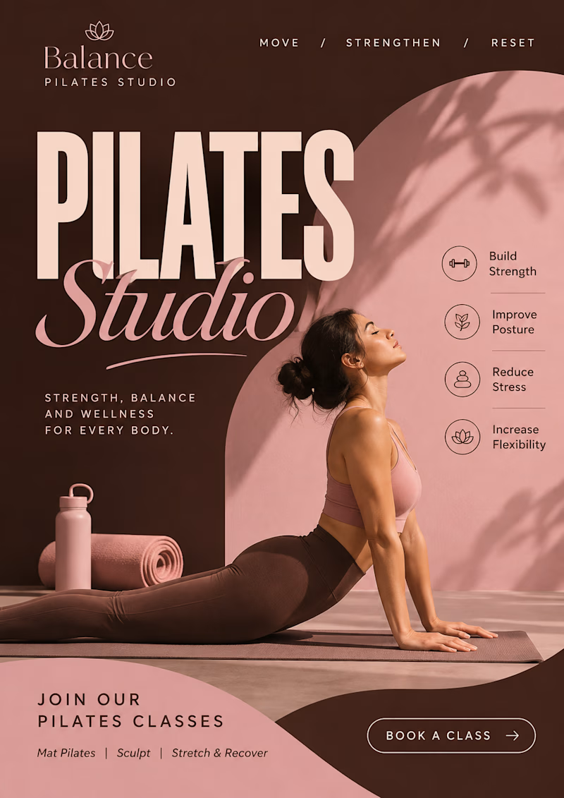
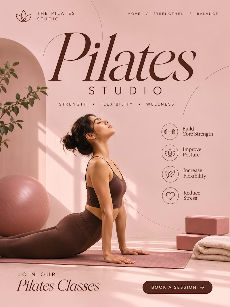
A minimal and elegant visual style with soft blush pink, cocoa brown, refined serif typography, and clean layouts to create a calm, premium wellness aesthetic.


3 voted
75%
1 voted
25%
4 votes
Closed

creating a consistent visual language that makes a brand recognizable, communicates its personality, and builds a stronger connection with its audience.


Very nice

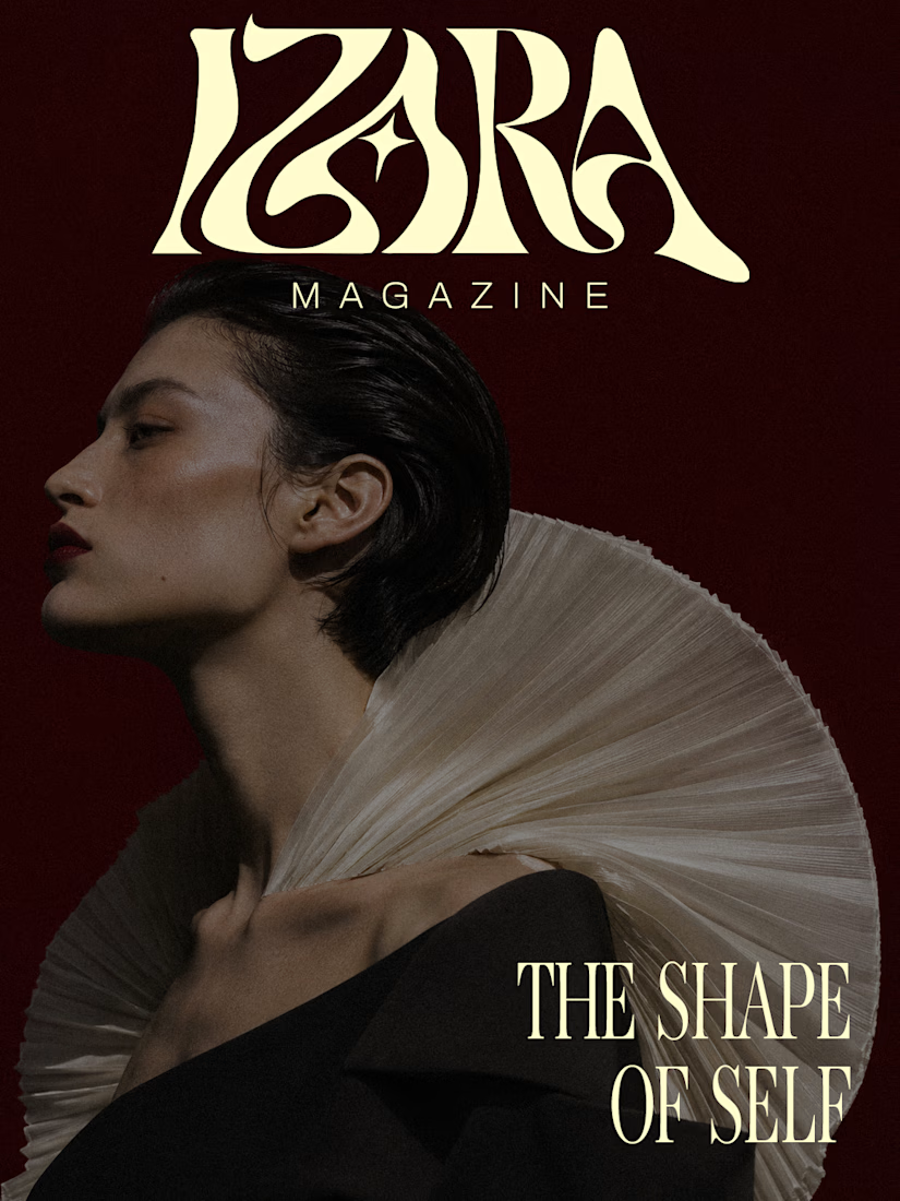
A magazine that refuses to look like every other magazine.
Introducing IZARA MAGAZINE — The Shape of Self.
A self-initiated editorial identity exploring the intersection of fashion, art and contemporary visual culture.
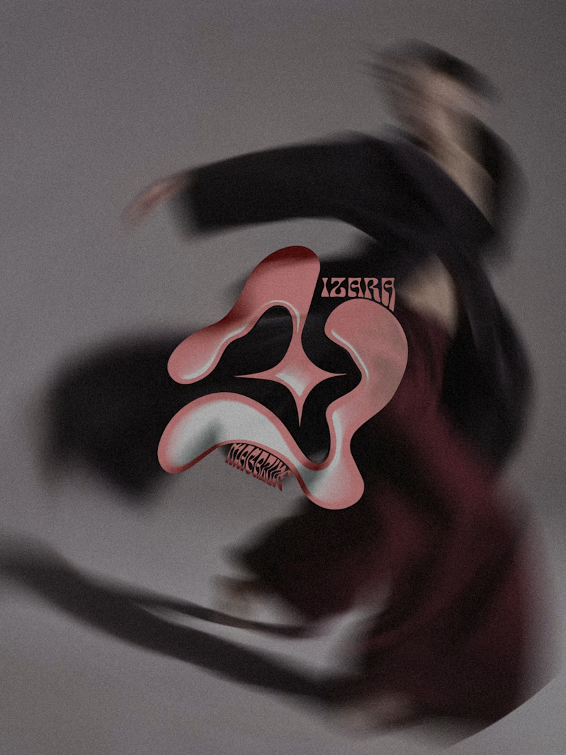
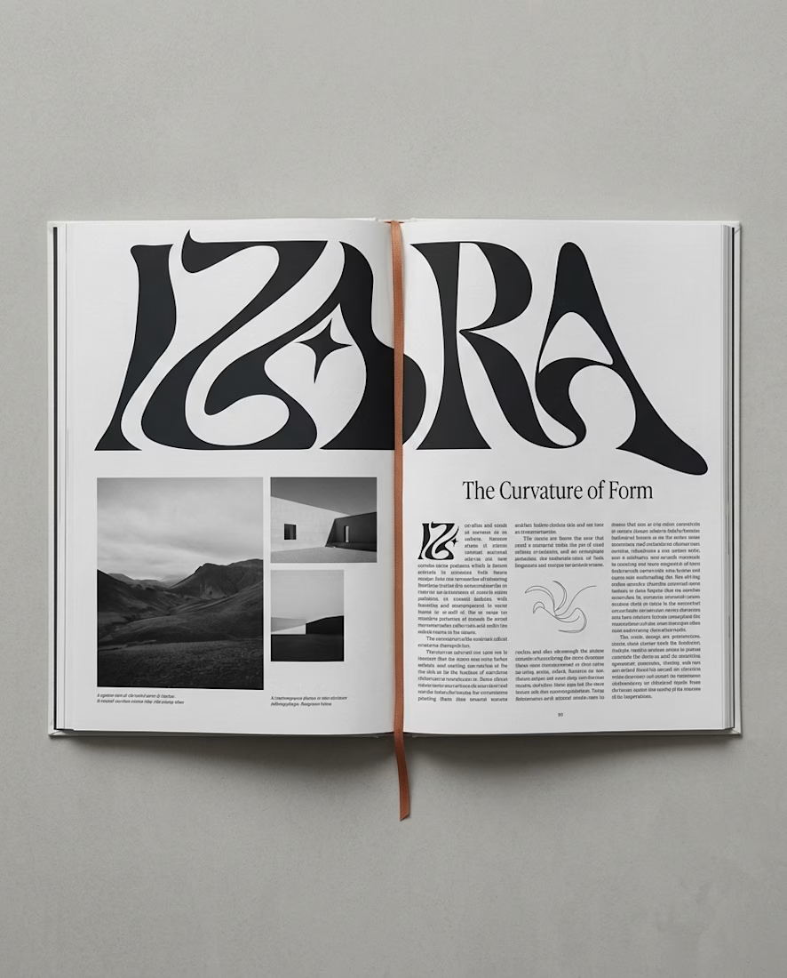
I wanted to create a visual world where bold typography, sculptural forms and experimental art direction could coexist — without losing a sense of identity.
From expressive visuals to editorial applications, every piece becomes part of the same creative universe.
Creative Direction & Visual Identity by Yarzy Studio.
Explore the full interactive case study:
https://izara-magazine-yarzystudio.framer.website
I'd love to hear which visual is your favorite🖤




I melt when I see bold typography 🫠❤️🔥


