The network for creativity
Join 1.25M professional creatives like you
Connect with clients, get discovered, and run your business 100% commission-free
Creatives on Contra have earned over $150M and we are just getting started
Back to feedPost
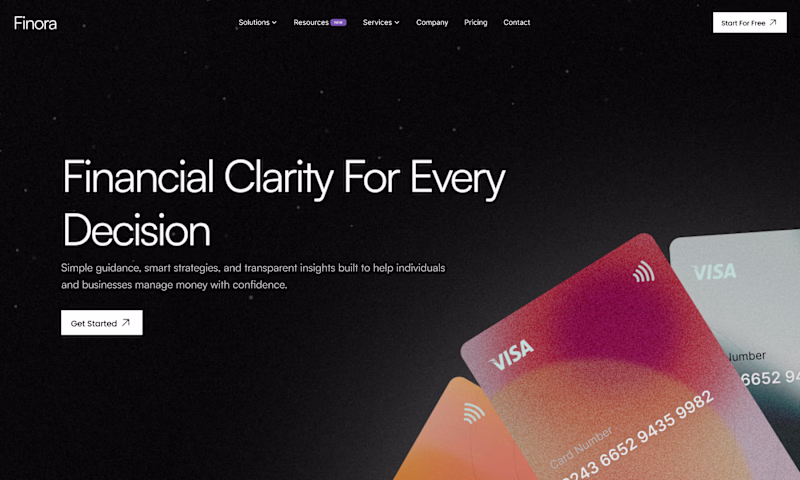
Taste Test
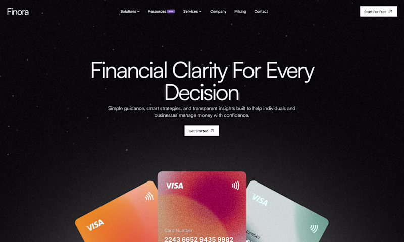
Left for me!
The hierarchy feels more intentional, and the 'Financial Clarity' message really lands when its front and center. Both are super clean, but the balance on the left is top-tier.
Exactly 💯
Left for sure, cleaner hierarchy and feels more trustworthy/premium.
Agreed💯
The left option feels more natural. The focus is clear from the title, and the cards provide good support to the content. 🎉
Yeah, the center alignment feels cleaner and more cohesive overall.
Yes🙌🏻exactly.
I prefer the left hero page, Breathing space and hierarchy where thing falling in place.
Exactly. The breathing space really helps the hierarchy feel intentional and balanced.
Option 1
Great taste. Thanks for voting ❤️
The network for creativity
Join 1.25M professional creatives like you
Connect with clients, get discovered, and run your business 100% commission-free
Creatives on Contra have earned over $150M and we are just getting started
Trending
Claude
Claude has entered the design space. How are you using Claude Design?
Contra University
Learn from expert creatives how to earn more using next-gen AI tools.
creativeaiflow
Creative AI workflows are evolving. What tools do you use, and what are their strengths and weaknesses?
freelancerlife
Freelancer life is wins, pivots, and everything in between. What’s yours right now?