The network for creativity
Join 1.25M professional creatives like you
Connect with clients, get discovered, and run your business 100% commission-free
Creatives on Contra have earned over $150M and we are just getting started
Back to feedPost
Taste Test

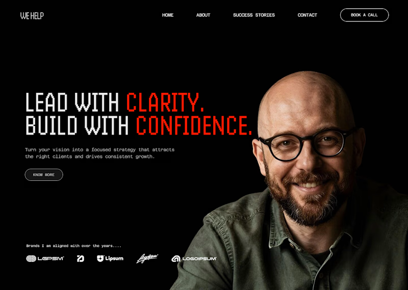
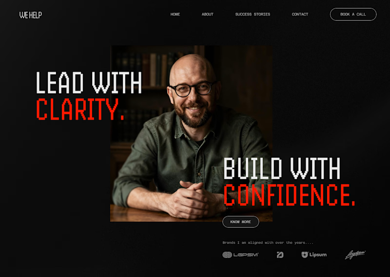
Was working on a UI concept for a Business coach header design. Which one out of the two do you people think will workout better? One seems easy on the eye while the other one forms a F pattern. Thanks for your vote.
2 voted
100%
0 voted
0%
2 votes
Closed


Darn this one is tricky.
naturally I'd say option 1.
Larger image, therefore more emotional impact.
But I think the typography separation on option 2 is strong, because it splices the heading with the business coach while I'm reading it, as opposed to seeing him at the end of...
Thanks for your feedback.
The network for creativity
Join 1.25M professional creatives like you
Connect with clients, get discovered, and run your business 100% commission-free
Creatives on Contra have earned over $150M and we are just getting started





Related posts

Same prompt. Two builders.
One site made with Lovable, one with Google AI Studio. A Flemish still-life snack brand, gilt frames, GSAP scroll, the works.
Which one is better?
33 voted
67%

16 voted
33%

49 votes
Closed

Same prompt. Same concept. Two AI tools. 👀
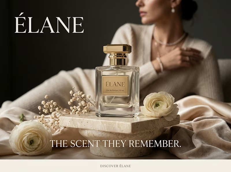
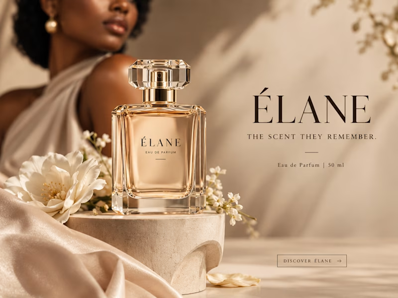
I gave ChatGPT and Gemini the exact same prompt to create a luxury perfume ad creative.
No changes. No extra instructions.
Now I want to know what YOU think:
Which creative did it better?
🔵 A— Gemini
🟣 B— ChatGPT
Look at the overall concept, visual quality, composition, typography, and how “ad-ready” it feels.
Who wins this round? 👀
Vote below and tell me what made you choose your answer.
#AIContent #AIAdvertising #AdCreative #CreativeStrategy #ChatGPT #Gemini #SocialMediaManager #SocialMediaStrategy #SocialMediaMarketing #MarketingStrategy #DigitalMarketing #ContentCreation

11 voted
39%
17 voted
61%
28 votes
Closed

I will go with Chatgpt on this.
It looks more luxurious and eye catching 🔥

Which one makes you want to stay A or B?


8 voted
24%
25 voted
76%
33 votes
Closed

I’d go with Immersive. It feels more engaging and premium, and the deeper color treatment makes the experience feel more like a real destination rather than just a booking page. 👌🔥