The network for creativity
Join 1.25M professional creatives like you
Connect with clients, get discovered, and run your business 100% commission-free
Creatives on Contra have earned over $150M and we are just getting started
Back to feedPost
What makes people stop, read, and remember?
It’s not always the design. It’s not always the words. And it’s definitely not about adding more.
Sometimes, the real difference is much simpler.
When a website feels confusing, people leave. When an eBook feels overwhelming, people stop reading. When a lead magnet looks beautiful but says nothing clearly, it gets forgotten.
The best content and design have something in common:
📌 They make the message easy to understand
That’s something I’ve come to value more with every project I work on.
Because when people understand the message, they’re more likely to connect with it.
And when they connect with it, they remember it.
📌People don’t buy content.
They buy clarity.


What makes you trust a brand faster, its message or its visuals?
The network for creativity
Join 1.25M professional creatives like you
Connect with clients, get discovered, and run your business 100% commission-free
Creatives on Contra have earned over $150M and we are just getting started
Related posts


What happens when one website has to talk to two different people?
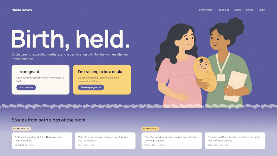
A client of ours teaches two audiences at once: expecting mothers who want a calm pregnancy, and women who want to become doulas. One brand, one site, two very different reasons to visit.
The usual fix is a hero that speaks to "everyone" and lands with no one. We designed it as a fork in the road instead:
1. Two doors in the hero. "I'm pregnant" and "I'm training to be a doula", side by side, equal weight. The visitor picks a path in one click, and the headline above them stays about the shared value.
2. One voice, two tones. The mothers' path is softer: fewer words, more room, gentle photos. The doula path is more structured: modules, certification, dates. Same fonts, same colors, different rhythm.
One proof section, split in two. Testimonials from mothers on the left, from doulas on the right. Each visitor sees people like them before the price.
Writing for everyone is writing for no one. Give each reader a door.
Have you ever designed a page for two audiences at once? How did you split it?


Love that purple hero with the two cards right up top.

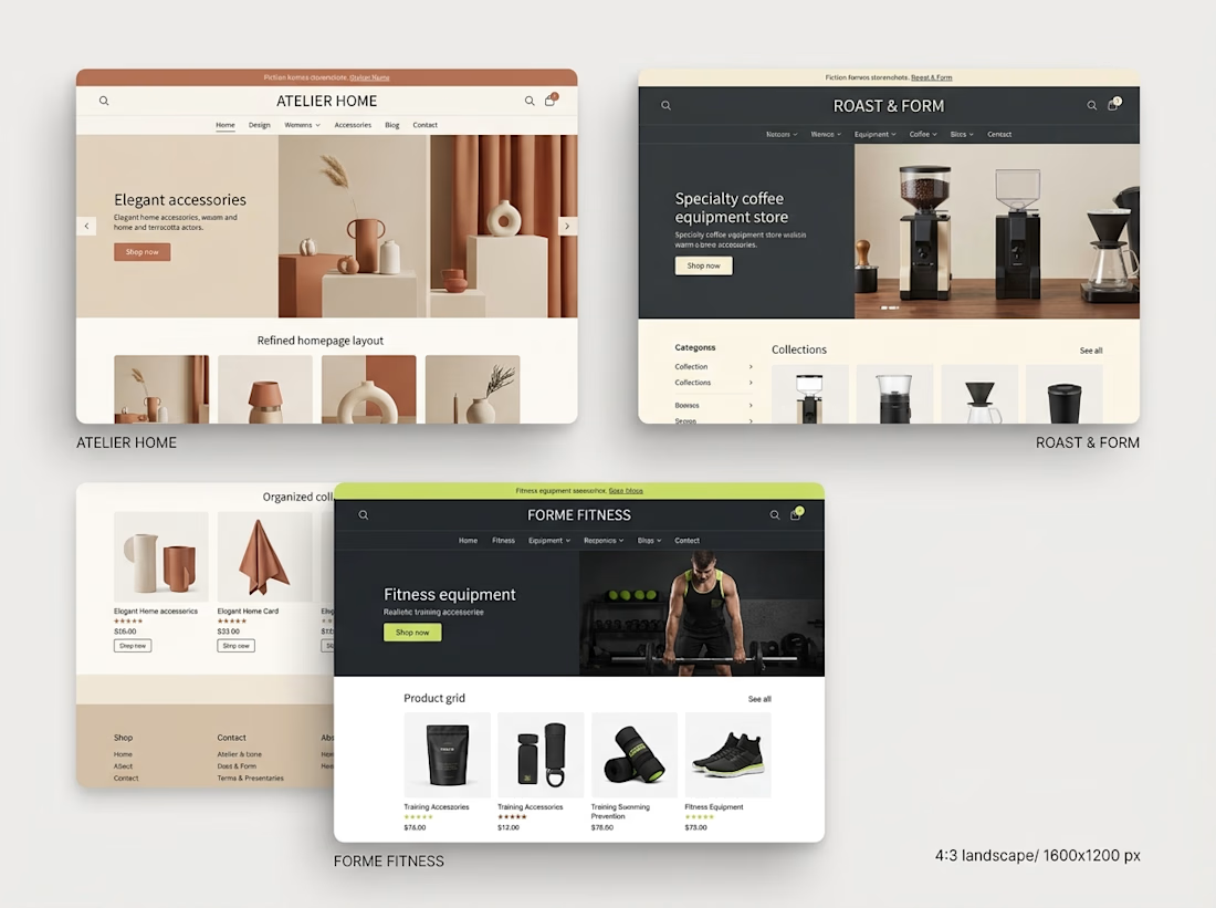
Over the past month, I've been spending more time exploring Shopify store design and thinking about what makes an online store work well.
One thing that stands out to me is that good e-commerce design involves much more than appearance.
I've been paying closer attention to:
→ How a homepage guides visitors
→ How product pages present important information
→ How collections help customers discover products
→ How navigation affects the shopping experience
→ How a store adapts to mobile screens
→ How consistent design builds a stronger brand experience
I'm also learning to think more carefully about the purpose behind each section instead of designing just because something looks good.
Every page should have a reason to exist, and every design decision should contribute to the overall experience.
I still have more to learn and improve, but each project gives me another opportunity to practice, experiment, and develop my approach.
My biggest takeaway so far: good Shopify design brings visual presentation, usability, and the customer's journey together.
What's one thing you believe every e-commerce designer should understand?



Understanding customer behavior is key to creating better shopping experiences. 👏


Across my career, I've worked with more than 100 clients.
One call worth getting right before you spend on design: is this a brand problem or an explanation problem?
A rebrand fixes a mismatch between the company and how it presents itself.
If buyers can't tell what your product does, a new identity leaves that question open. The explanation still has to be written.
List what buyers get wrong about you. If most of it is about what the product does and who it's for, start with the explanation.