The network for creativity
Join 1.25M professional creatives like you
Connect with clients, get discovered, and run your business 100% commission-free
Creatives on Contra have earned over $150M and we are just getting started
Back to feedPost

✈️ Altitude Academy — Aviation Training, Reimagined
I designed Altitude Academy as a modern website concept for aviation training academies looking to turn visitors into future students.
The experience is built around a clear journey:
→ Explore aviation programs
→ Compare upcoming batches
→ Discover instructors & career opportunities
→ Book a consultation
→ Apply for the next available batch
The site includes dedicated program pages, upcoming batch information, faculty profiles, editorial content, application-focused CTAs, and a complete legal/content structure — all wrapped in a clean, premium aviation-inspired visual system.
Built in Framer with a CMS-driven structure, making it easy for an academy to manage programs, blogs, faculty, and upcoming batches.
Designed for aviation academies, training institutes, and education brands that want something more polished than a typical course website.
Need a website like this for your academy or training business? Let's talk.
#Framer #WebDesign #UIDesign #Aviation #Education #FramerTemplate #WebDesignPortfolio


The network for creativity
Join 1.25M professional creatives like you
Connect with clients, get discovered, and run your business 100% commission-free
Creatives on Contra have earned over $150M and we are just getting started



Related posts


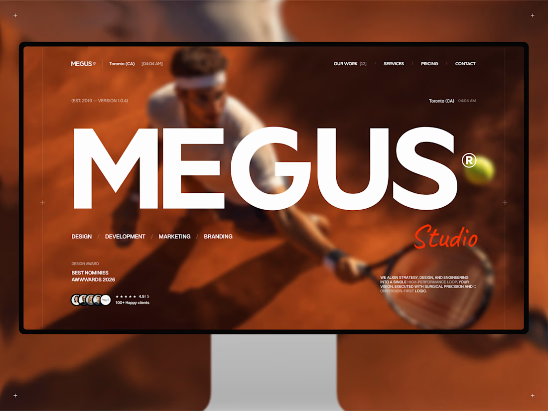
Finally, MEGUS® ⚡️ is live on the @Framer Marketplace! 🚀
After 2 months of focused work, the template is now published and ready.
MEGUS is a complete system for modern brand and portfolio sites — strategy, identity, motion, and development in one cohesive setup. 👾
Explore the full template and see it in action here:
https://www.framer.com/marketplace/templates/megus/
Available now. ⚡️


Same projects. Different perspectives.
With INKY, switching between grid and list views changes more than the layout.
The grid gives projects a visual presence. The list offers a more direct way to browse and compare.
Neither is necessarily better.
They're simply two ways of experiencing the same work.
One portfolio. Two perspectives.

Cool 3D assets

Not every website needs more elements.
Sometimes, it needs better decisions.
A thoughtful layout.
A strong typographic hierarchy.
The right images.
Consistent spacing.
A clear navigation.
And enough room for the design to breathe.
These details might seem small, but together they shape how people experience a website.
That's one thing I appreciate about working with Framer: the opportunity to explore layouts, interactions, and visual details while keeping the experience intentional.
For me, good web design isn't about adding more.
It's about knowing what to keep, what to remove, and what deserves attention.
Less noise. More meaning. Better experiences.
What's one small design detail that immediately makes a website feel premium to you?

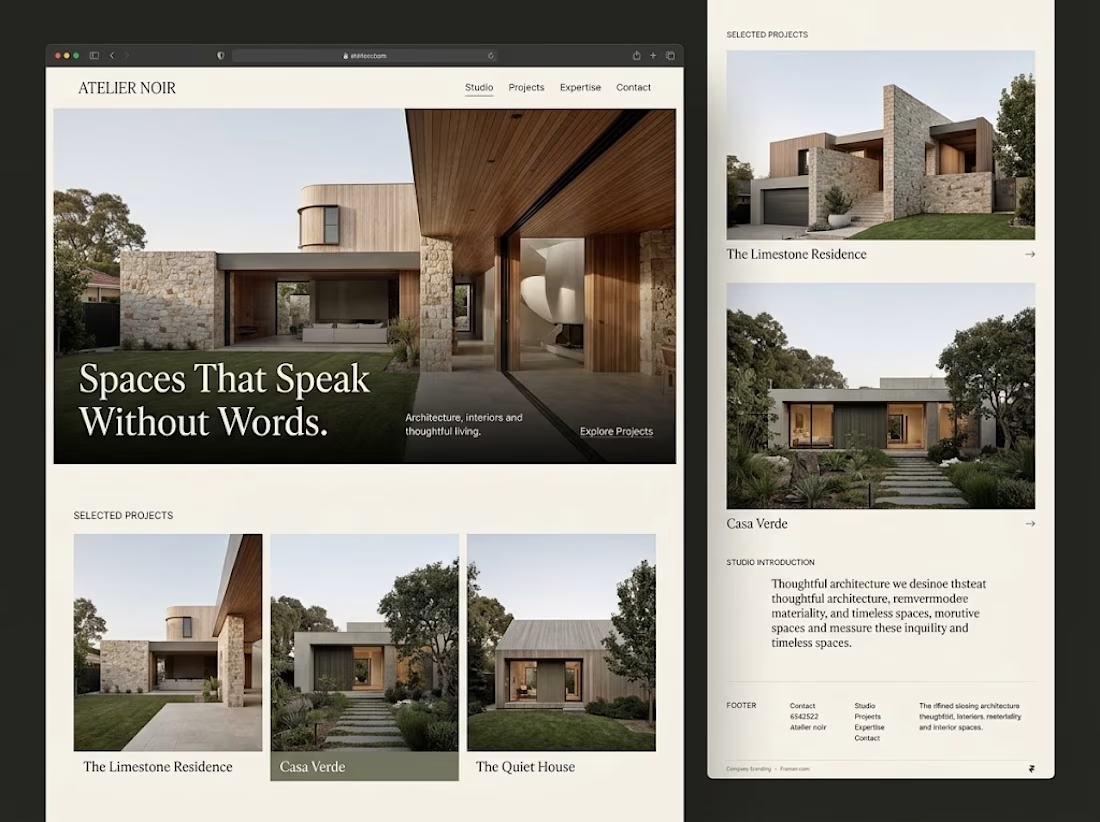

Generous whitespace for me. The serif headline over the photo on your Atelier Noir layout is a good example.