The network for creativity
Join 1.25M professional creatives like you
Connect with clients, get discovered, and run your business 100% commission-free
Creatives on Contra have earned over $150M and we are just getting started
Back to feedPost
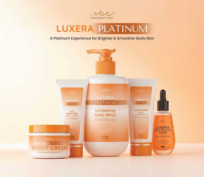
Taste Test
Feed layout comparison 👀
Which one works better visually?
3 voted
33%
6 voted
67%

9 votes
Closed
I’d go with the tagline option because it helps support the brand. “Luxera Platinum” leads the name, but on its own it doesn’t really explain what differentiates it from other products.
Thank you for the insight!
With tagline for sure. Texts help users understand the context of the product. If you feel like it doesn't belong there, you can use a less aggressive color like a dark orange so it feels more connected. Great work!
Great point, thank you!
You got it!
Focuses the viewers eye entirely on the logo and brand name, reducing visual noise.
The network for creativity
Join 1.25M professional creatives like you
Connect with clients, get discovered, and run your business 100% commission-free
Creatives on Contra have earned over $150M and we are just getting started
Challenges
View allTrending
Claude
Claude has entered the design space. How are you using Claude Design?
Contra University
Learn from expert creatives how to earn more using next-gen AI tools.
fifaworldcup2026
The World Cup is here and the whole world's watching. How are you designing for the world stage?
creativeaiflow
Creative AI workflows are evolving. What tools do you use, and what are their strengths and weaknesses?
freelancerlife
Freelancer life is wins, pivots, and everything in between. What’s yours right now?