The network for creativity
Join 1.25M professional creatives like you
Connect with clients, get discovered, and run your business 100% commission-free
Creatives on Contra have earned over $150M and we are just getting started
Back to feedPost

I studied how Coca-Cola builds emotional consistency across decades, and here’s what stood out:
• Red wasn’t random; it became a dominance strategy.
• They sell emotion before product.
• Visuals are localised for cultural connection.
• The dynamic ribbon guides the eye with intention.
• They avoid trends to protect brand trust.
• Every campaign is built around one core emotion.
This case study explores how strategy shapes visual systems, not just aesthetics.
Concept project. Strategy-first execution.


The network for creativity
Join 1.25M professional creatives like you
Connect with clients, get discovered, and run your business 100% commission-free
Creatives on Contra have earned over $150M and we are just getting started



Related posts


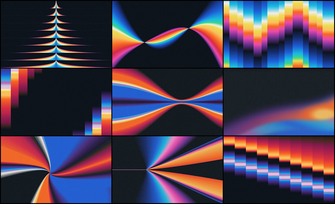
We designed the visual identity for an early-stage studio that helps AI companies adapt one product story for different audiences and channels.
Its positioning was already defined. Our job was to make it visible.
The organizing idea was refraction: one source opening into multiple expressions.
Rays expand from a shared point. Color fields stretch, compress and change direction, which gives a still image a sense of movement.
If your brand needs a lot of variety, decide first what every variation stays connected to.


Kalotės Pušynas, a gated quarter of modern houses.
I created the identity and the website. A wordmark that joins modern and classic, a deep blue and cream palette with four steps of blue, kalotespusynas.lt where buyers choose their house plot by plot, and everything the sales team hands over on site.
Check - Full Case Study


Great

Great brands are built through details, consistency, and a clear creative vision. ☀️
For CORVX, we brought a skincare brand to life — from the initial logo concept and complete brand identity to product aesthetics, creative photography, social media graphics, and ongoing social media management.
Every visual, every detail, and every touchpoint works together to create a cohesive brand experience that feels premium, distinctive, and memorable.
From the first concept to every social interaction — one vision, one consistent brand. ✨

Thumbs up