The network for creativity
Join 1.25M professional creatives like you
Connect with clients, get discovered, and run your business 100% commission-free
Creatives on Contra have earned over $150M and we are just getting started
Back to feedPost

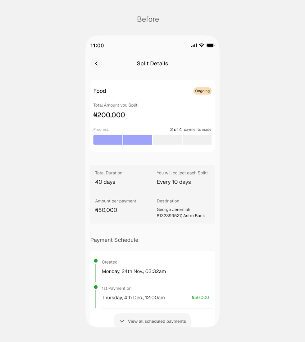
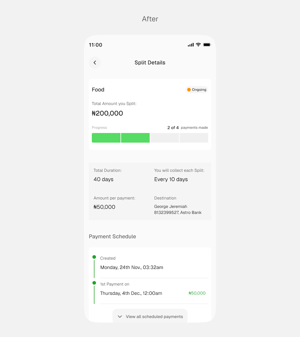
I made a few changes to this Split details active screen.
The idea was to maintain consistency, so I changed the progress bar color to match the success green in the payment schedule section.
I also worked on the spacing to improve visual flow.
What do you think?
The network for creativity
Join 1.25M professional creatives like you
Connect with clients, get discovered, and run your business 100% commission-free
Creatives on Contra have earned over $150M and we are just getting started





Related posts

Made this Static ads for a payment platform
what do you think?
#motion #designer

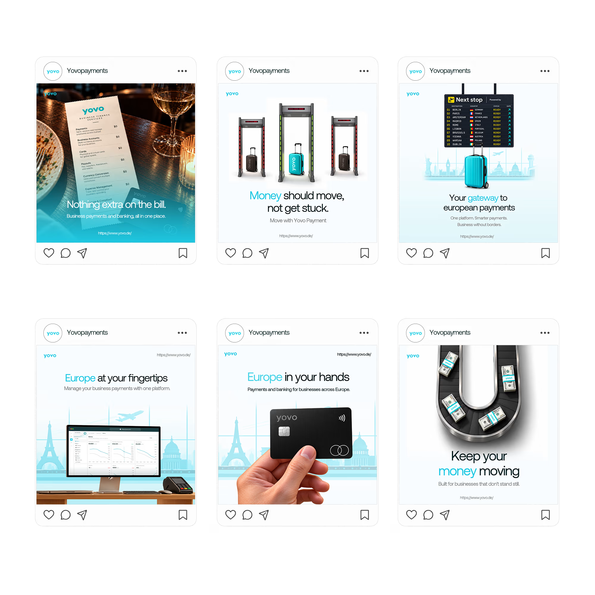

Pairing one physical object per tile (the menu, the security gate, the card) with a short headline keeps six ads feeling like a single system. Which of them ended up pulling the most attention, the literal card shot or one of the metaphor ones?

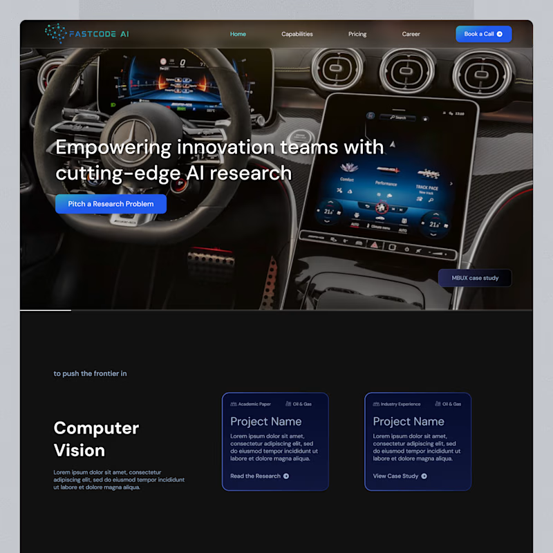
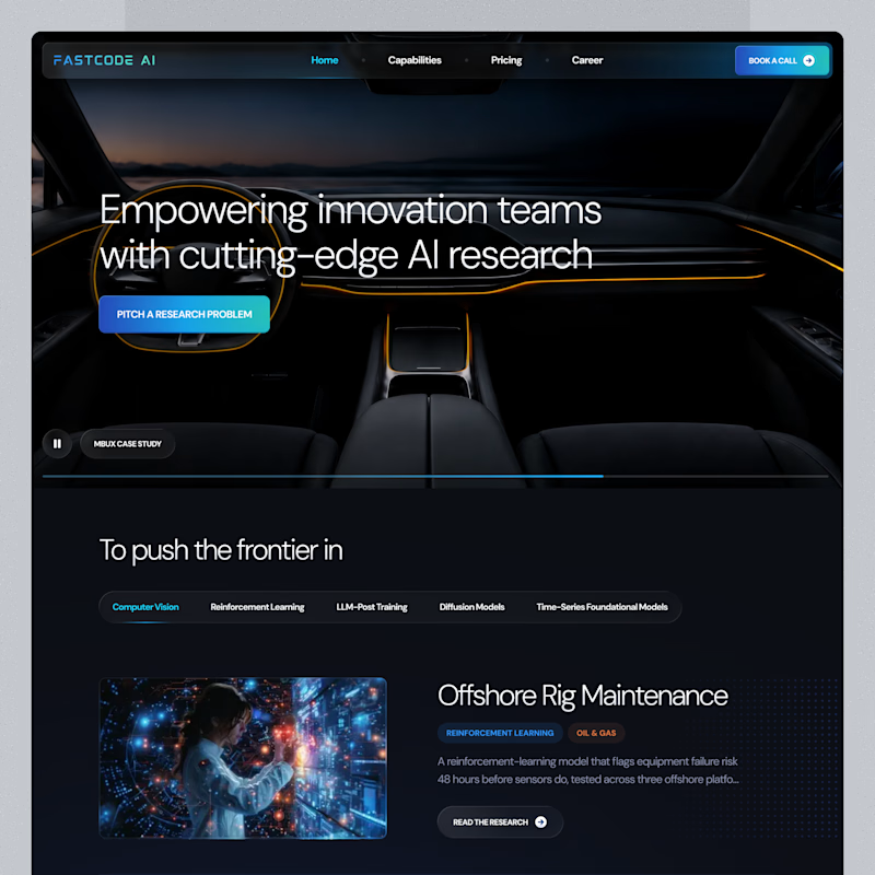
Same landing page, two passes on the surface.
Which one feels more finished?

18 votes
Ends in 7h

B is has more professional image 👍❤️

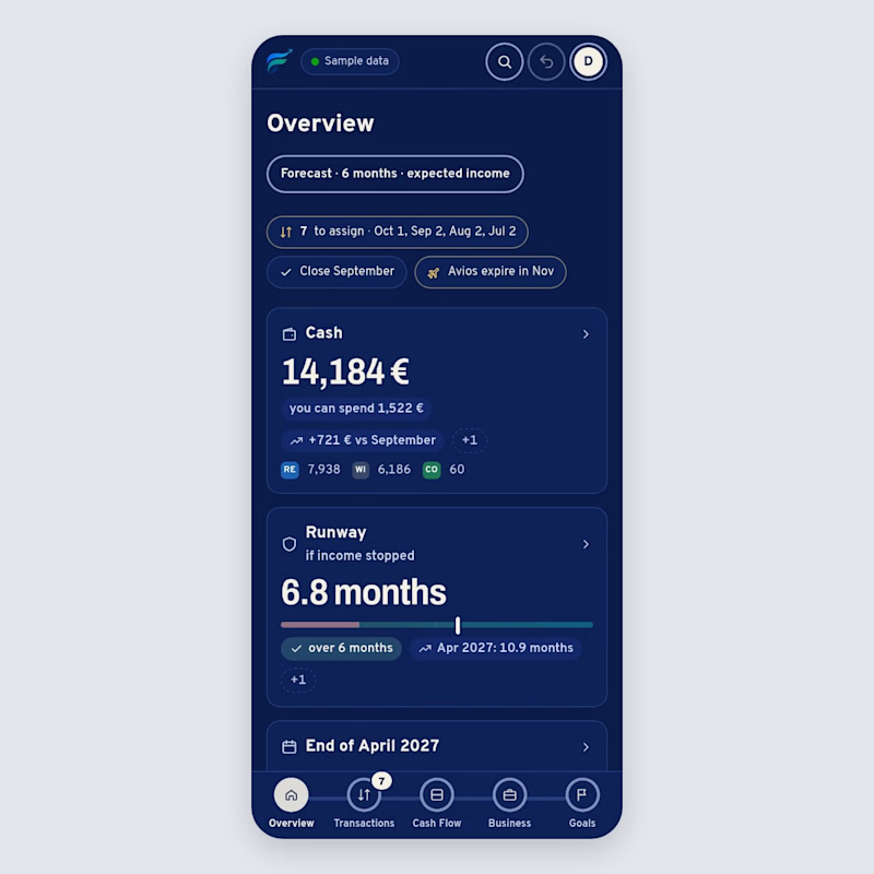
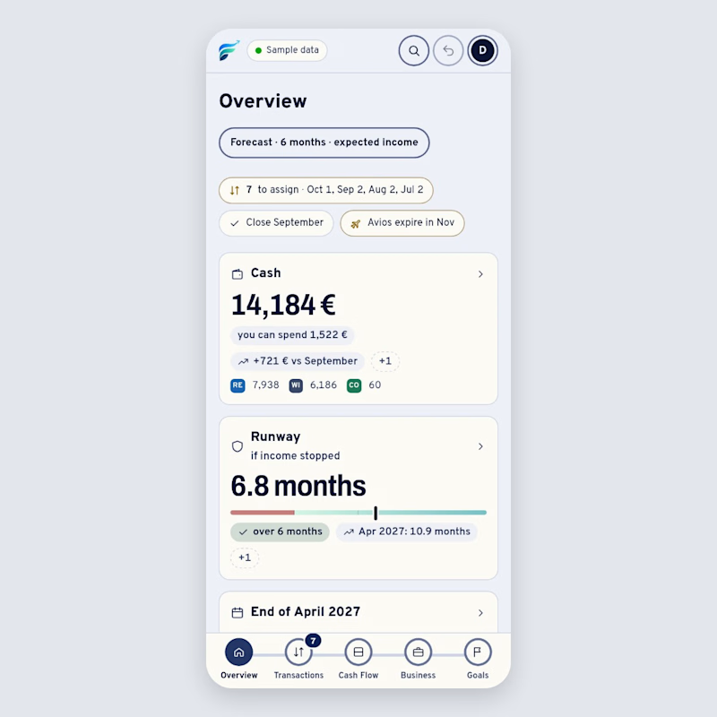
Same screen, two themes: the overview of Flusso, a money dashboard I'm building. People open it every day, so I want the default to feel calm. Which theme would you open every morning, and why? 👇
1 vote
Ends in 14h

Great visual hierarchy.