The network for creativity
Join 1.25M professional creatives like you
Connect with clients, get discovered, and run your business 100% commission-free
Creatives on Contra have earned over $150M and we are just getting started
Back to feedPost

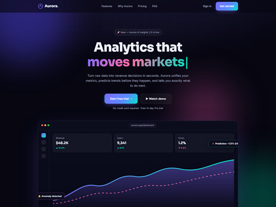
Responsive multi-section business website built with semantic HTML5 and CSS3 — modern Hero, Services, and Pricing with clean typography and full mobile adaptation. Live at aurora-abood.netlify.app


The network for creativity
Join 1.25M professional creatives like you
Connect with clients, get discovered, and run your business 100% commission-free
Creatives on Contra have earned over $150M and we are just getting started







Related posts

Primland puts a whole mountain resort on one interactive 3D map. You start high above the Blue Ridge Mountains with clouds drifting through the valley, then pick a pin and fly down to the lodge, the pool, or the mountaintop restaurant. The terrain, the trees, and the smooth camera moves make you want to book a trip.
Big shout-out to Robert Borghesi for building this. The scale and the attention to detail are impressive.


Photographer, filmmaker, or anyone whose images are the work? Halation is a portfolio template with four series, a page for each, commissions with prices, availability by month and an enquiry form.

This is fantastic Lauri! 🔥 Halation looks perfect for photographers and filmmakers - love how you structured it with four series, commissions with prices, availability by month and enquiry form! Super thoughtful and practical template, not just pretty! Great work as always!

A few weeks ago I published REVAI as a landing page concept.
Today it's a real template you can use for your product.
The idea behind it hasn't changed: a landing page works when it guides attention in order. Hook, then value, then proof, then the ask. The claim comes first and alone. The features earn their place after the value is clear. The proof shows up right before the ask, not buried at the bottom.
Nothing on the page is there for decoration. Every section is doing a job.
Now it's built in Framer, fully responsive on Desktop, Tablet and Phone, with animated headlines, scroll reveals, a contact page and a Design System guide. Duplicate it, swap in your own brand and copy, and keep the structure.
