The network for creativity
Join 1.25M professional creatives like you
Connect with clients, get discovered, and run your business 100% commission-free
Creatives on Contra have earned over $150M and we are just getting started
Back to feedPost
Shopify store design, Search Engine Optimization and Marketing
The network for creativity
Join 1.25M professional creatives like you
Connect with clients, get discovered, and run your business 100% commission-free
Creatives on Contra have earned over $150M and we are just getting started
Trending
Claude
Claude has entered the design space. How are you using Claude Design?
Contra University
Learn from expert creatives how to earn more using next-gen AI tools.
creativeaiflow
Creative AI workflows are evolving. What tools do you use, and what are their strengths and weaknesses?
freelancerlife
Freelancer life is wins, pivots, and everything in between. What’s yours right now?
Related posts
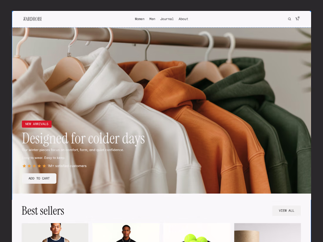
Wardrobe — Shopify Fashion E-commerce Template
Wardrobe is a premium e-commerce template built for modern fashion brands, lifestyle retailers, and independent apparel businesses. Designed in Framer and powered by Shopify through Frameship, the template combines the flexibility of a marketing website with a fully functional online store—allowing brands to showcase collections, sell products, and manage inventory without sacrificing design quality.
The project focuses on creating a refined shopping experience inspired by editorial fashion websites, where clean layouts, immersive imagery, and thoughtful typography let the products take center stage.
The Challenge
Many Shopify themes prioritize functionality over aesthetics, while marketing websites often lack seamless commerce integration. The challenge was to bridge both experiences by creating a storefront that delivers premium storytelling alongside a complete shopping workflow.
The template also needed to remain highly customizable, responsive, and easy for brands to launch without extensive development.
Design Approach
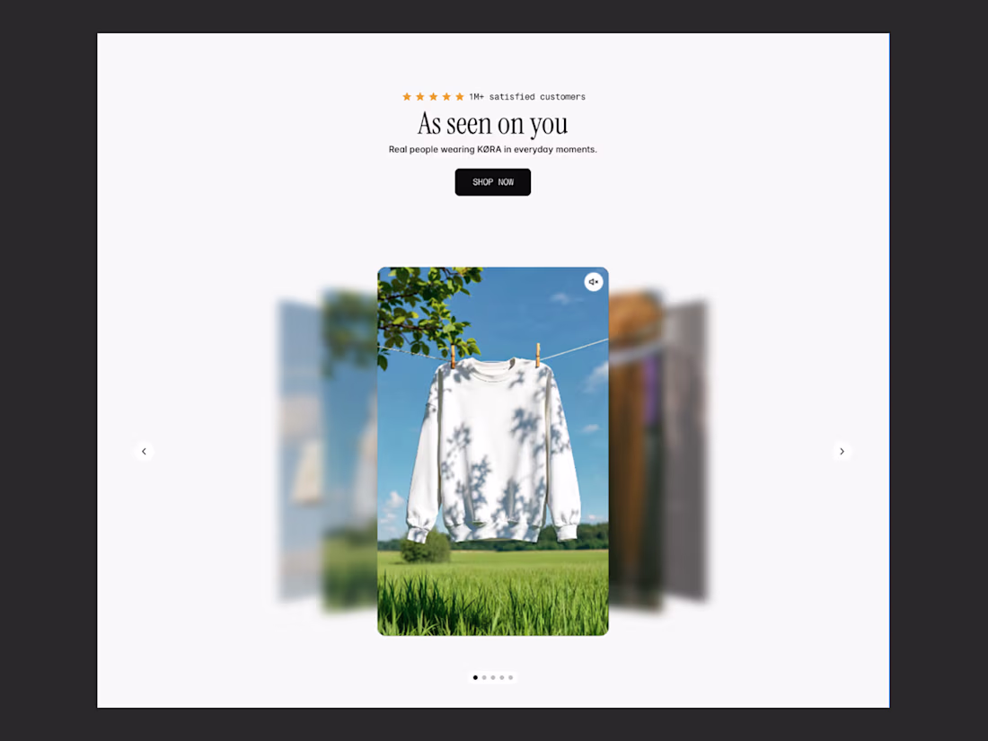
Wardrobe embraces a minimalist design language with generous whitespace, elegant typography, and large product photography to create a premium retail experience. Every page was designed to reduce distractions and guide customers naturally from discovery to purchase.
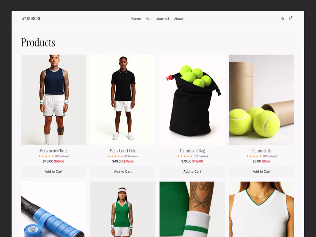
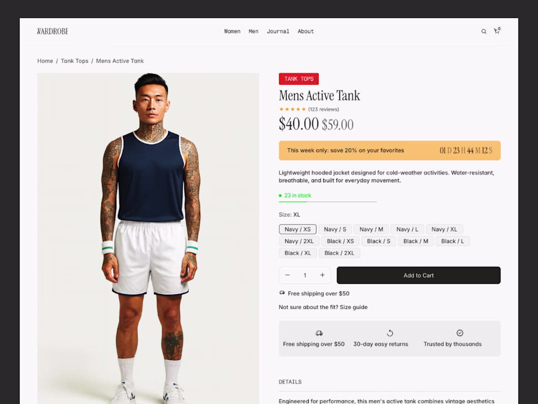
Using Frameship, Shopify collections, products, pricing, inventory, and cart functionality are connected directly to Framer, allowing businesses to manage their store through Shopify while maintaining complete creative freedom over the website experience.
Key Features
- Premium fashion e-commerce storefront
- Shopify integration powered by Frameship
- Dynamic product listings and collections
- Product detail pages with variants and inventory
- Shopping cart and checkout integration
- Editorial-inspired landing pages
- Category and collection pages
- Customer reviews and product highlights
- Fully responsive across all devices
- SEO and performance optimized
- Built with reusable Framer components
Design Highlights
The interface combines editorial aesthetics with practical e-commerce functionality. Large lifestyle photography, refined serif typography, and carefully balanced layouts create a luxury shopping experience while maintaining excellent usability.
Interactive product cards, featured collections, promotional banners, and conversion-focused product pages help customers browse, compare, and purchase products with minimal friction. The integration with Shopify ensures the design remains scalable for growing brands.
Outcome
Wardrobe is a production-ready Framer template built for the Framer Marketplace, giving fashion brands and retailers a fast way to launch a premium online store without compromising on design. By combining Framer's creative flexibility with Shopify's commerce capabilities through Frameship, the template delivers a seamless shopping experience that's both visually engaging and easy to manage.
This project demonstrates my expertise in designing modern e-commerce experiences, integrating third-party commerce platforms, and building scalable Framer templates that balance aesthetics, performance, and conversion.
Looking for a reliable Virtual Assistant to manage your Shopify store and find winning products?
With 8+ years of experience in Shopify and eCommerce, I can help you with:
✅ Shopify Store Management
✅ Winning Product Research
✅ Product Listing & Optimization
✅ Product Sourcing
✅ Order Fulfillment (DSers)
✅ SEO-Friendly Product Pages
✅ Inventory & Store Maintenance
Let me handle the day-to-day operations while you focus on growing your business.
📩 Let's work together to scale your Shopify store!
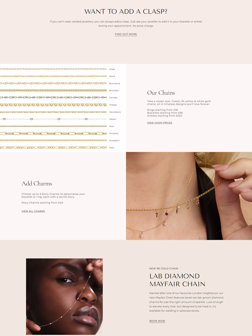
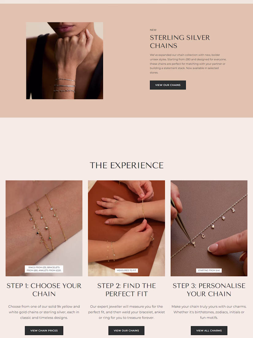
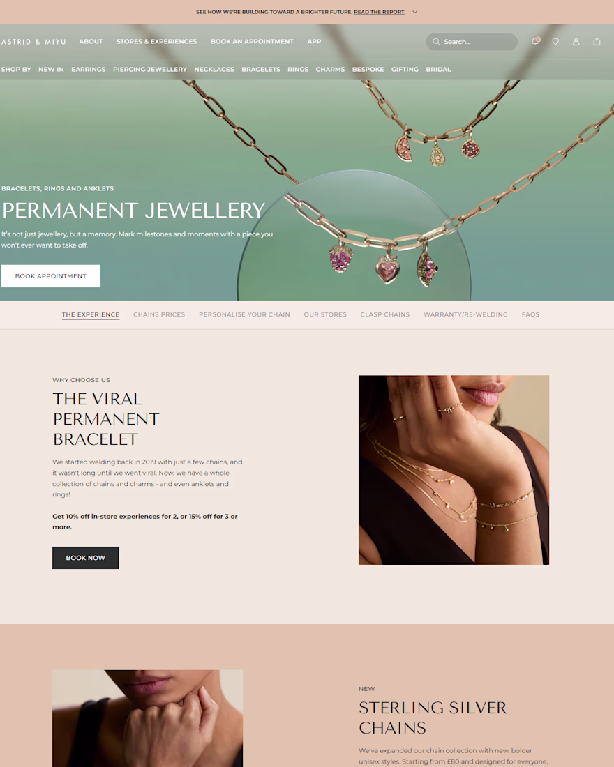
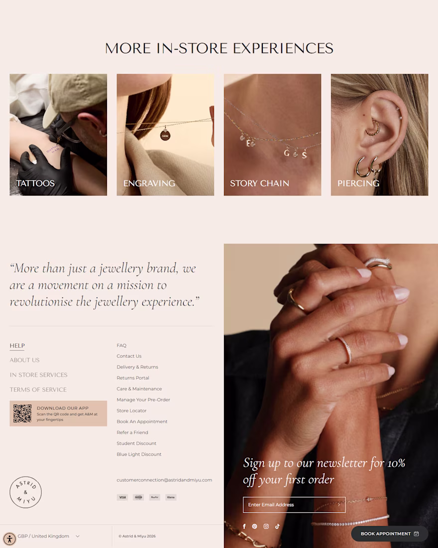
I redesigned the Astrid & Miyu-inspired Shopify jewelry store to deliver a premium, luxury-focused shopping experience that balances elegant aesthetics with high-converting eCommerce design principles. The project focused on improving user experience (UX), enhancing visual storytelling, and creating a seamless customer journey from homepage to checkout.
The redesign features a clean, modern interface with refined typography, immersive lifestyle imagery, intuitive navigation, and strategically organized collections that make it easier for customers to discover products. Product pages were optimized with trust-building elements, compelling product layouts, clear calls-to-action, and a mobile-first design to maximize engagement and conversions across all devices.