The network for creativity
Join 1.25M professional creatives like you
Connect with clients, get discovered, and run your business 100% commission-free
Creatives on Contra have earned over $150M and we are just getting started
Back to feedPost
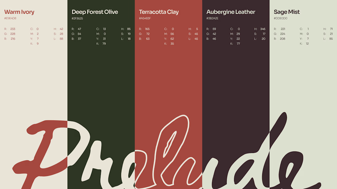
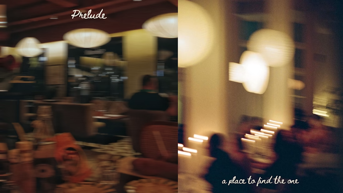
So, I just completed this brand work.A comprehensive brand identity developed for a concept brand — Prelude. It's a community that hosts singles mixtures as an organic, offline way of meeting people, with an added twist of having questionnaires that allows couple a glimpse into each other's minds.
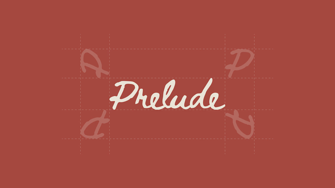
The design brief was to design a brand that feels warm, human and curious. We looked at the competition (in software and otherwise) to find the right, distinct color palette for the brand. Then, we chose a handwritten script for the logo to feel more human, with imperfect strokes and inconsistencies within the wordmark itself. The motto for the brand is "at love's service", which is how the team wants to operate their mixers and the events they host within the same. It's meant to be poetic and also convey what their mission is.



prelude is honestly a perfect name for a singles mixer lol

Ikr!
The network for creativity
Join 1.25M professional creatives like you
Connect with clients, get discovered, and run your business 100% commission-free
Creatives on Contra have earned over $150M and we are just getting started











Related posts


Three weeks into building the Pasted website, after the design was approved, an 11-page document arrived with a whole new vision.
It was beautiful work, and it described a different project at the agreed price.
I asked them to decide: keep the approved scope, or pause and price the new idea separately. On day six, they chose the original. We shipped two weeks later.
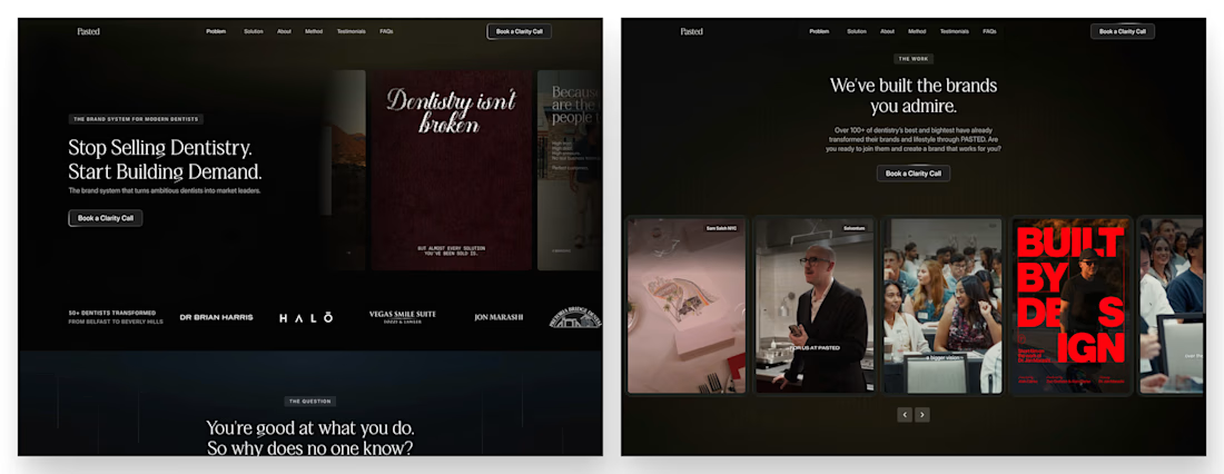

Offering to price the new vision as its own phase also lets the client see what the idea costs without it feeling like a no. Was a change-order process already written into your contract, or did you build that path on the spot?

AURIXIT — Luxury Headphones Landing Page 🎧💗
A vibrant landing page concept for a premium audio brand, combining luxury sound, fashion-inspired visuals, and a bold digital experience
The design brings together bright magenta tones, oversized typography, lifestyle photography, and clean UI elements to create a modern, eye-catching aesthetic
Special attention was given to:
• Bold lifestyle-focused hero composition
• Vibrant pink and magenta color palette
• Clean, oversized typography
• Music playlist and suggested tracks
• Premium headphone presentation
• Clear CTA and minimal navigation
• Responsive mobile experience
The result is a fresh, stylish landing page that connects premium audio technology with fashion, music, and personal expression ✨

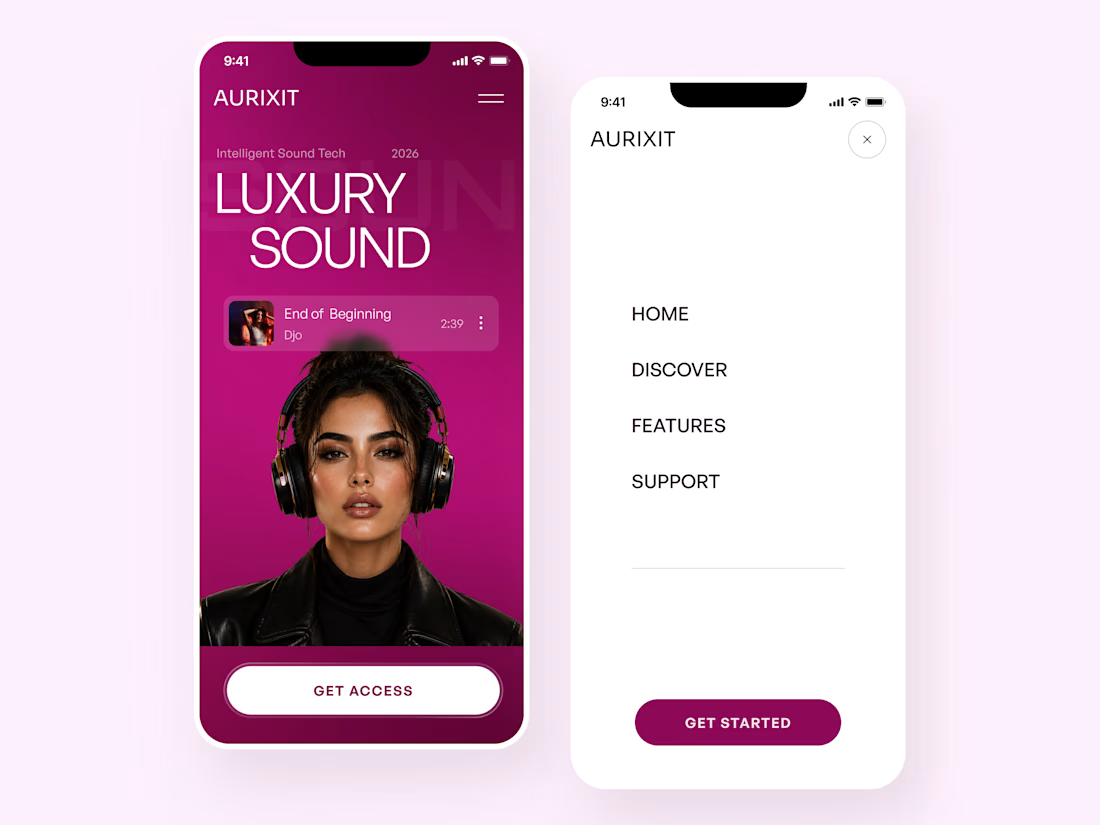
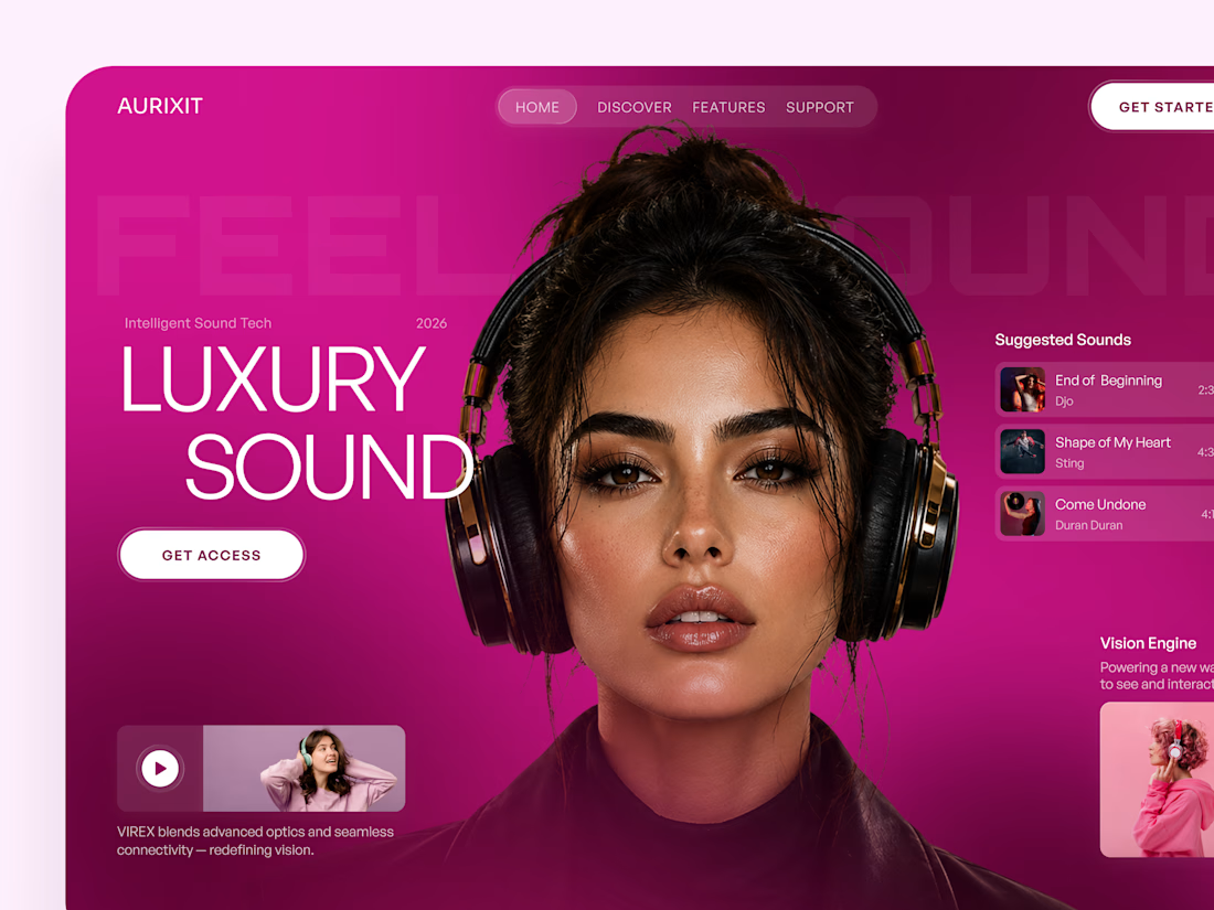
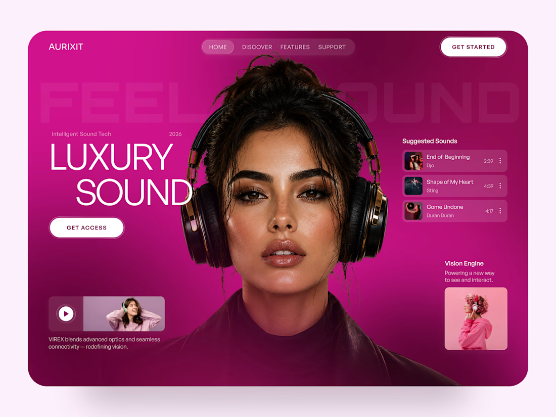

Magenta with the black headphones really pops. Was the small playlist text on pink tricky for contrast?

Why does every restaurant group fix inconsistency with a bigger logo?
I tried a smaller one with a better schedule
Norr & Co.

This is very nice 👌