The network for creativity
Join 1.25M professional creatives like you
Connect with clients, get discovered, and run your business 100% commission-free
Creatives on Contra have earned over $150M and we are just getting started
Back to feedPost

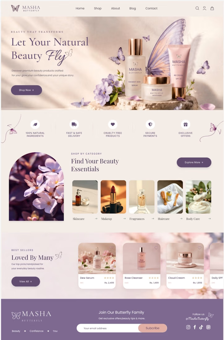
Just wrapped up this clean, modern UI/UX design and frontend setup for a luxury skincare and beauty brand! 🌿✨ Focused on soft aesthetic tones, smooth user navigation, and high conversion flow to give customers a premium online shopping experience.
What do you guys think of this aesthetic? Drop your thoughts below! 👇"
UI/UX Design, Web Development, E-commerce, Skincare, Beauty Brand, Frontend, React, Tailwind CSS


The network for creativity
Join 1.25M professional creatives like you
Connect with clients, get discovered, and run your business 100% commission-free
Creatives on Contra have earned over $150M and we are just getting started
Related posts

Casemate: making malware analysis feel calm instead of scary
Cybersecurity websites usually look the same: black background, green code, a hooded guy. I wanted to try the opposite for Casemate, a concept for a malware analysis tool.
The idea is simple: the product keeps a suspicious file in a sealed chamber and watches what it does. So I put a bug frozen in amber in the middle of a canyon. It’s dangerous and under control at the same time, and you get it without reading a word.
Then I made sure the page still works for a security lead who wants facts. The stats sit right next to the headline: threats isolated, latency, endpoints covered.
The hardest part was keeping it warm without losing trust. I stayed with one terracotta colour, wide capitals and mono labels, so it reads like a serious tool and not a poster.
I’m taking on new projects for SaaS and tech teams. If you have a product that’s hard to explain in one glance, send me a message.
What do you think, would you trust a security product with a canyon on the homepage?


I love it! It feels so calm, and I would definitely try it! This is amazing, Kris. I never thought cybersecurity could be this cool ❤️🔥

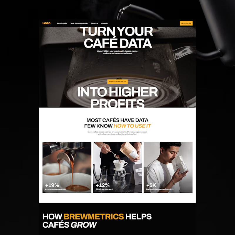
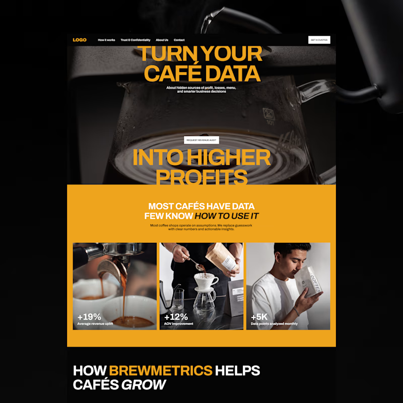
Exploring two color palette directions. Which one are you going for? 👀
13 voted
57%
10 voted
43%
23 votes
Closed

the bold gold of b is a winner by me!

Serious numbers, calm design.
512Financial is an Austin-based firm that steps in as the finance, HR and hiring team growth-stage companies don’t have yet. Their world is board meetings, due diligence and funding rounds, which can feel heavy and intimidating for founders.
My goal with the website was to make it feel the opposite: clear, steady and human. Deep green tones, lots of breathing room, and a “Readiness by Stage” section that lets every founder find their next step in seconds, from Seed to Series B and beyond.
Live now: 512financial.com


