The network for creativity
Join 1.25M professional creatives like you
Connect with clients, get discovered, and run your business 100% commission-free
Creatives on Contra have earned over $150M and we are just getting started
Back to feedPost

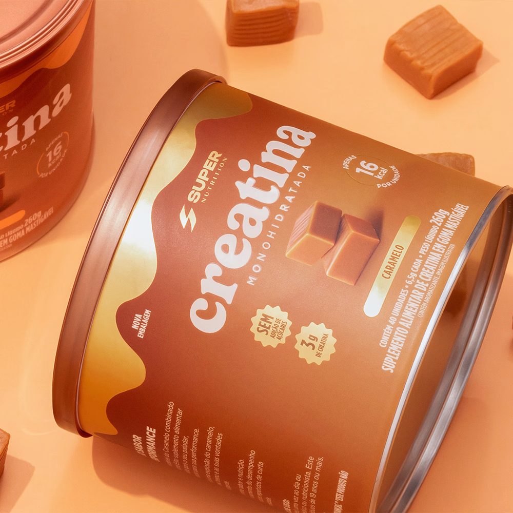
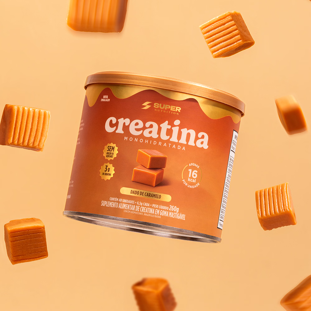
The project stemmed from the challenge of breaking away from the traditional visual language of the supplement category typically technical and functional to create packaging capable of sparking desire even before the first use. Inspired by the indulgence of artisanal caramels, the design bridges the worlds of performance and pleasure, transforming creatine into an aspirational product.
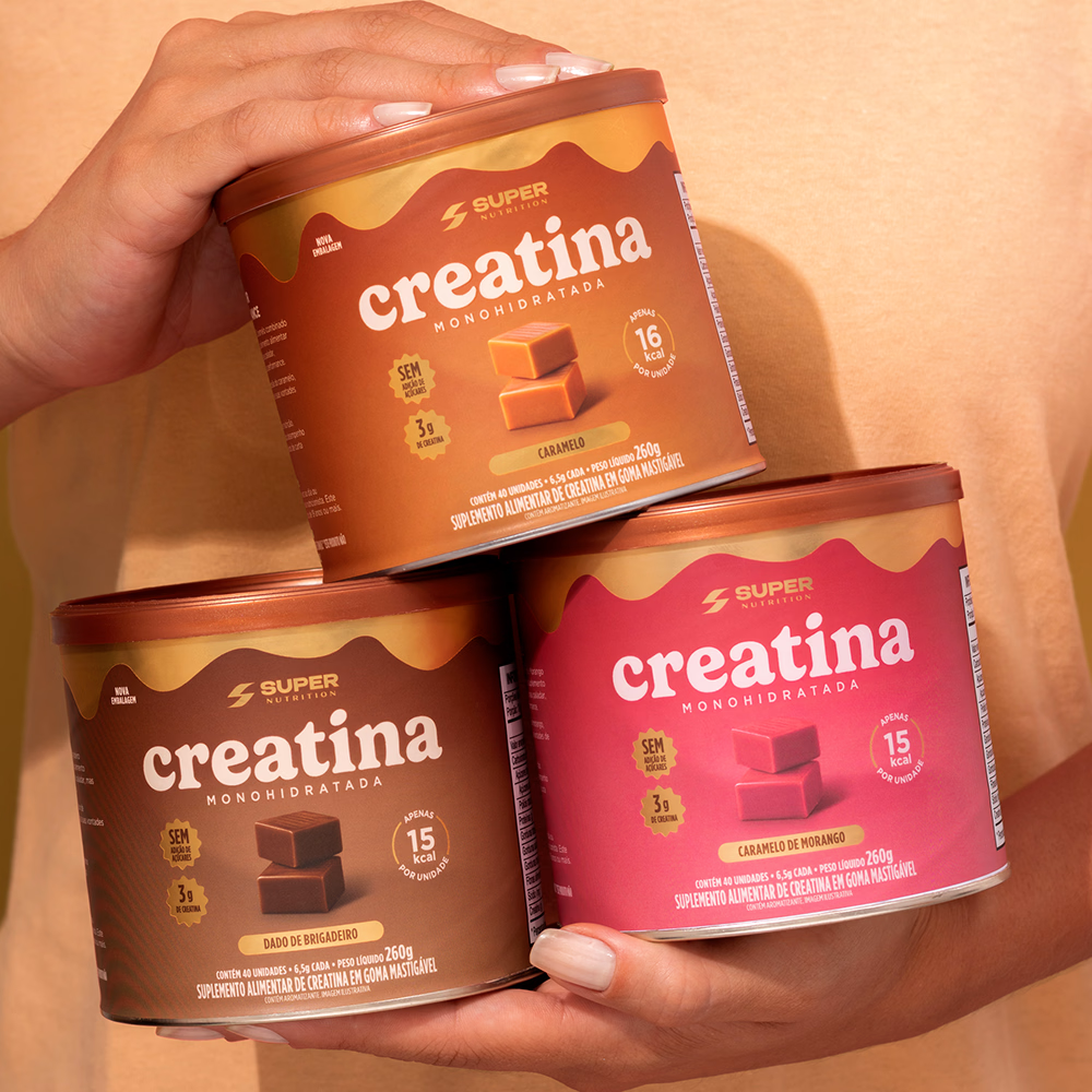
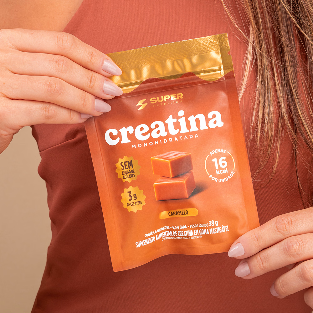
The visual identity employs a warm, sophisticated palette, combining caramel, chocolate, and gold tones to convey flavor, premium quality, and indulgence. A “sauce” graphic element at the top of the package immediately reinforces the sensory appeal, while product photography highlights texture and creaminess, further enhancing visual allure.
The information architecture was streamlined to highlight key benefits quickly and intuitively, balancing nutritional communication with an emotional aesthetic. Each flavor features a unique color, strengthening product differentiation within the line while maintaining visual cohesion and brand recognition.
More than just launching a supplement, the project introduces a new perception of the category: a product that unites performance, pleasure, and design. The result is striking, contemporary, premium packaging that transforms a functional benefit into a desirable consumer experience, elevating the brand’s perceived value and creating a strong impact at the point of sale.


The network for creativity
Join 1.25M professional creatives like you
Connect with clients, get discovered, and run your business 100% commission-free
Creatives on Contra have earned over $150M and we are just getting started



Related posts

Hey Everyone! I've been a little quiet on here lately, but I'm finally back with lots of amazing branding and packaging design case studies which I was working behind the scenes.
Keep an eye out for lots of verified case studies coming your way. 👀
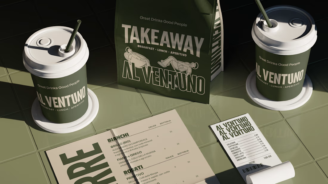
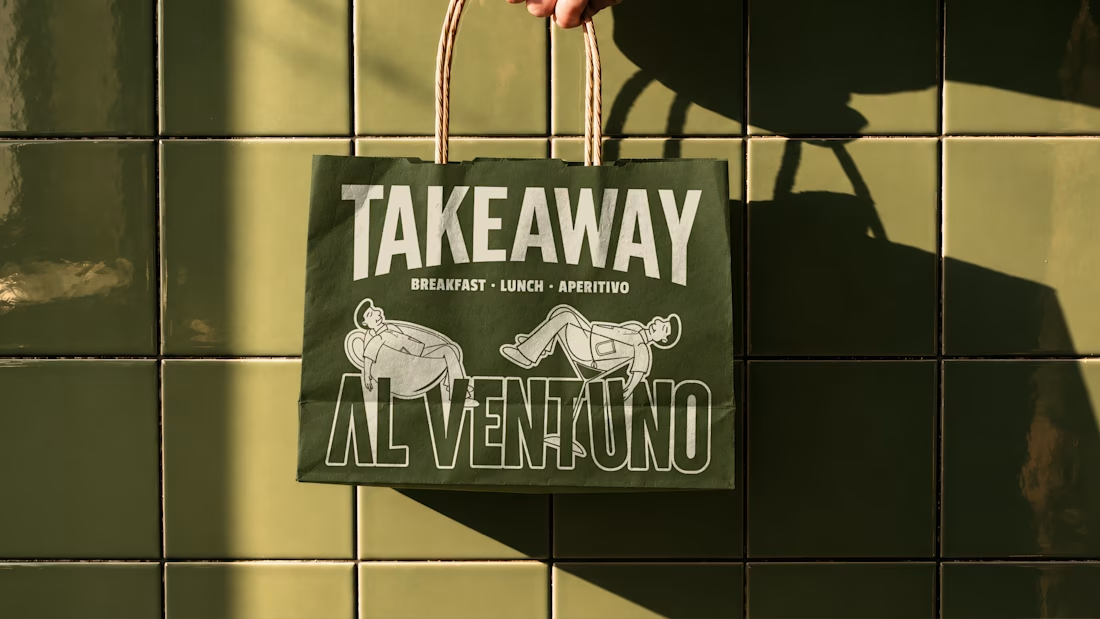
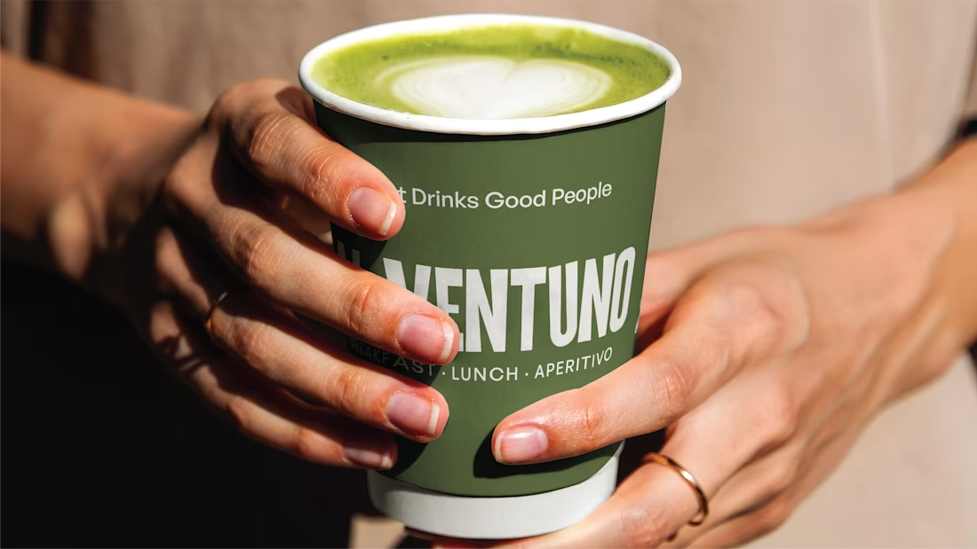
For now, here’s a little peek at some of the work I’ve created lately for a contemporary Italian cafe in Lecce.

Love it! Great work!

AVYLO Skin Care Packaging Design

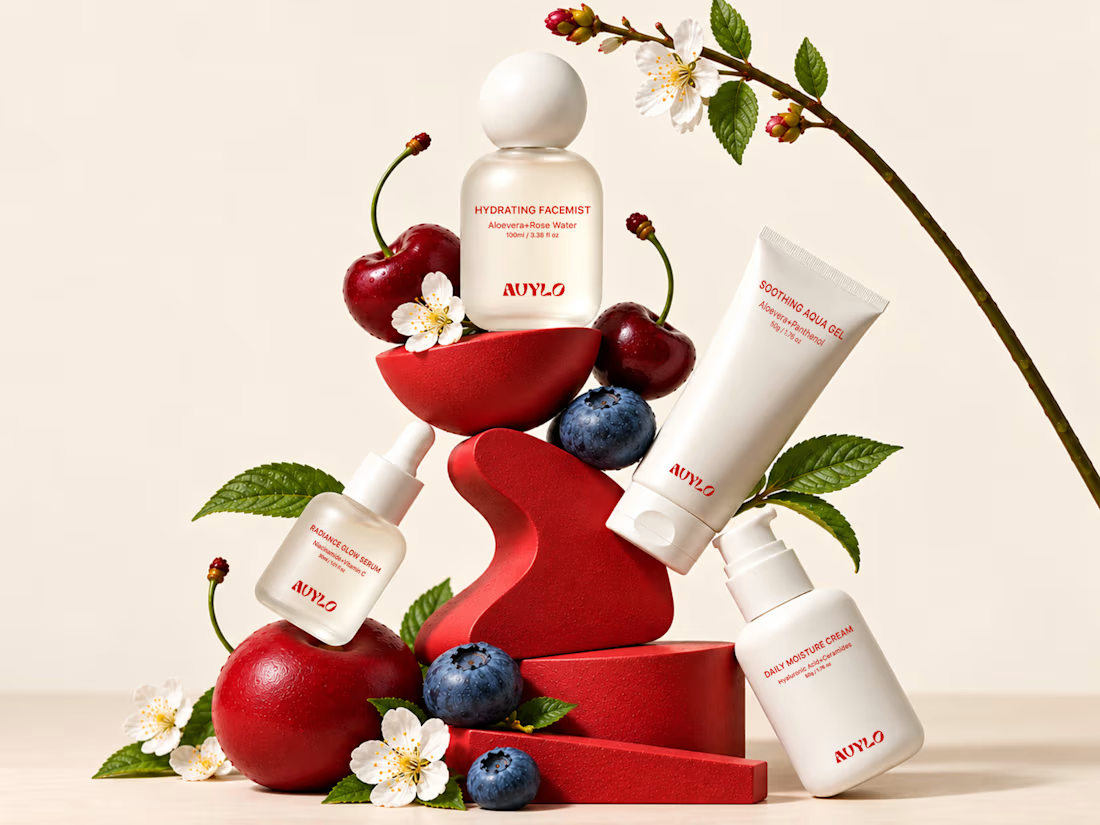
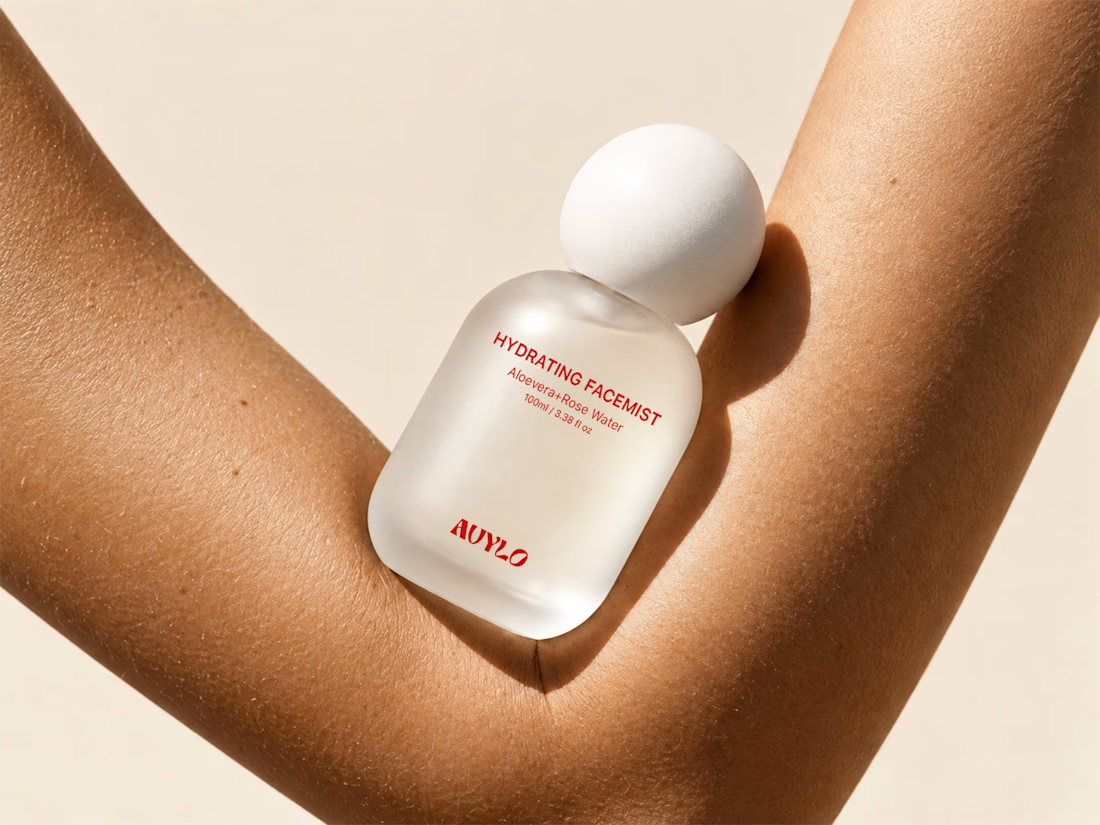
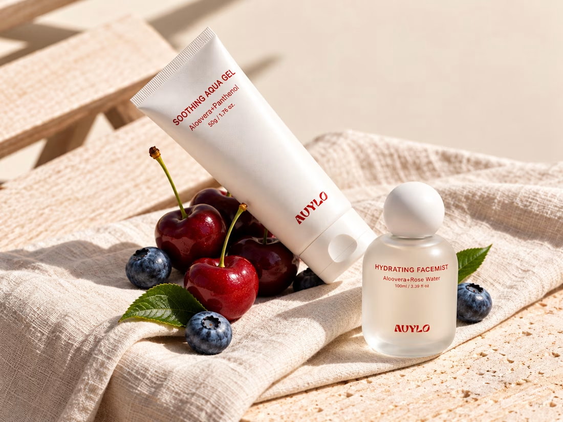

Good job

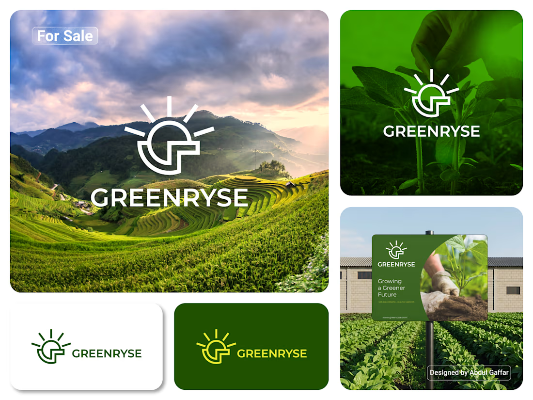
GREENRYSE – G Lettermark, Sun Logo Design, Sustainable Agriculture.
Introducing GREENRYSE, a modern logo concept inspired by nature, agriculture, and the power of growth. The symbol combines a geometric letter G with a rising sun, representing new beginnings, natural energy, and a brighter future for agriculture.
The presentation explores how the logo works across different backgrounds and applications, including agricultural landscapes, product imagery, and outdoor signage. Its clean geometric structure and fresh green color direction create a natural yet professional look.
Designed for agricultural companies, organic farming businesses, crop production, sustainable agriculture, and modern agritech ventures.
Stunning!