The network for creativity
Join 1.25M professional creatives like you
Connect with clients, get discovered, and run your business 100% commission-free
Creatives on Contra have earned over $150M and we are just getting started
Back to feedPost
Taste Test
Which layout do you prefer to show clear information in a website?


87 voted
65%
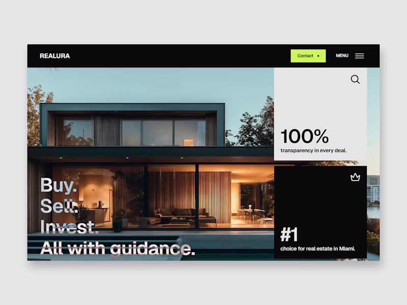
47 voted
35%
134 votes
Closed

I will go for the one at the right

Interesting!

Hey @Carlos Huertas first of all GREAT work. On the layout 1 too much things going on: image background, text blending/inverting, numbers cards, it's hard to focus on the important things.
So interesting take. I'll take it into account. The text effect is to improve contrast because it's a parallax effect on the section. Thank you for the feedback!

Clean work, I'll go with the left one
Thank you! I prefer it too

Layout 1 looks great but Layout 2 focuses on the numbers.
I'll go with layout 2
Interesting. Thank you for he feedback!

Of course the first one, no doubt!
I like it too but maybe it's not the best option to show clear information.

Amazing and outstanding work.
Thank you so much!


Everyone that voted Layout 1 probably didn't even read the caption
Probably 😂, it's not a bad option tho. There is contrast. The thing is that the option 1 depend so much on how is the background image.

Option 2 because the first one is so warm and pretty that I just focus on the centre of the page and ignore the rest
HAHAHAHA, best comment 😂

it's a very difficult choice, but 1 is more suitable because it's immediately clear what it's about 🥹
so like an option you can add the data from layout 2 in squares at the 1
Really interesting! I will try to design that option. Thank you for the feedback!

Layout 1 all the way. Nice, big numbers on the landing page capture your attention, pointing out the key figures. The Second layout does show all the figures but you have to scroll down to see them... which no one will do... You could afford to add all 4 figures on the landing...
So helpful feedback, thank you so much Kristina! Designing a new version mixing both is what some of you are saying which I think is the best option. Really interesting to see different opinions and feedback.


Really depends on what information you wanna present as primary... numbers are always great, but without context, they are just numbers... the first one looks like hero and gives context, while the second one is just numbers, that doesn't appear to be used in the same (hero)...
Yeah, actually both are different sections from the home page but any hero section. They are just middle sections. What you said makes all sense. It all depends on the "storytelling" of the page.
Thank you so much for your feedback!

its the same Landing page right
1 has the Hero and 2 has the sub section to the hero.
both goes well together.
Yeah, they are both in the same landing, but they are not the hero, they are middle page sections
if its possible combine both
like having the left as the background and have the right metric in the bottom section over it.

Option one looks more immersive, Well done!
Thank you! Appreciate it a lot


Going with simplicity and readability - option 2!
Great option Keara!

Carlos i prefer section Layout 2 !
The network for creativity
Join 1.25M professional creatives like you
Connect with clients, get discovered, and run your business 100% commission-free
Creatives on Contra have earned over $150M and we are just getting started


Trending
portfolioreview
The best portfolios tell a story, not just show a grid. Share yours for feedback.
brandguidelines
Brand guidelines are becoming living systems, not static documents. What are you building for your clients?
aivideo
AI video tools are moving at warp speed. Which ones are you experimenting with?
freelancerlife
Freelancer life is wins, pivots, and everything in between. What’s yours right now?
aidesignflow
AI tools are redefining how design gets made. What does your workflow look like?