The network for creativity
Join 1.25M professional creatives like you
Connect with clients, get discovered, and run your business 100% commission-free
Creatives on Contra have earned over $150M and we are just getting started
Back to feedPost

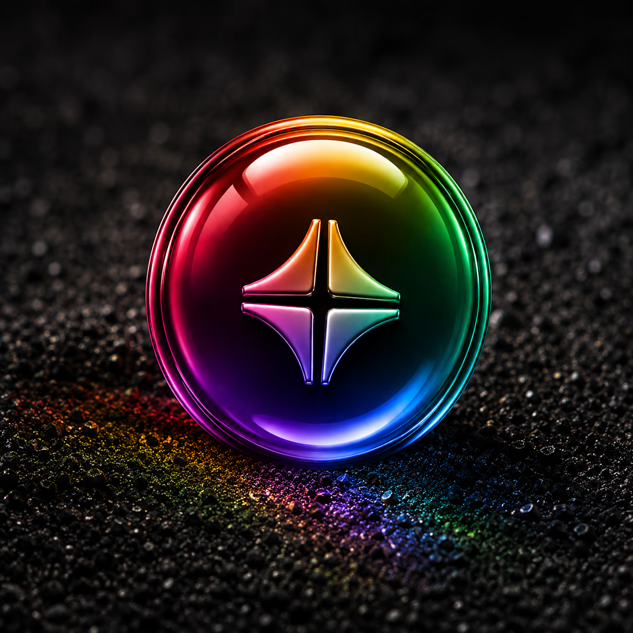
Couldn't resist jumping on the Contra icon trend!
My feed has been flooded with so many incredible community renditions of the logo that I just had to put my own spin on it.
For my concept, I wanted to give the icon a hyper-premium, tactile feel. I focused on trapping those signature vibrant gradients inside a glossy glass capsule, letting the internal light refract right onto that dark, textured terrain below.
What do you think of this direction?
#ContraDesign #IconDesign #3DArt #VisualDesign #GraphicDesigner

The network for creativity
Join 1.25M professional creatives like you
Connect with clients, get discovered, and run your business 100% commission-free
Creatives on Contra have earned over $150M and we are just getting started





Related posts


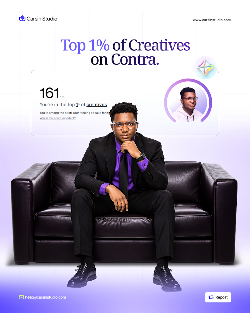
After making my first $1K on @contra, I just hit the top 1% of creatives.
Want a higher visibility score?
• Complete your profile
• Add 3+ strong projects
• Add 2+ services
• Get client recommendations
• Stay active and responsive
• Keep your work fresh
Don’t just create a profile and wait for clients.
Build it. Stay active. Get seen.

Well deserved! Reaching the top 1% on Contra takes real effort. These tips are super helpful for anyone looking to grow. Congratulations and keep crushing it!


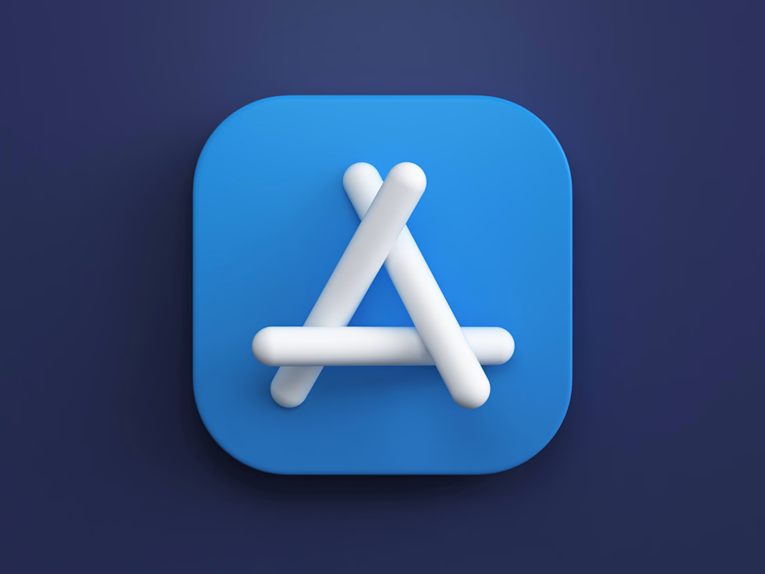
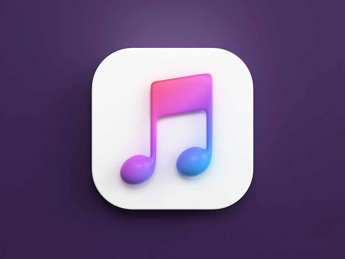
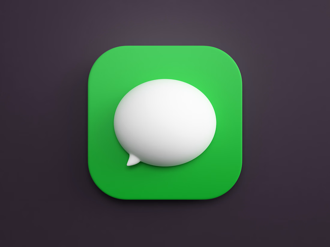
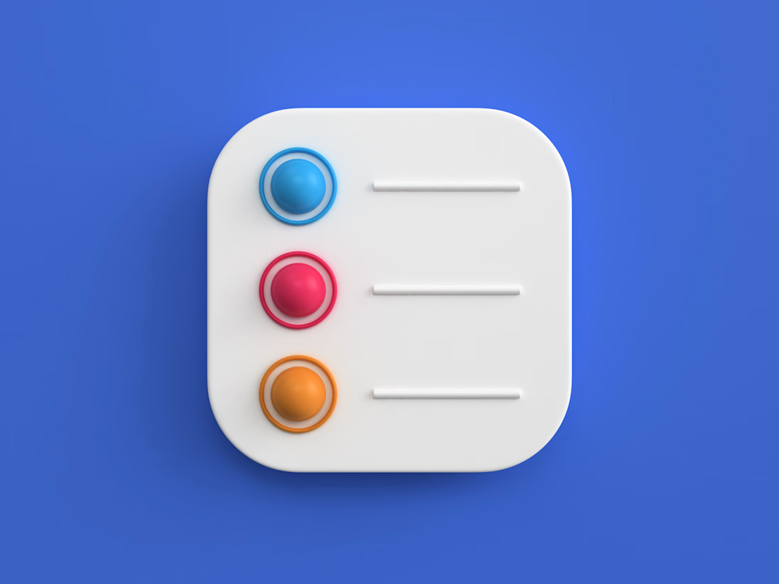

The soft highlight on the Messages bubble makes it feel like real glass. Which tool did you render these in?

I’m happy to share a new logo redesign! ✦
I had the opportunity to redesign this logo for a client from Cambodia, and the entire redesign was completed within a day.
What do you think of the new direction? Share your thoughts in the comments! 👇
10 voted
91%
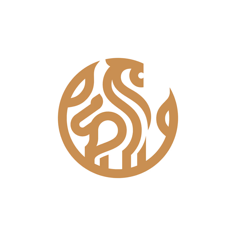
1 voted
9%
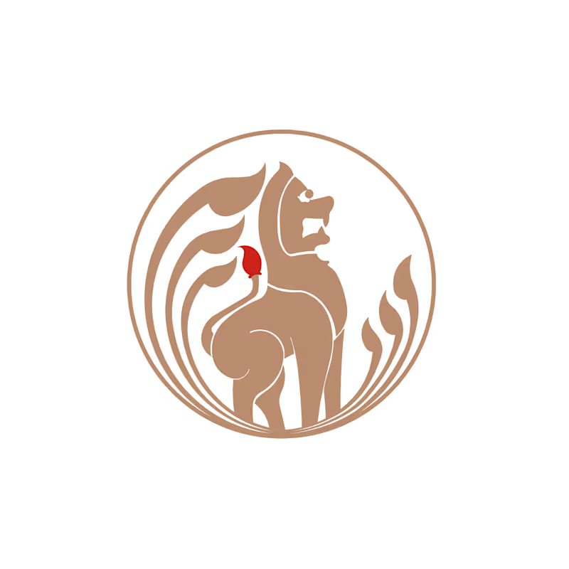
11 votes
Closed

After is more professional ❤️