The network for creativity
Join 1.25M professional creatives like you
Connect with clients, get discovered, and run your business 100% commission-free
Creatives on Contra have earned over $150M and we are just getting started
Back to feedPost
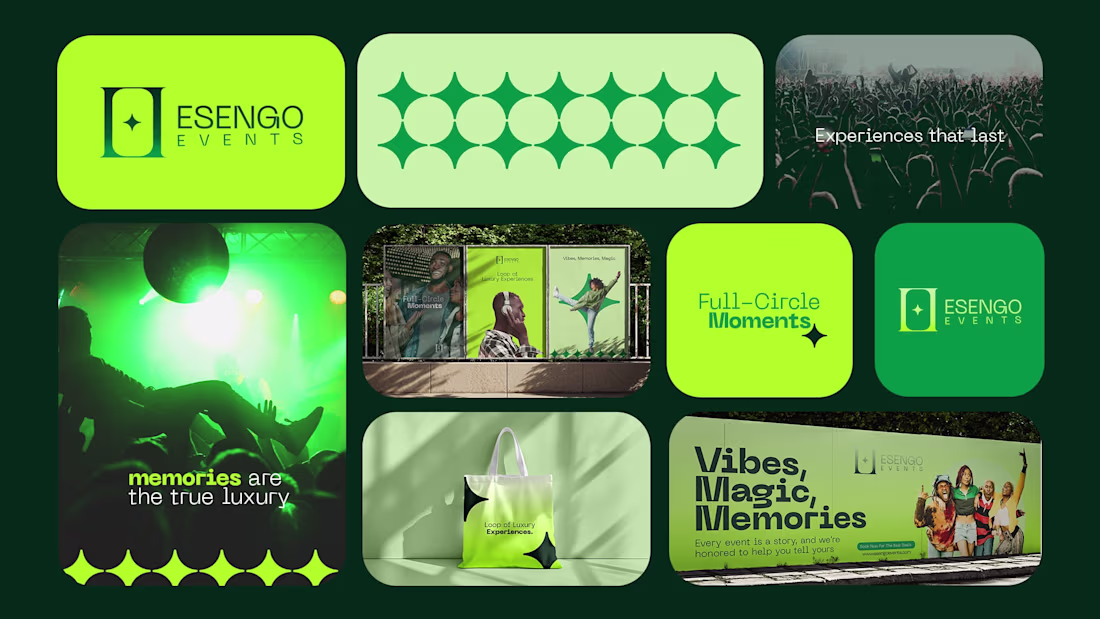
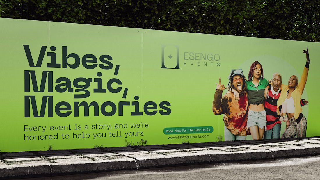
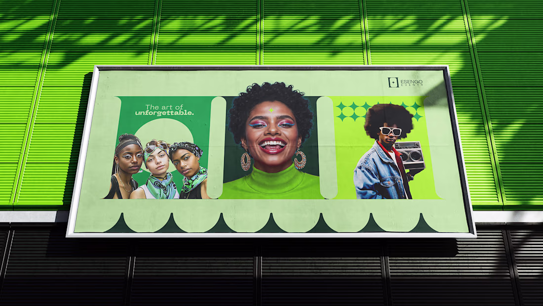
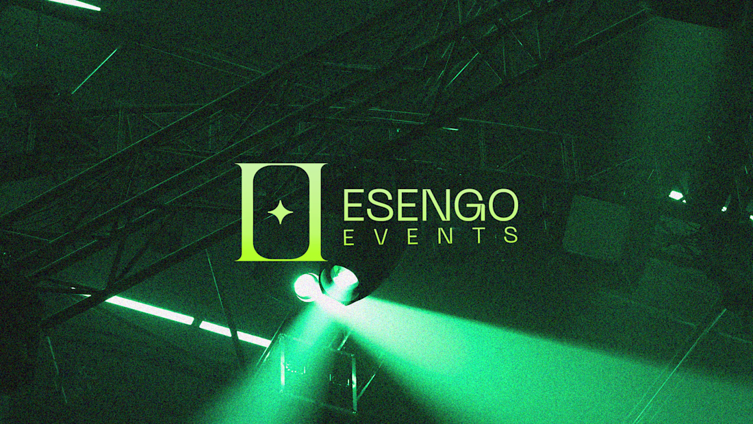
The mission was clear: "We need an identity that feels bright, fun, and memorable, something that could embody both joy and timeless elegance".
I approached the challenge by keeping things minimal yet meaningful. The logo fuses the two “E” initials into a pillar-like structure, symbolizing the foundation, support, and precision Esengo brings to every event. At the center sits a star — representing the intersection of memories, moments, and the magic that defines unforgettable experiences.
This project further emphasizes that great design isn't always all in your face; sometimes it whispers with clarity, balance, and purpose. And when it does, it leaves a lasting impression. You can view the entire case-study in the link below;
https://lnkd.in/dX4hi7p2
The network for creativity
Join 1.25M professional creatives like you
Connect with clients, get discovered, and run your business 100% commission-free
Creatives on Contra have earned over $150M and we are just getting started
Trending
Claude
Claude has entered the design space. How are you using Claude Design?
Contra University
Learn from expert creatives how to earn more using next-gen AI tools.
creativeaiflow
Creative AI workflows are evolving. What tools do you use, and what are their strengths and weaknesses?
portfolioreview
The best portfolios tell a story, not just show a grid. Share yours for feedback.
freelancerlife
Freelancer life is wins, pivots, and everything in between. What’s yours right now?