The network for creativity
Join 1.25M professional creatives like you
Connect with clients, get discovered, and run your business 100% commission-free
Creatives on Contra have earned over $150M and we are just getting started
Back to feedPost

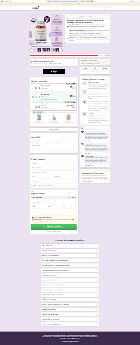
Health Landing Checkout Page

The network for creativity
Join 1.25M professional creatives like you
Connect with clients, get discovered, and run your business 100% commission-free
Creatives on Contra have earned over $150M and we are just getting started



Related posts



Designed the new StyleRef landing page.
Drop three photos in, and the page pulls one style out of them: colour, material and camera rules, written as a spec you can paste into any AI tool.
The page shows it happening instead of explaining it.
See it in action → StyleRef.io

Using the actual extracted spec makes the demonstration much more useful. Showing the three source images beside one generated result would let visitors judge what the tool preserves, rather than relying on the animation alone. That input-to-output comparison can answer the main buying question quickly.

What if your landing page looked better, loaded faster, and scored 100 across every Lighthouse metric? 🚀
That was the goal behind this redesign.
I rebuilt the landing page with Astro, leveraging its lightweight architecture and minimal JavaScript by default to deliver faster loading, smoother interactions, and a better user experience.
The result? A cleaner design, improved performance, and 100/100 across all Lighthouse metrics.
