The network for creativity
Join 1.25M professional creatives like you
Connect with clients, get discovered, and run your business 100% commission-free
Creatives on Contra have earned over $150M and we are just getting started
Back to feedPost

A little recognition for a project close to me.
Mesh Padel Center has just been featured by Indústria Criativa, a Portuguese platform dedicated to showcasing creative work and talent across design, architecture, advertising and the wider creative industries.
The feature highlights the naming, branding and signage developed for this distinctive padel club in Braga, Portugal.
The identity was built around the architecture of the space, translating its structural grid and sense of movement into a flexible visual system.
From the name and logo to the typography, iconography and environmental signage, the goal was to create a brand that felt energetic, contemporary and naturally connected to the space it inhabits.
Always great to see a project continue to resonate beyond its original launch!
→ Full project on Indústria Criativa:
https://industriacriativa.pt/project/82077/mesh-padel-center
The network for creativity
Join 1.25M professional creatives like you
Connect with clients, get discovered, and run your business 100% commission-free
Creatives on Contra have earned over $150M and we are just getting started



Related posts

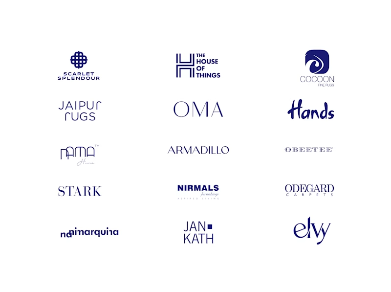
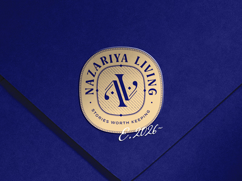
A little look at how Nazariya Living stands apart from its category.
On one side, familiar visual conventions. On the other, an identity with its own character, rooted in stories worth keeping.
We chose not to blend in. :)
Which side catches your eye?


3 voted
30%
7 voted
70%
10 votes
Closed

That side with all the competitor logos in one grid is the slide I'd steal for a client presentation. Nothing explains "why this direction" faster than showing the sea of sameness first. The navy seal wins easily after that.

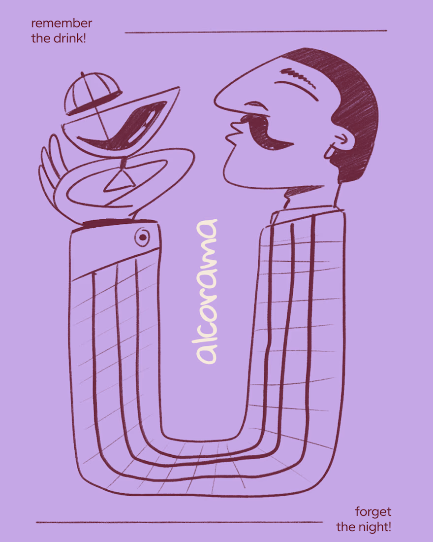
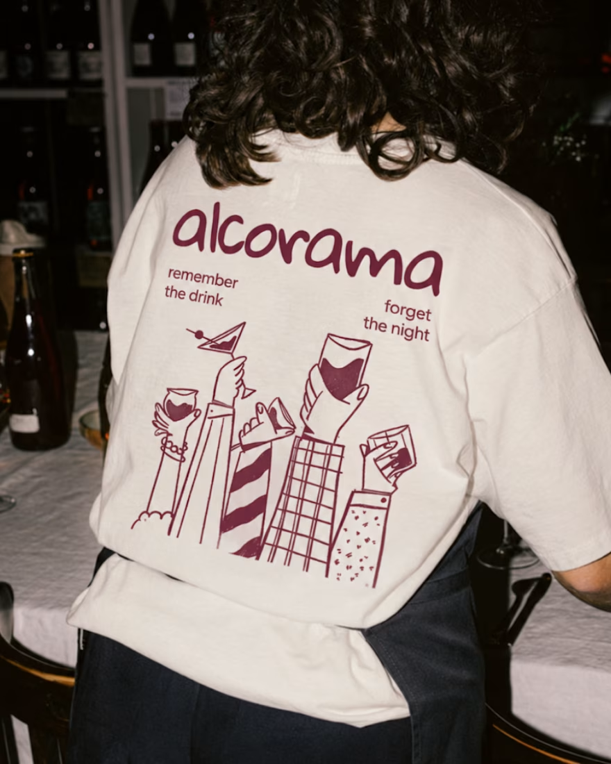
Final direction picked! I love when brands use custom illustration as the main way to communicate with their audience.
Direction discovery should not take more than one week and it should be full of personality! Ready to upgrade your brand?
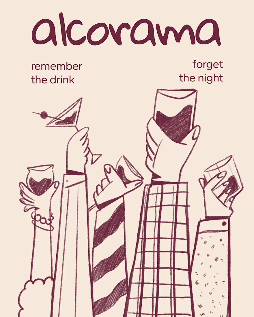


Amazing work!
Your competitors are a reference point, not a creative brief!!
For Nazariya Living, we started by studying the visual language of the premium carpet and home décor category. From logo styles to typography and overall aesthetics, we mapped the conventions that had become familiar across the market.
But understanding the category was only the starting point.
We wanted to build something that didn't just fit into the market, but brought a distinct point of view to it.
An identity rooted in storytelling, archival references and a visual language of its own.
Understand the category. Challenge the convention. Build something worth remembering.
That's how we approach branding for all of our clients.
Are you looking to build a brand that stands apart rather than blend in? Let's talk.


Challenge the convention is easy to say. Ignoring the carpet aisle's beige bible takes nerve.