The network for creativity
Join 1.25M professional creatives like you
Connect with clients, get discovered, and run your business 100% commission-free
Creatives on Contra have earned over $150M and we are just getting started

The network for creativity
Join 1.25M professional creatives like you
Connect with clients, get discovered, and run your business 100% commission-free
Creatives on Contra have earned over $150M and we are just getting started



Related posts

Dark Mode 🖤 or Light Mode 🤍?
Which one matches your vibe? 👀
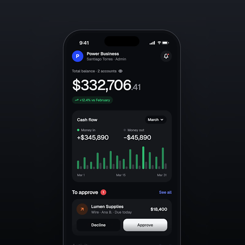
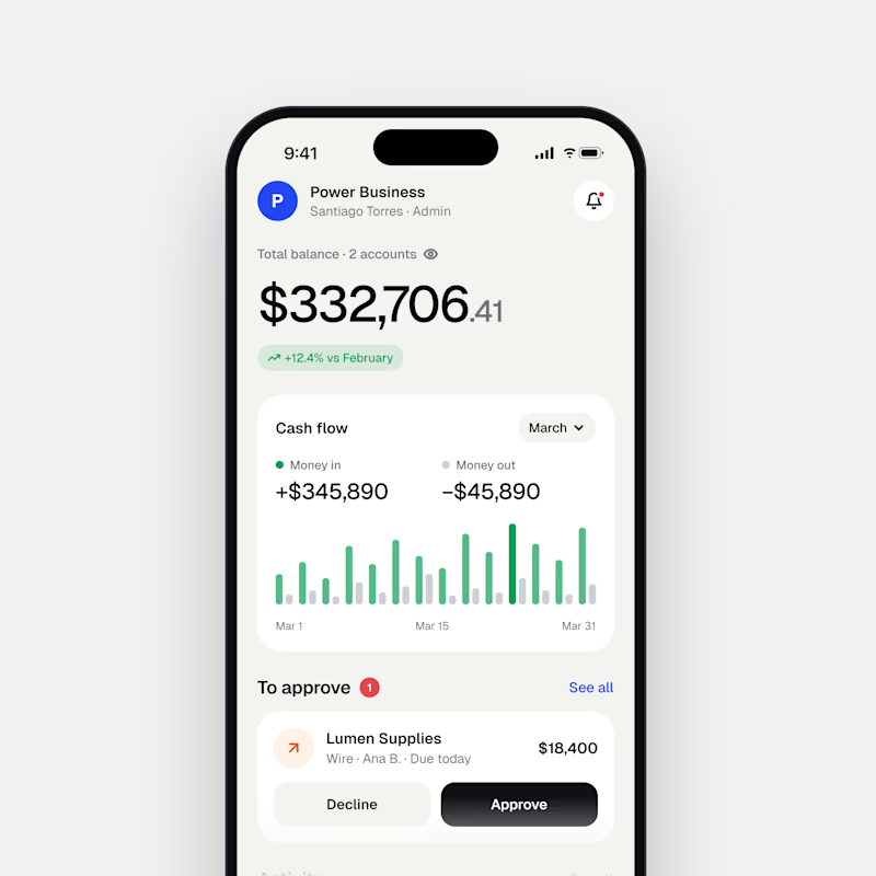
13 votes
Ends in 1d

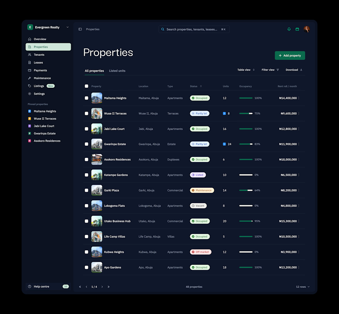
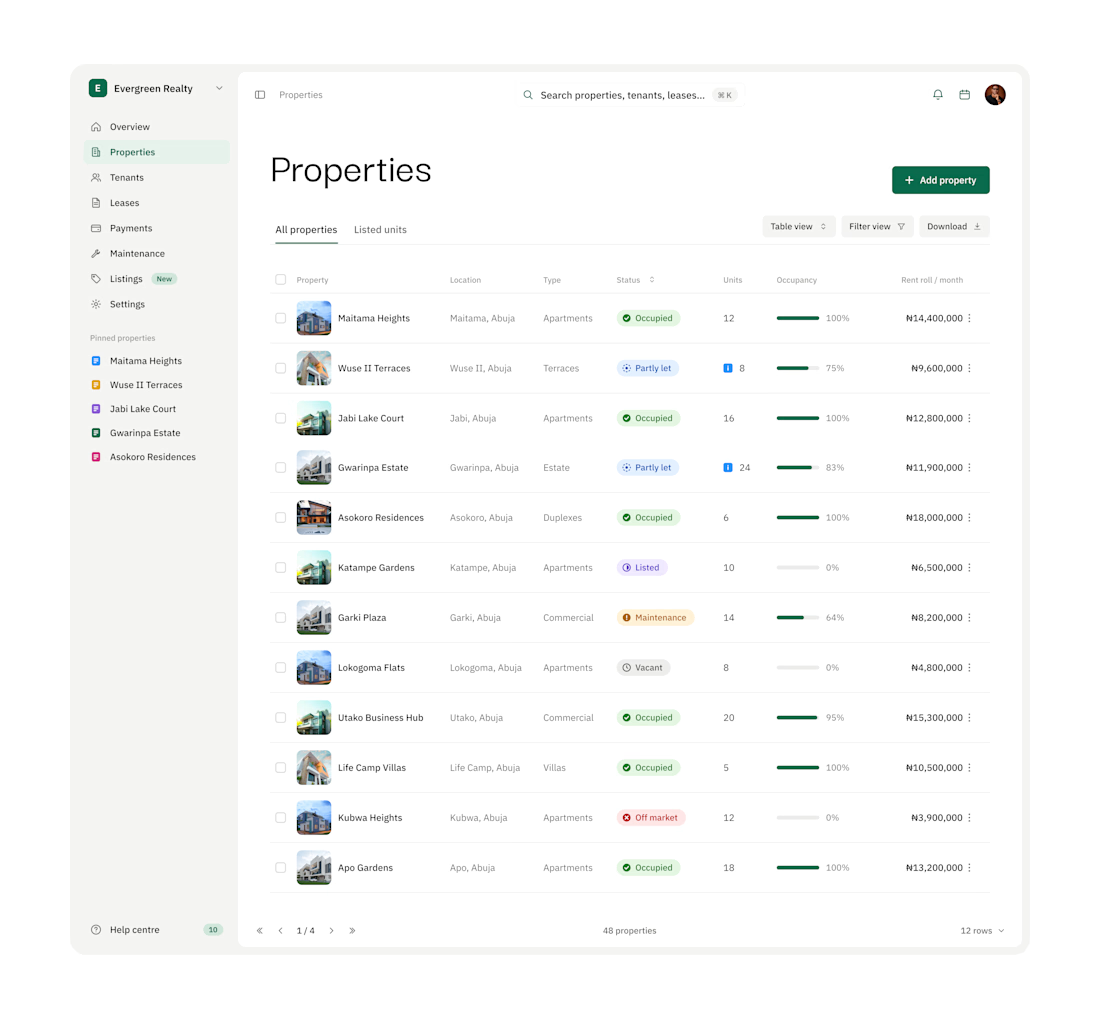

Dark mode is the default for trading tools. But is it the right choice for a website? 🤔
For Octopi, a no-code trading automation plugin for, we explored both directions:
🅰️ Dark: focused, pro-level, feels at home next to trading charts
🅱️ Light: clean, open, feels approachable for traders who don’t code
Which one would make you click “Get started”? 👇
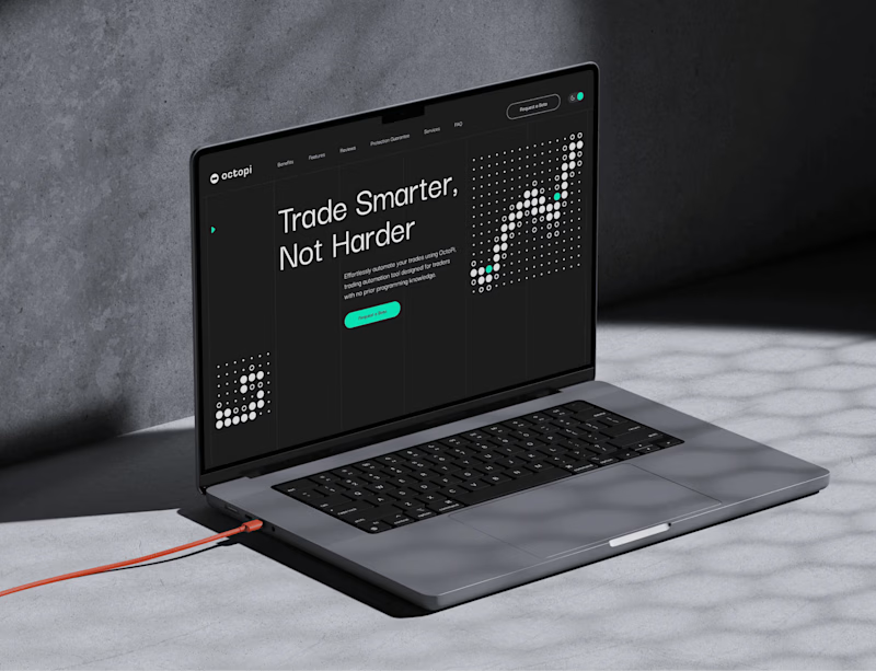
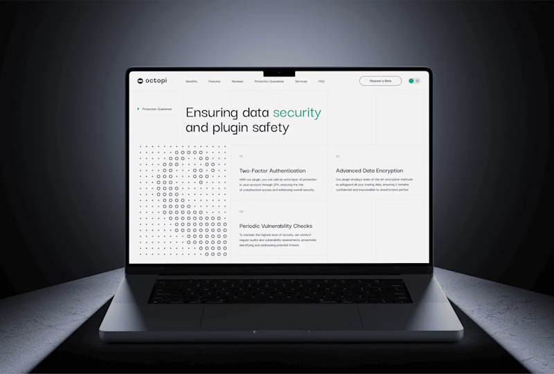
1 vote
Ends in 1d