The network for creativity
Join 1.25M professional creatives like you
Connect with clients, get discovered, and run your business 100% commission-free
Creatives on Contra have earned over $150M and we are just getting started
Back to feedPost

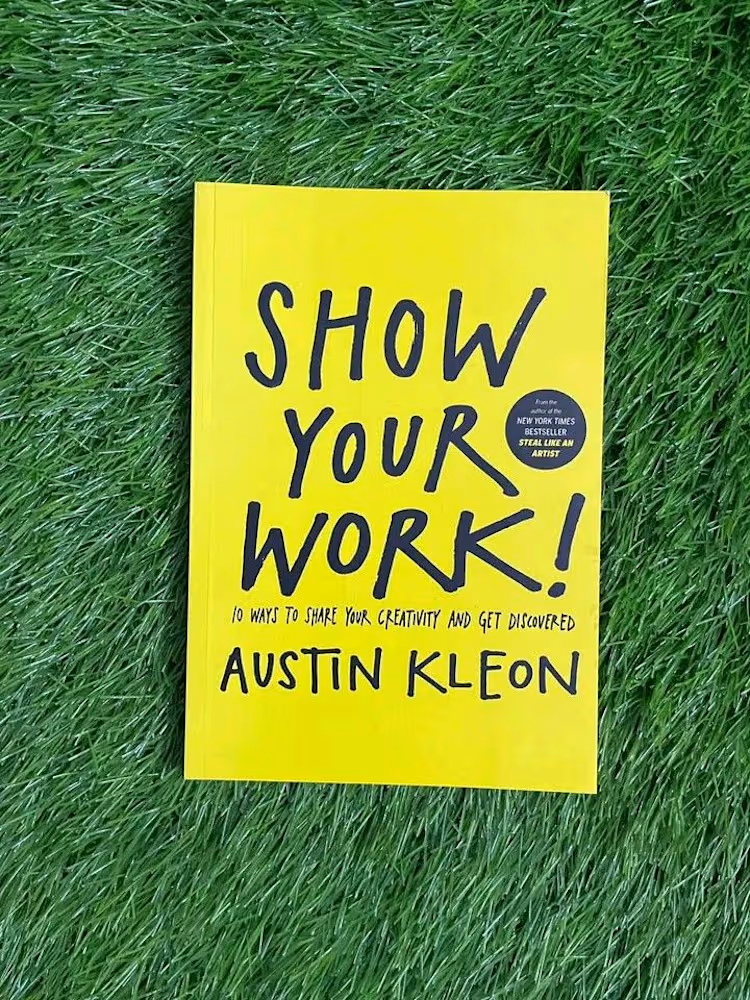
📘 First read of 2026: Show Your Work
One big lesson from Q4 2025: showing your work actually works.
I started posting more consistently - WIPs, small explorations, and lessons learned. Nothing perfect, just progress.
That led to more visibility, better conversations, and a client discovering my work and hiring me.
So this year, I’m doubling down on building in public and sharing the process as I go.
If you’ve been waiting for things to be “perfect,” this is your sign to start.
#buildinpublic #showyourwork #productdesign #uxdesign #learninginpublic
The network for creativity
Join 1.25M professional creatives like you
Connect with clients, get discovered, and run your business 100% commission-free
Creatives on Contra have earned over $150M and we are just getting started











Related posts

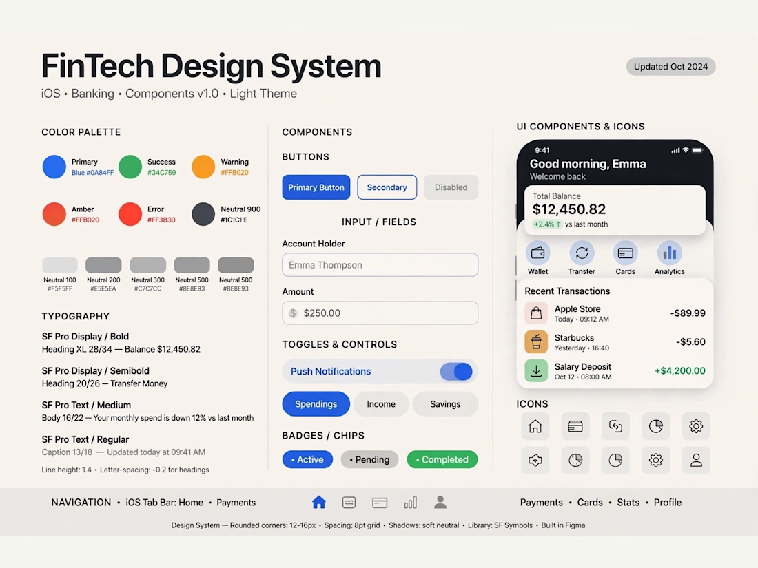
FinPulse — Premium Cross-Border Remittance App
Designed a trustworthy FinTech mobile app for global money transfers.
Process: Started with user flow & wireframes for 3-tap transfer, then built a scalable design system in Figma with 100+ components.
Outcome: Final UI focuses on clarity and trust — from onboarding to Home Dashboard ($12,450 balance), Send Money, and Money Sent success state. Built for conversion and speed.
Tools: Figma, iOS Design System, SF Pro
Tags: Mobile App, FinTech, UI/UX, Product Design


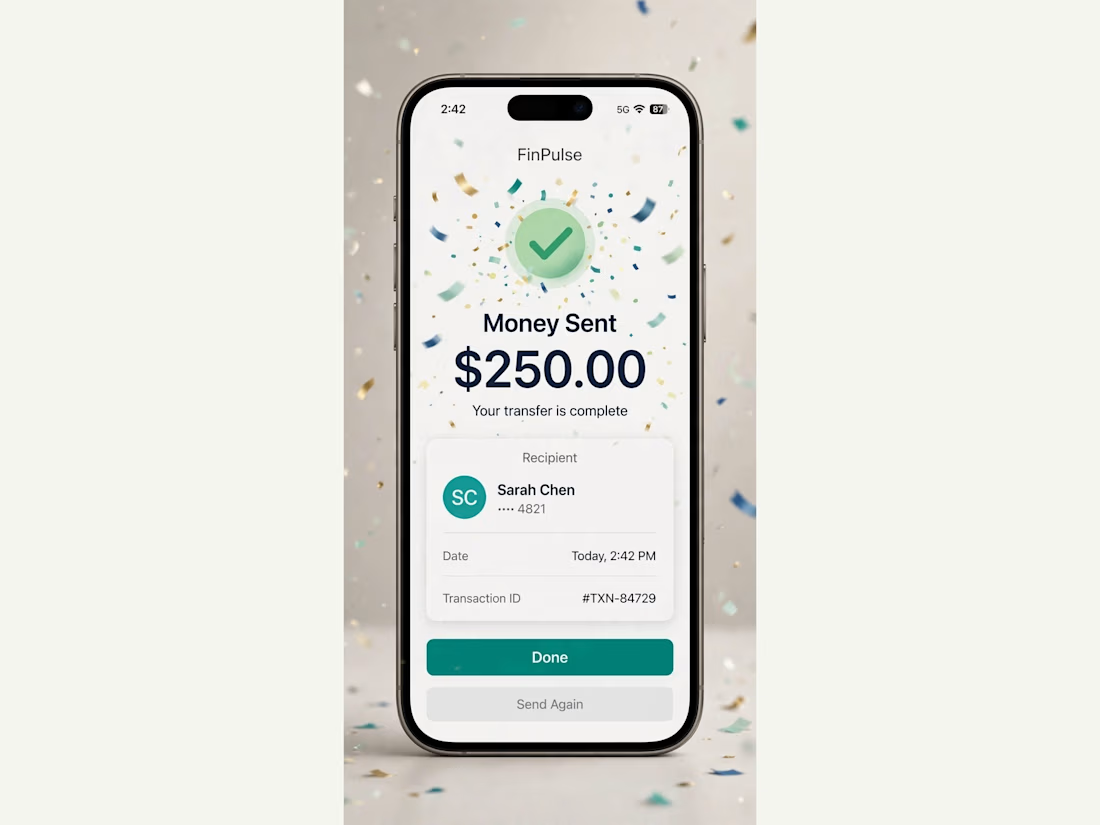
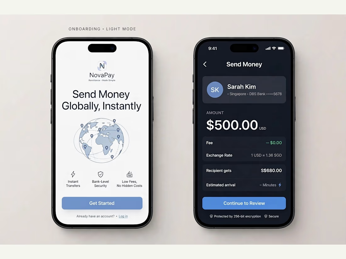
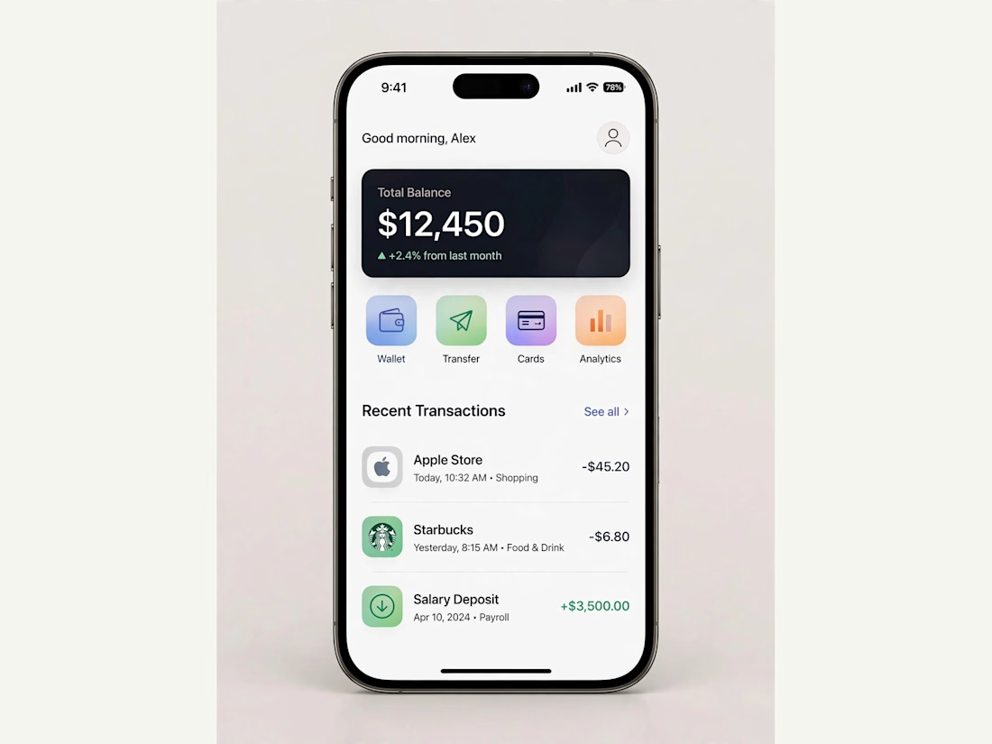

Really solid FinTech mobile design. Clean, trustworthy, and the user flow sounds well thought out. Great outcome on the final UI!

🎬 DEBUT
A launch-day ad that rolls out the red carpet for your product.
Friday, October 20. Premiere night.
A limo glides up to the carpet.
A perfume takes the spotlight.
"Who are you wearing?"
It was wearing the night.
Saturday, a skateboard walked the same carpet.
"Can you do it again?"
It landed it.
Sunday, a soda can cracked open in front of the press.
"What's the flavour?"
Nobody would say.
None of them were real.
All of them got a premiere.
🎟️ Every launch deserves a red carpet.
Most of them get a story post.
So I built the whole premiere.
The marquee. The press pen. The fans. The limo.
A rooftop across the street to watch it all from.
I had way too much fun with this one.
Built the street in Blender, then rolled the cameras in SVGator with the MCP.
Six premieres.
One template.
Zero redraws.
Swap the logo and the product.
Every marquee, wall and shot follows.
Retype the headline, the date and what the press shouts.
Every word is live text. Every layer has a name.
The cameras never change.
So who's walking the carpet next?
The flashes never stop. ✨
🛠️ Built in SVGator with the MCP, staged in Blender. 1,429 named layers, 3,917 keyframes.
Use the template 👇
DEBUT · Red-carpet launch ad


the motion looks so fine-

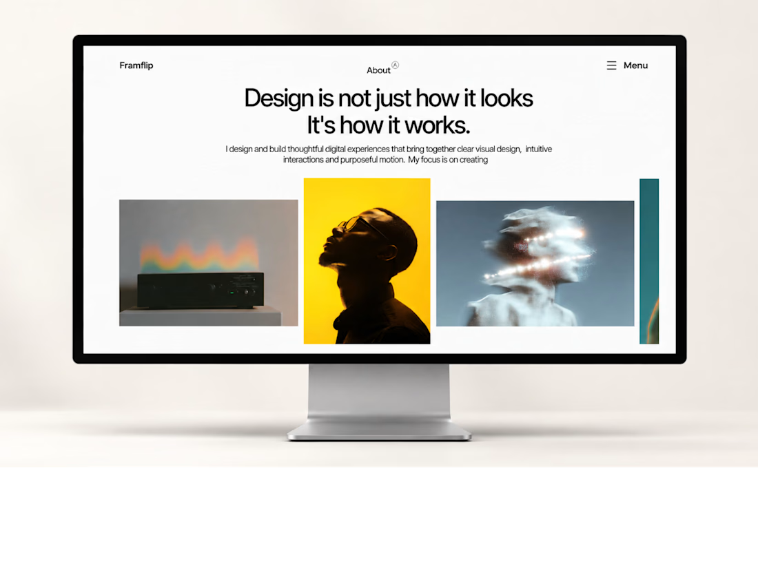
My first Framer template is live!
One step closer to building something great. ✨
#Framer #WebDesign



first templates are always the scariest to ship. curious how you decided what to leave out