The network for creativity
Join 1.25M professional creatives like you
Connect with clients, get discovered, and run your business 100% commission-free
Creatives on Contra have earned over $150M and we are just getting started
Back to feedPost

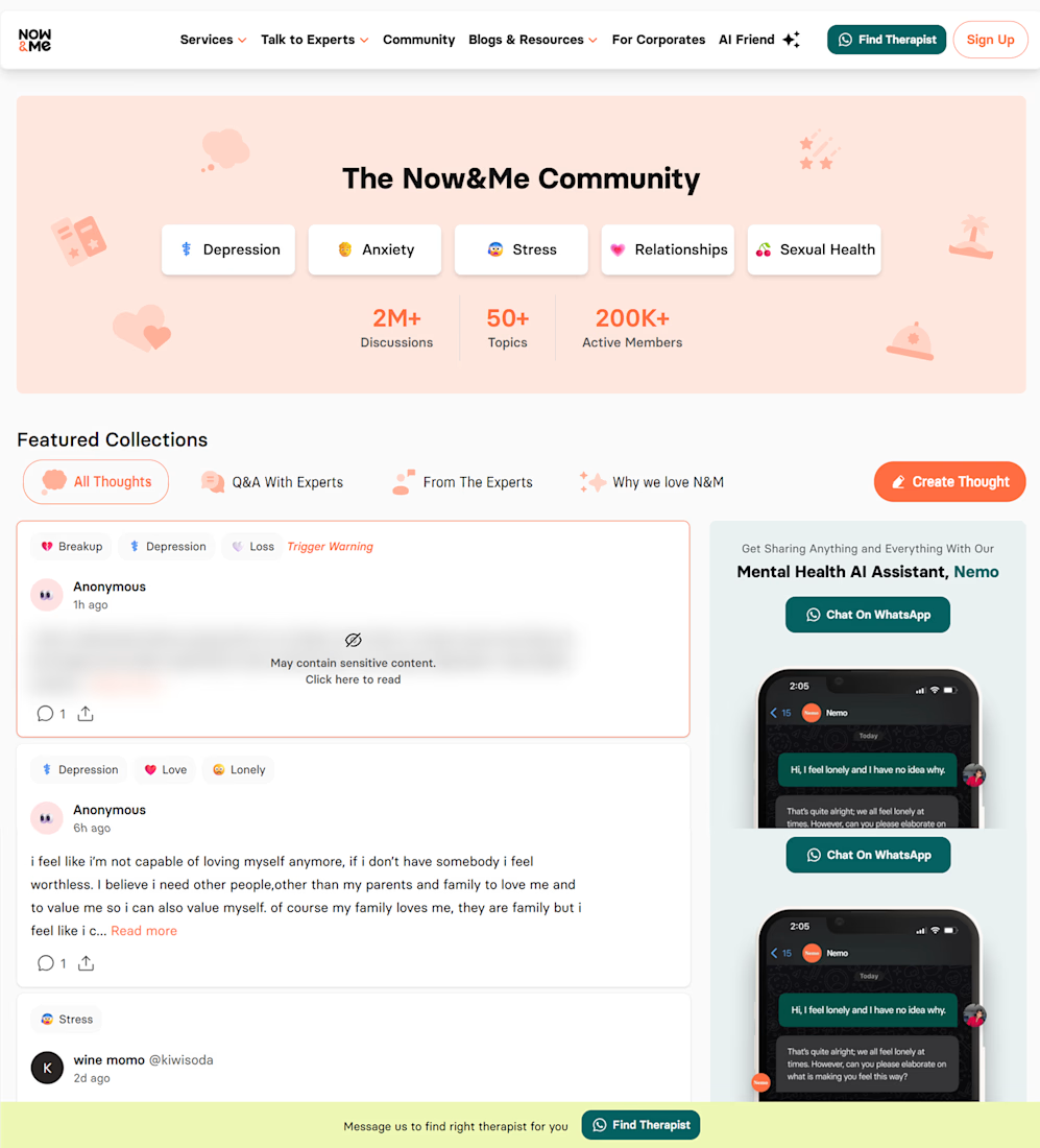
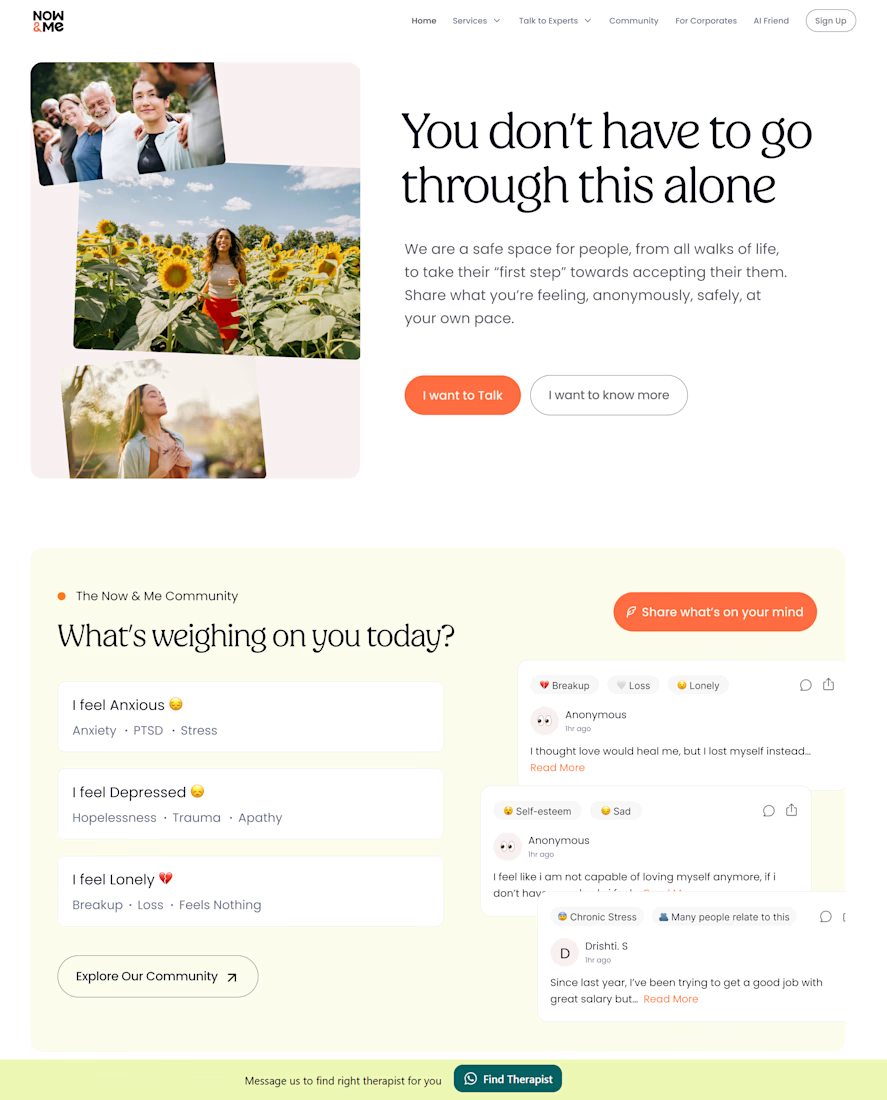
Before → After:
I redesigned Mental Health platform website with a focus on making the experience clearer, calmer, and more action-oriented.
What I improved:
☑️ A stronger hero section
The original hero lacked a clear primary CTA, making it harder for users to understand what action they should take immediately.
☑️ A less crowded homepage
There were too many tags, sections, and competing elements presented at once. I simplified the hierarchy so the user's primary action gets the attention it deserves.
☑️ Clearer UX hierarchy
I reorganized content and interactions to reduce cognitive load and help users navigate the platform more naturally.
☑️ More intentional CTAs
Instead of making users figure out what to do next, the redesigned experience guides them toward meaningful actions.
Good UX doesn't add more. It knows what to remove.
The network for creativity
Join 1.25M professional creatives like you
Connect with clients, get discovered, and run your business 100% commission-free
Creatives on Contra have earned over $150M and we are just getting started
Trending
retrofuturism
Share your favorite designs from the past exploring the distant future. Or your own take on the aesthetic 🚀
halftone
Dots. Texture. Grain. Let's see your designs using the halftone technique.

Midjourney
Creatives are showing off what they're making with Midjourney.
colorgrade
Video editors sound off: How do you enhance the mood of your video in color grading?


Related posts

Anthesis is now available. 🌙
A cinematic Framer template inspired by the legendary Kadupul flower, designed for creative studios, agencies and designers who want their portfolio to feel like a story instead of a collection of pages. Built with CMS, immersive interactions, premium animations and a complete onboarding guide to help you launch quickly.


That tagline paired with the dark bloom is gorgeous. Feels like a story, exactly the vibe you wanted.

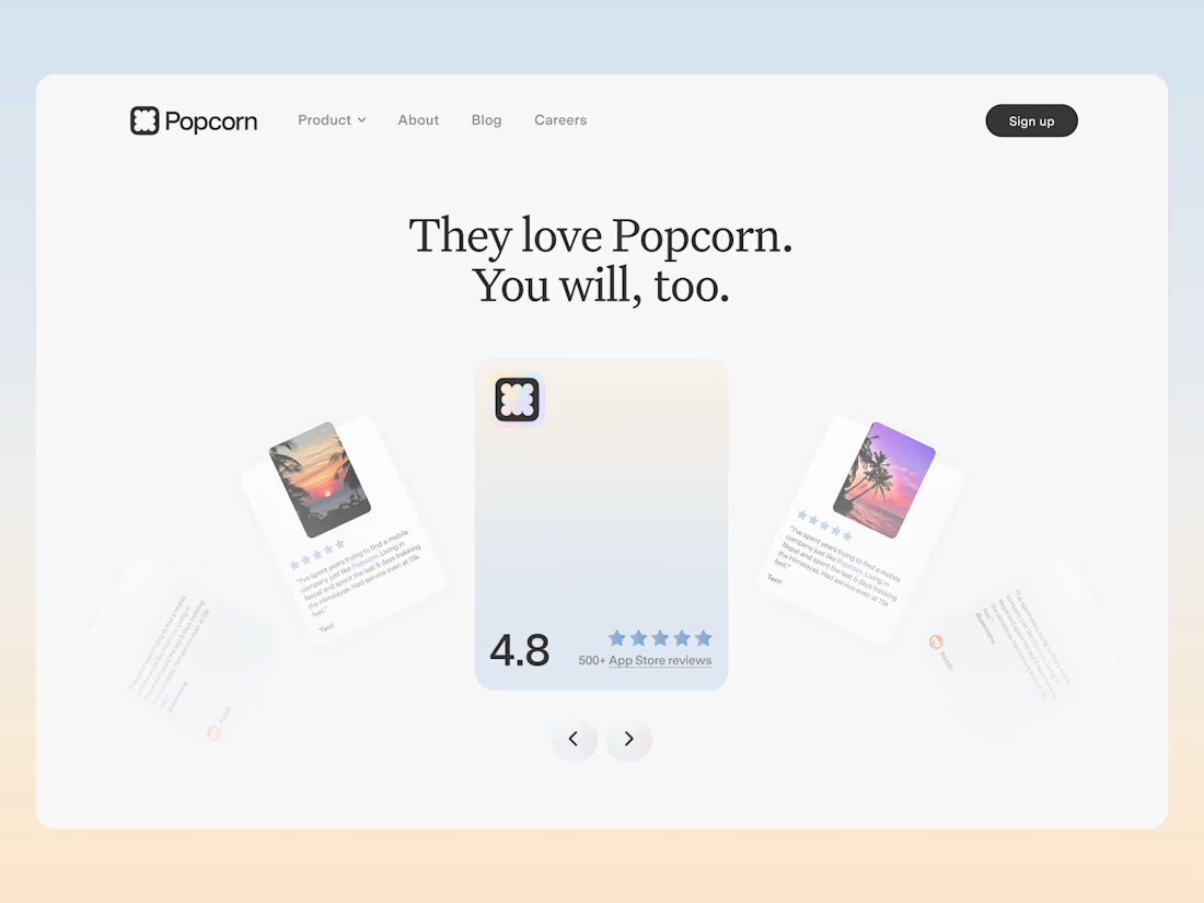
An exploration for the review section of Popcorn. Didn't make it live but i really liked it!



Yoo seems goood

A premium service with a generic website creates an immediate
trust gap.
For this private aviation concept, the hero had to communicate
more than luxury.
Couldn't agree more. First impressions matter, especially for premium brands.