The network for creativity
Join 1.25M professional creatives like you
Connect with clients, get discovered, and run your business 100% commission-free
Creatives on Contra have earned over $150M and we are just getting started
Back to feedPost

The ability to shift viewpoints and look at things from different angles in the fast-paced world of today is priceless.


awesome! bravo!

Love this 🙌


I will think all, again
The network for creativity
Join 1.25M professional creatives like you
Connect with clients, get discovered, and run your business 100% commission-free
Creatives on Contra have earned over $150M and we are just getting started











Related posts

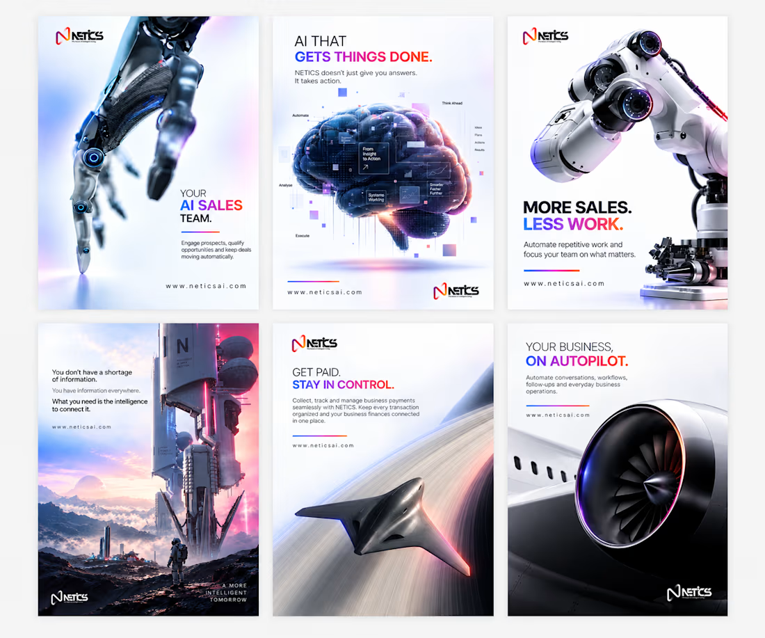
Making AI feel tangible through design.
One thing I kept thinking about while working on NETICS was: how do you make a brand about something as complex as AI feel simple, clear, and actually interesting?
I didn’t want to just make things look futuristic. I wanted the designs to communicate.
So I focused on three things:
1. Brand identity. A consistent visual language, from the gradients and typography to the overall look, so every design feels like NETICS.
2. Functionality. Clear headlines, simple copy, and a visual hierarchy that helps people understand what the product actually does.
3. Aesthetics. Cinematic 3D visuals, futuristic elements, and enough whitespace to keep everything clean without losing that tech feel.
The goal was simple: make the brand look good, but more importantly, make the message stick.
Because what’s the point of beautiful design if people don’t understand what you’re trying to say?
Here’s a look at the work.


Turned the cosmos, stars, and data concepts into a dynamic visual system.
Loved crafting every little detail here.
Hope you like them.


I came across an amazing piece by Wes Cockx, which inspired me to create something similar.
The goal wasn't just to recreate the visuals, but to understand how the motion works and how to build it using Geometry Nodes in Blender.
It was a great opportunity to experiment, learn new techniques, and practice skills I can bring into future client projects.
Sometimes, the best way to learn is to take something that inspires you and figure out how it works.
--
No AI was used.


Recreating a piece to learn the motion is a great way to practice. The lighting looks sharp.