The network for creativity
Join 1.25M professional creatives like you
Connect with clients, get discovered, and run your business 100% commission-free
Creatives on Contra have earned over $150M and we are just getting started
Back to feedPost

✨ Which style would you choose? Let me know in the comments! 👇

The network for creativity
Join 1.25M professional creatives like you
Connect with clients, get discovered, and run your business 100% commission-free
Creatives on Contra have earned over $150M and we are just getting started











Related posts

Same content, different experience. A few thoughtful design choices can completely change how a presentation feels, flows, and communicates. Which version would you choose?

11 voted
31%
24 voted
69%
35 votes
Closed

Verde Vista 1 is more modern and futuristic specially with blue colors and robotic hand❤️
Great job Rasid🎉🎉🔥🔥

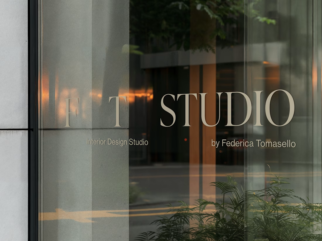
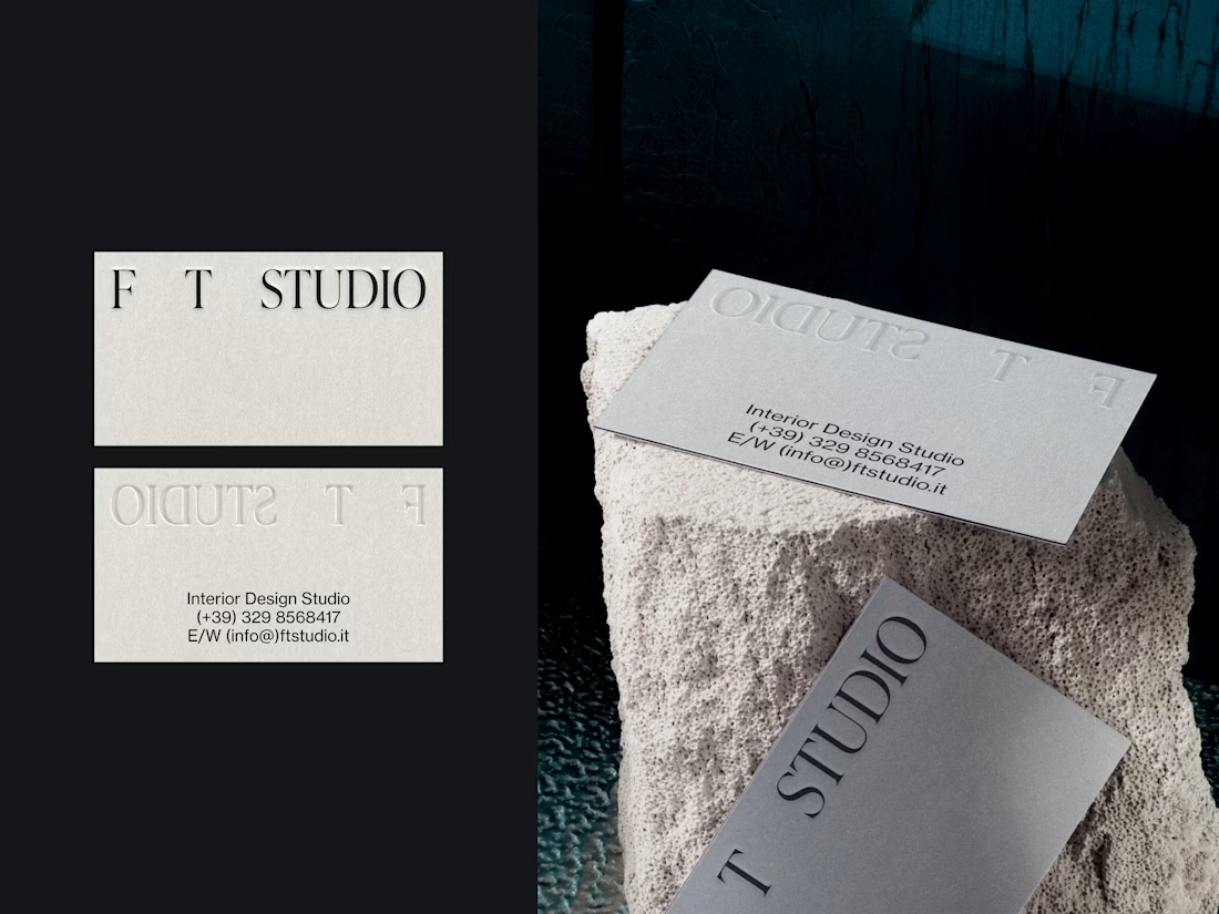
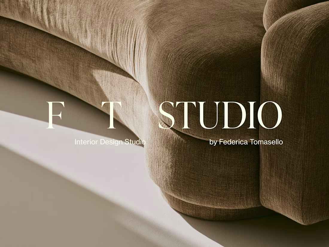
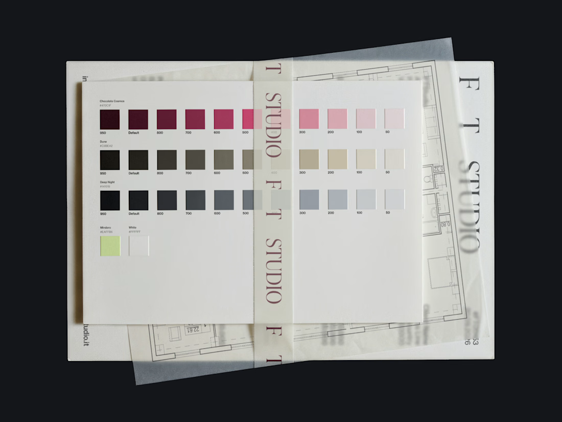
FT Studio is an Interior Design Studio, led by Federica Tomasello.
Through careful listening and a psychological approach to design, she studies each client’s personality and translates it into details that make the space unmistakably theirs.
The brand identity is built around the one thing she works with every day: space.
Hope you enjoy it!🤍 Check it out



Nice

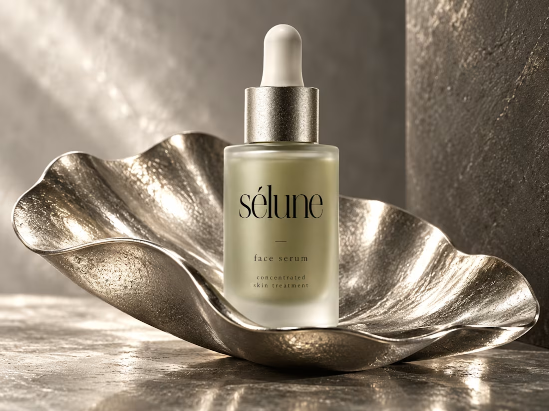
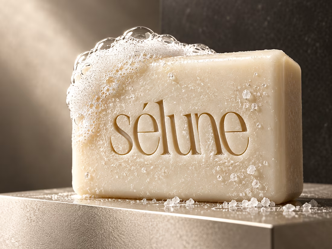
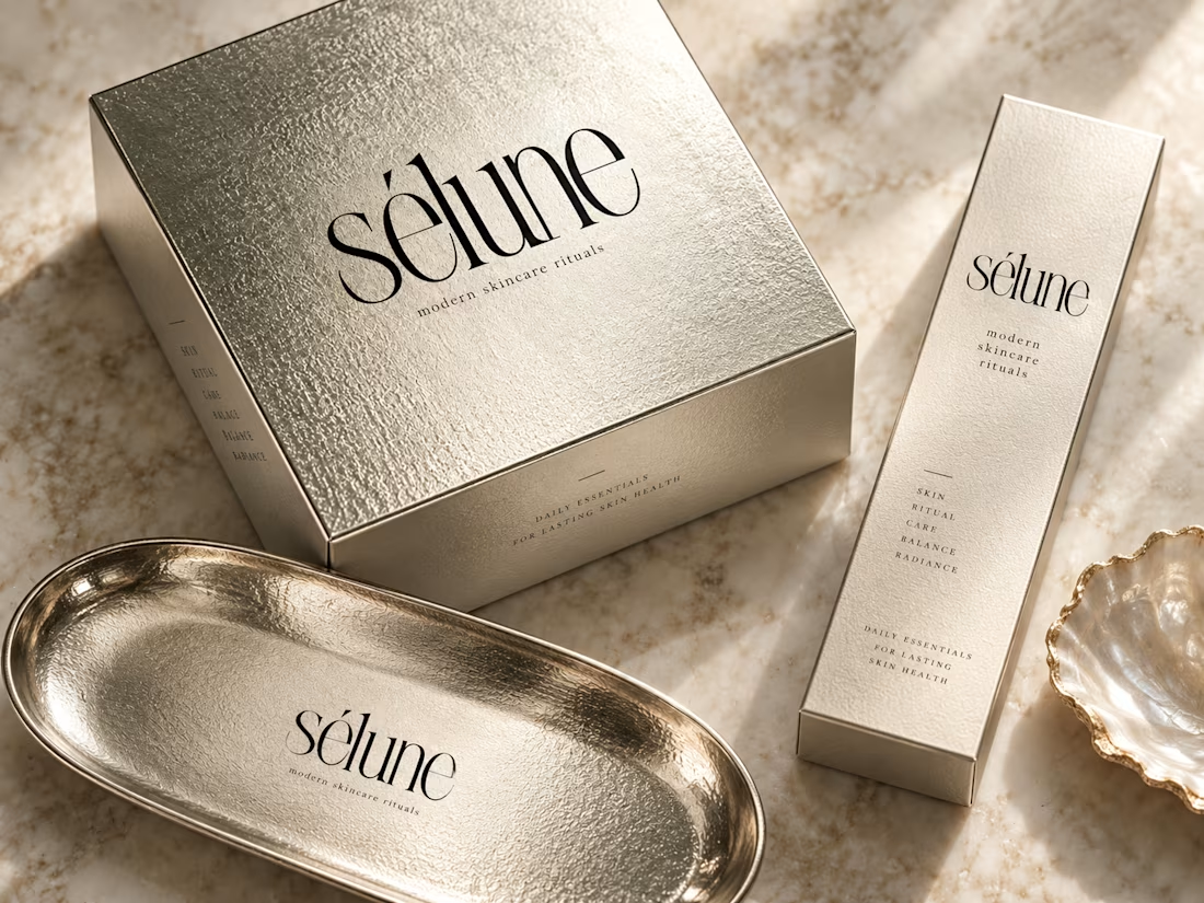
✨ Introducing SÉLUNE — where skincare meets quiet luxury.
What do you think of this direction for a modern skincare brand? ✨


Amaizinh nusrat ♥️♥️🔥