The network for creativity
Join 1.25M professional creatives like you
Connect with clients, get discovered, and run your business 100% commission-free
Creatives on Contra have earned over $150M and we are just getting started
Back to feedPost
Taste Test

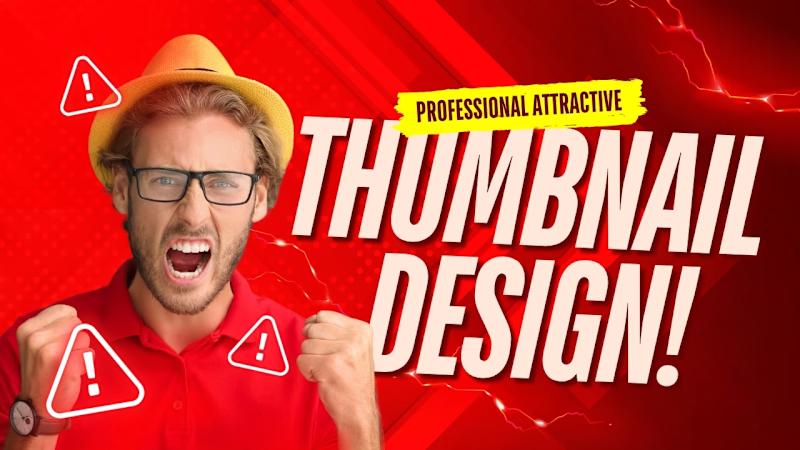
🔥 Which Thumbnail Is Better?
1️⃣ Professional & Bold
2️⃣ Clean & Eye-Catching
👉 Vote for your favorite!
💬 If you like it, feel free to message me for your next thumbnail!
Ya thora more professional:
🎨 Help Me Choose the Best Thumbnail!
Which one would you click? 👀
1️⃣ or 2️⃣ — Drop your vote!
💬 Need a thumbnail like this? Feel free to message me.


0 voted
0%
1 voted
100%

1 vote
Closed
The network for creativity
Join 1.25M professional creatives like you
Connect with clients, get discovered, and run your business 100% commission-free
Creatives on Contra have earned over $150M and we are just getting started



Related posts

Which brand would you rather spend a year with?
A. Zvezda Works
Zvezda means star. It’s an invented maker of heavy-duty tools and field systems for people who weld, rig, haul and repair. Space-race poster ink, constructivist diagonals, riveted steel, two plates that never quite line up. Loud on headlines, quiet everywhere else.
B. Herbarium Hours
Plant-based skin and body care that treats every ingredient like a specimen. Pressed leaves, field notes, hand-labelled bottles, zero rush.
One feels like a poster pulled fresh off a press. The other feels like a page from a naturalist’s notebook.
21 voted
48%
23 voted
52%
44 votes
Closed

Nice!

Boyi (猼訑) · SHC-18/36 🐑 👁️✨
Which do you prefer — Foil Card 🃏 or 3D Render?


25 voted
54%
21 voted
46%
46 votes
Closed
Nice!

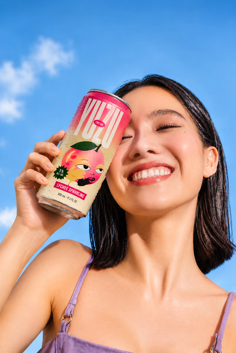
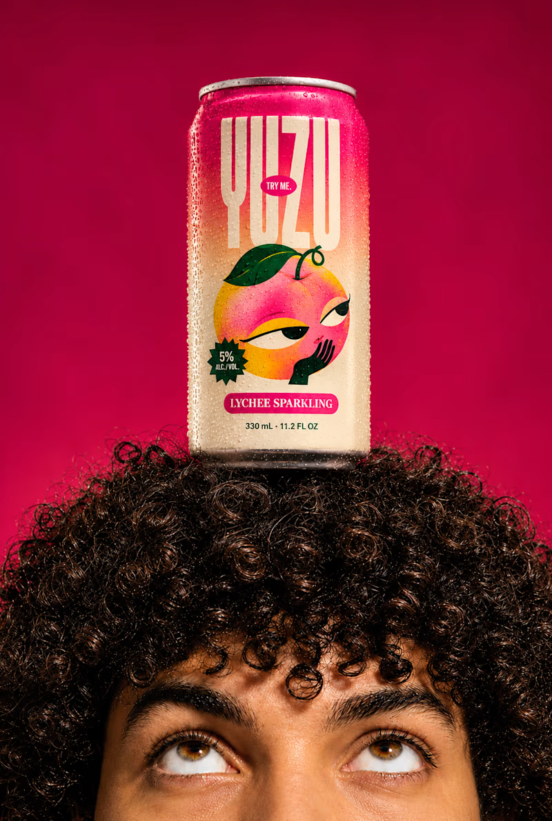
YUZU Flavor Face-Off — Which One Wins?
39 voted
48%
43 voted
52%
82 votes
Closed

Fresh & Bold gets my vote. That deep red makes the can impossible to miss, and the design lets the product do the talking instead of the lifestyle shot around it. Sweet & Playful is lovely photography, but on a shelf I think the red one is the one you'd actually pick up first.