The network for creativity
Join 1.25M professional creatives like you
Connect with clients, get discovered, and run your business 100% commission-free
Creatives on Contra have earned over $150M and we are just getting started
Back to feedPost

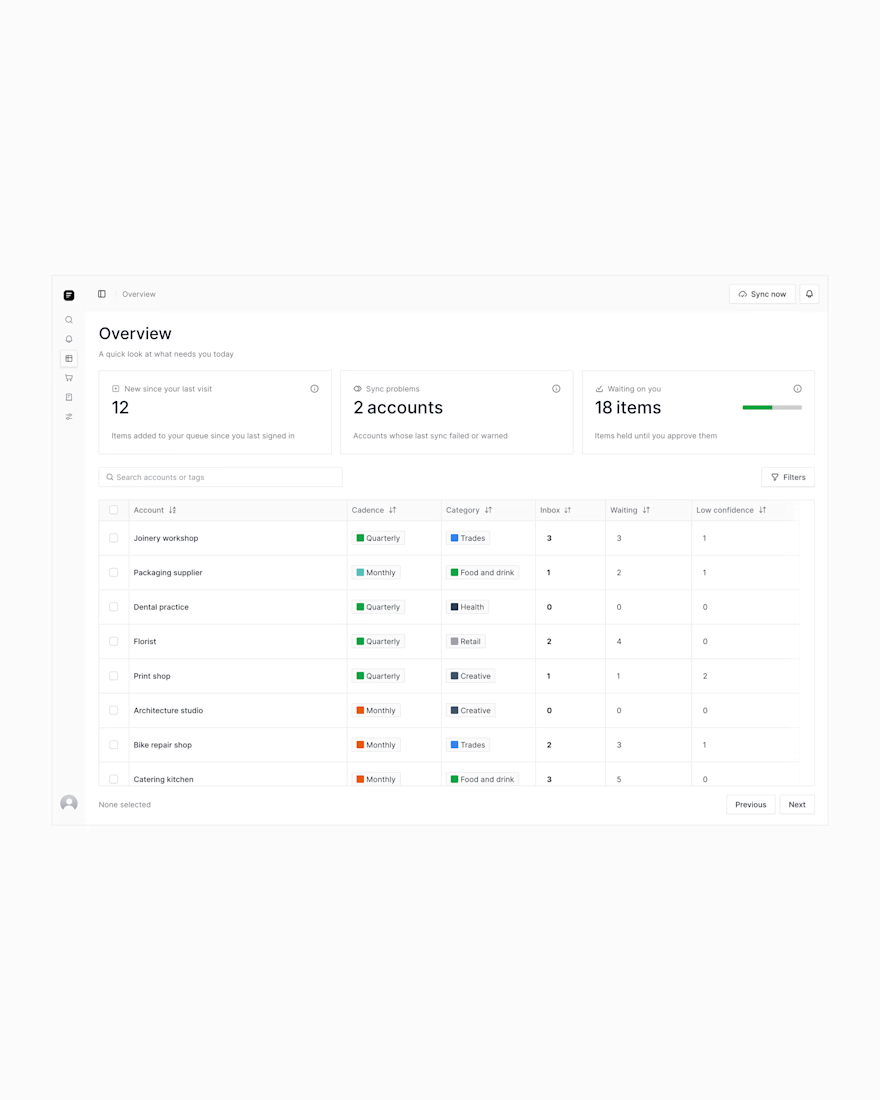
Following up on the insights dashboard I shared earlier.
I designed the overview/dashboard page today- the home base that brings everything together. I made a few tweaks to make things clearer and easier to scan.
Let me know what you think.
Ps, users preferred option A.🙂


Practice makes perfect.
I say that because comparing how I used to design dashboards then and the way I design dashboards now, I see is growth.
I’ve always been...
The network for creativity
Join 1.25M professional creatives like you
Connect with clients, get discovered, and run your business 100% commission-free
Creatives on Contra have earned over $150M and we are just getting started











Related posts

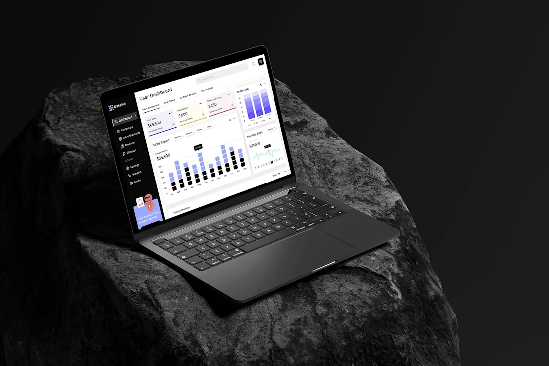
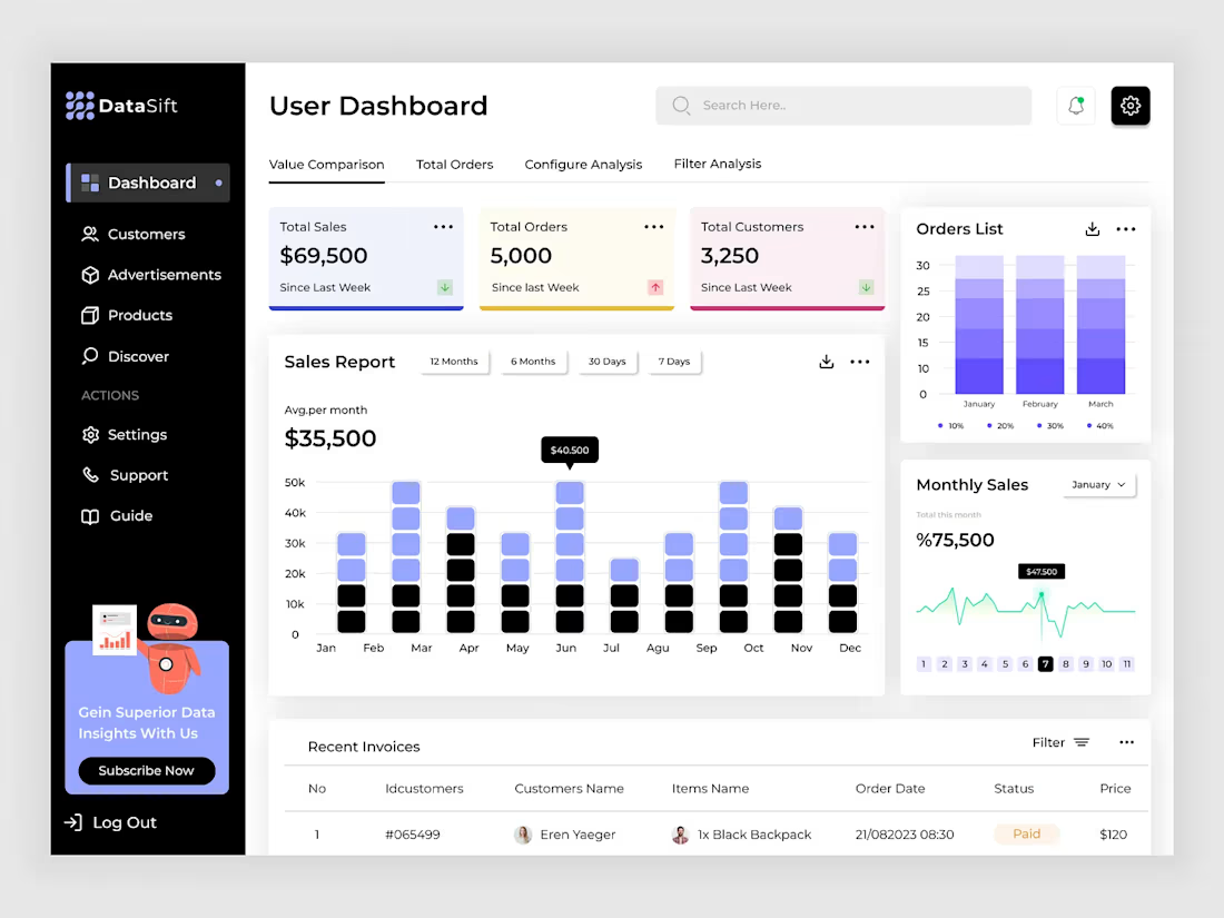
Sales Analytics Dashboard Design
Hello,
Hope you're doing well. This is a, Sales Analytics Dashboard Design. Let me know what you are thinking about the design and don't forget to press the "L" button 😎




Excited to share a major update! We’ve just rolled out a fresh design for our AI platform. 🚀
Our focus was on streamlining complex AI workflows into an intuitive, responsive, and frictionless interface—making it easier to build, iterate, and deploy without clutter.
Take a look at the preview above:
What are your first impressions of the new visual direction?
Where do you see room for improvement or subtle UX enhancements?
Drop your thoughts and critique in the comments below—always looking to iterate and refine!
Would you like me to tailor this post around specific features of the redesign (such as dark mode, dashboard analytics, or navigation flows), or adapt it into a project case study format?


