The network for creativity
Join 1.25M professional creatives like you
Connect with clients, get discovered, and run your business 100% commission-free
Creatives on Contra have earned over $150M and we are just getting started
Back to feedPost

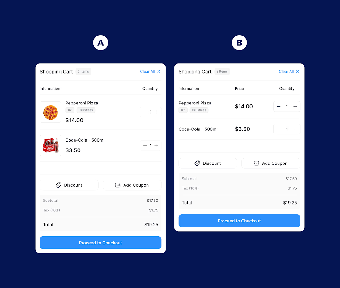
Cart design for Restaurant POS.
Two directions.
A.
1. You recognize the product instantly.
2. Images reduce mistakes.
3. Modifiers are visible.
4. Better for complex or customizable orders.
5. But it uses more data and space.
B.
1. You scan faster.
2. More compact.
3. Handles large quantities better.
4. Cleaner for high volume environments.
5. But less visual confirmation.
A reduces errors, B increases speed.
Good UX depends on the environment, not preference.
Any other points you would add?

Thank you!

Love this breakdown. Framing it as context over preference is spot on.
Good job Emon 🙌
Thanks
The network for creativity
Join 1.25M professional creatives like you
Connect with clients, get discovered, and run your business 100% commission-free
Creatives on Contra have earned over $150M and we are just getting started











Related posts


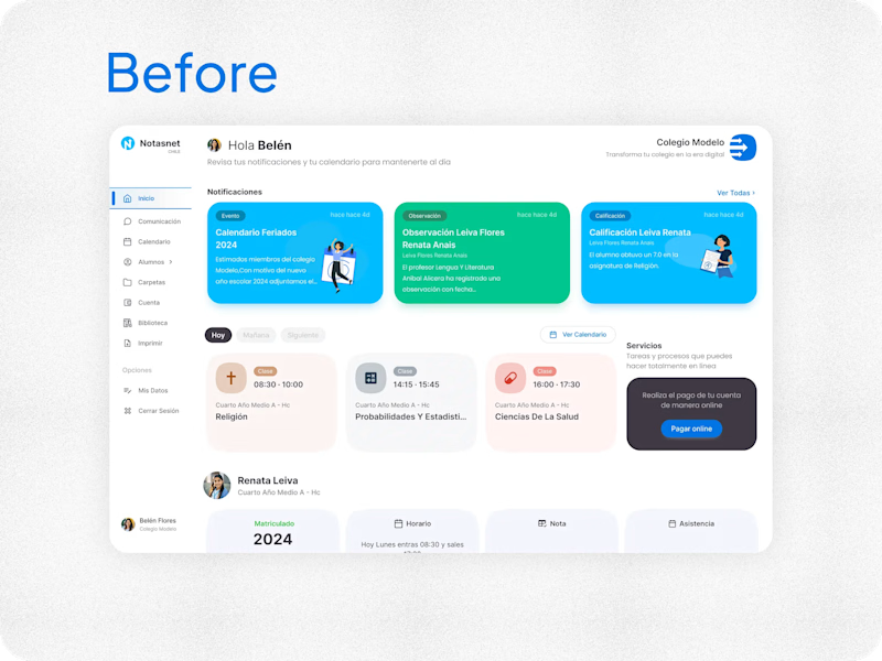
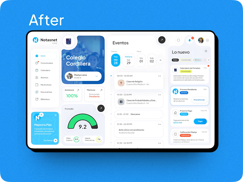

After absolutely it's more practical 🎉🎉🔥🔥

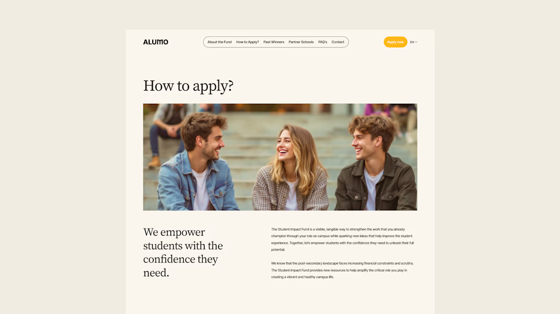
The Client: Alumo is a student impact fund that pools collective influence from influencers and partner schools to deliver a $250,000 annual grant program for student-led projects across Canada.
The Issue: The fund needed a website that could communicate trust and purpose to two very different audiences — students applying for grants and partner schools or influencers considering joining — while also showcasing past winners and guiding applicants through the process clearly.
The Solution: A multi-page website was designed with a warm, approachable visual identity using earthy tones, generous imagery, and clear information hierarchy. Each section — About, Past Winners, and How to Apply — was structured to reduce friction and build confidence, making it easy for students to understand eligibility and take action before the deadline.

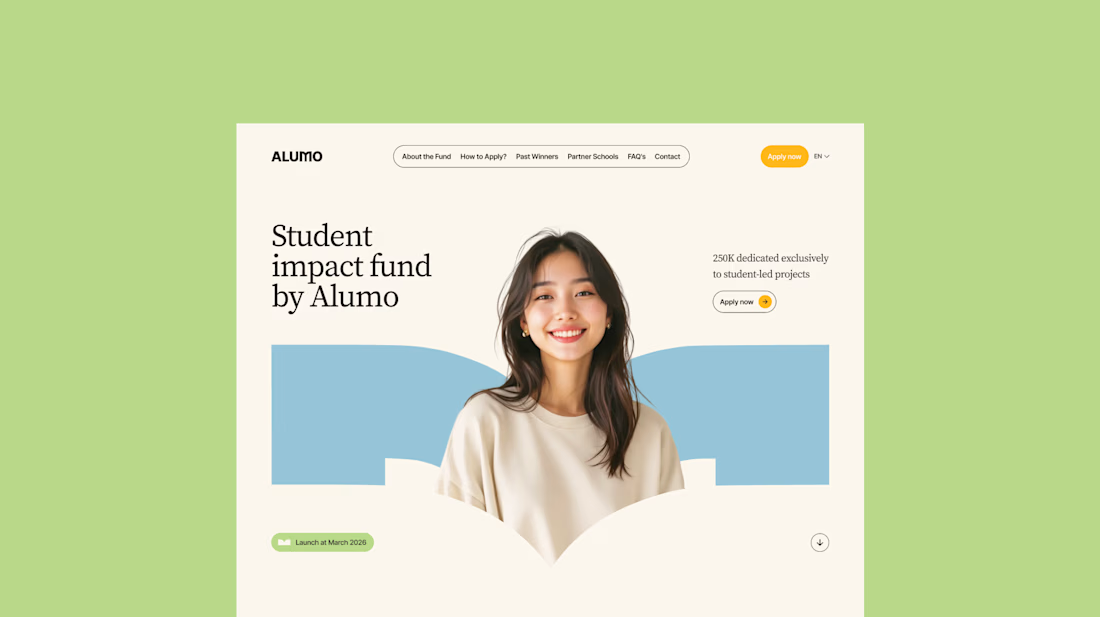
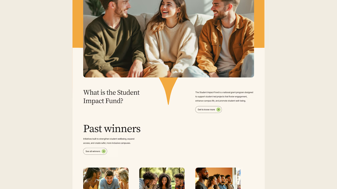
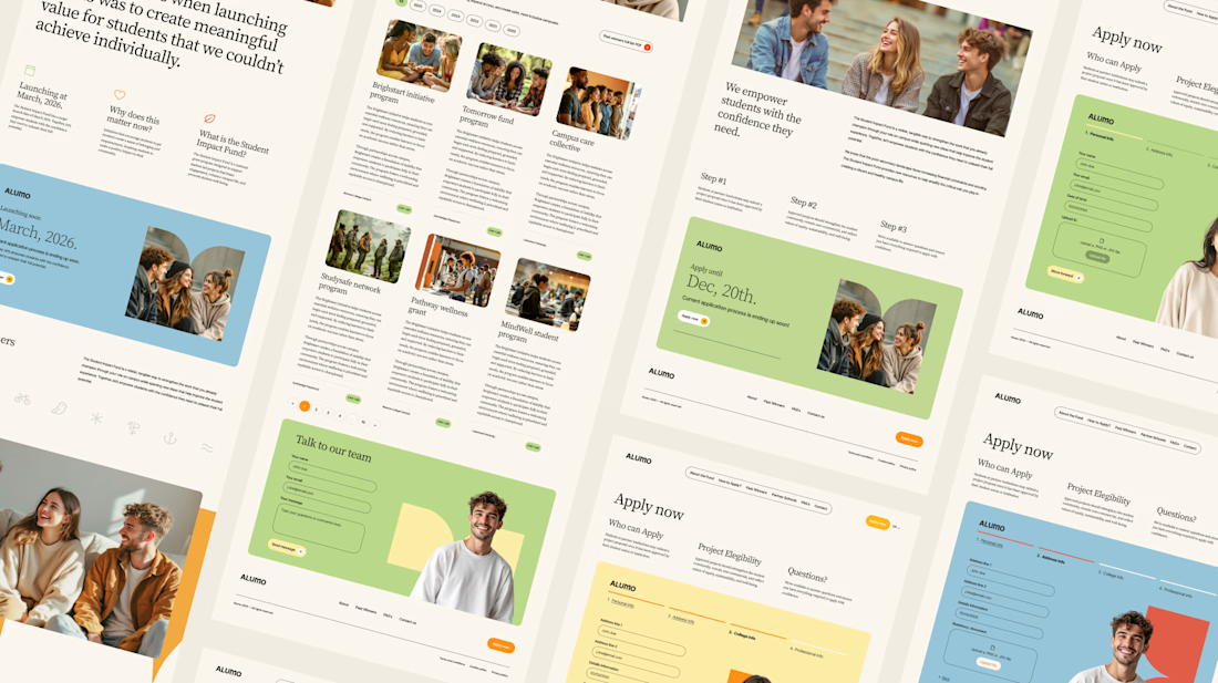

Love how you're tackling trust + purpose for a $250K fund - that's a tough balance with two audiences. Communicating credibility for a student-led initiative across Canada is huge. Would love to see how you solved it!

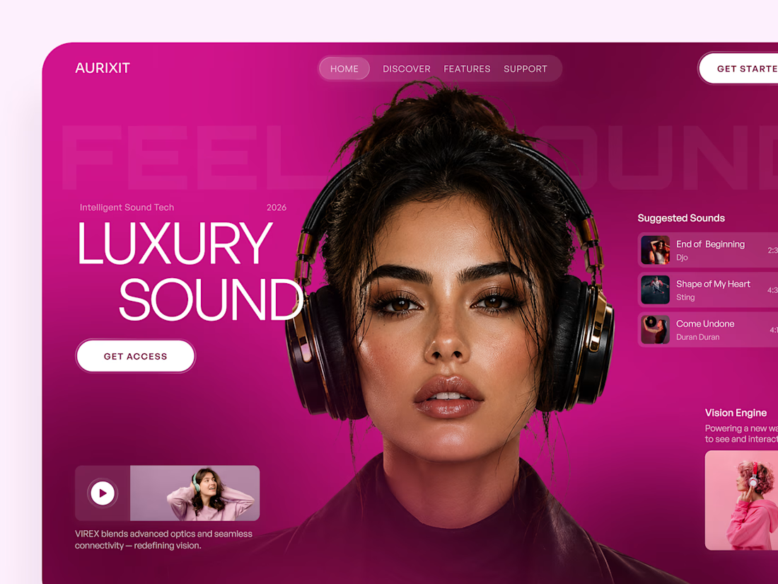
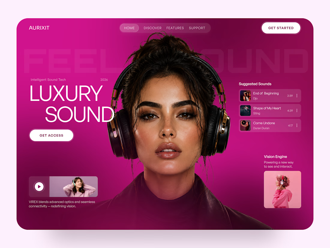
AURIXIT — Luxury Headphones Landing Page 🎧💗
A vibrant landing page concept for a premium audio brand, combining luxury sound, fashion-inspired visuals, and a bold digital experience
The design brings together bright magenta tones, oversized typography, lifestyle photography, and clean UI elements to create a modern, eye-catching aesthetic
Special attention was given to:
• Bold lifestyle-focused hero composition
• Vibrant pink and magenta color palette
• Clean, oversized typography
• Music playlist and suggested tracks
• Premium headphone presentation
• Clear CTA and minimal navigation
• Responsive mobile experience
The result is a fresh, stylish landing page that connects premium audio technology with fashion, music, and personal expression ✨

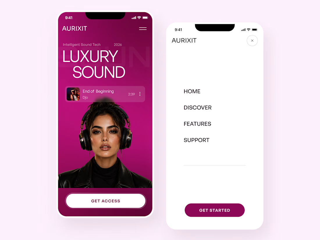

Magenta with the black headphones really pops. Was the small playlist text on pink tricky for contrast?