The network for creativity
Join 1.25M professional creatives like you
Connect with clients, get discovered, and run your business 100% commission-free
Creatives on Contra have earned over $150M and we are just getting started
Back to feedPost



The network for creativity
Join 1.25M professional creatives like you
Connect with clients, get discovered, and run your business 100% commission-free
Creatives on Contra have earned over $150M and we are just getting started



Related posts

've reviewed 50+ startup websites, and I noticed a pattern.
Their hero sections are often simple. They tell you who the product is for and what it does.
While working on this redesign concept for
@Alloovium, I wanted to explore a different direction.
Their original website already explained the product and its audience.
But what if the hero also used visuals that reflected the world their customers work in?
People often scan websites before deciding what to pay attention to.
Relevant visuals can catch their attention and create a connection with the audience before they start reading.
So I explored a few visual directions inspired by the construction industry.
Building a startup? I'd love to help you explore a new direction for your website.

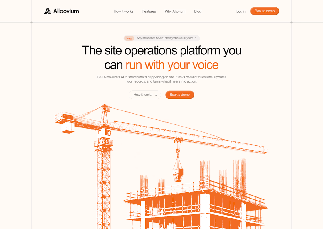
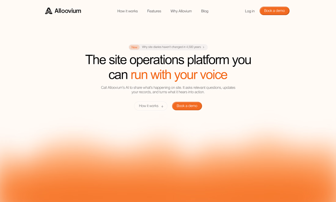
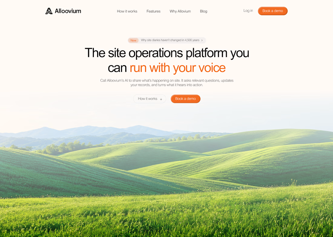

The construction visuals work well.

wow, this looks sharp. Amazing work


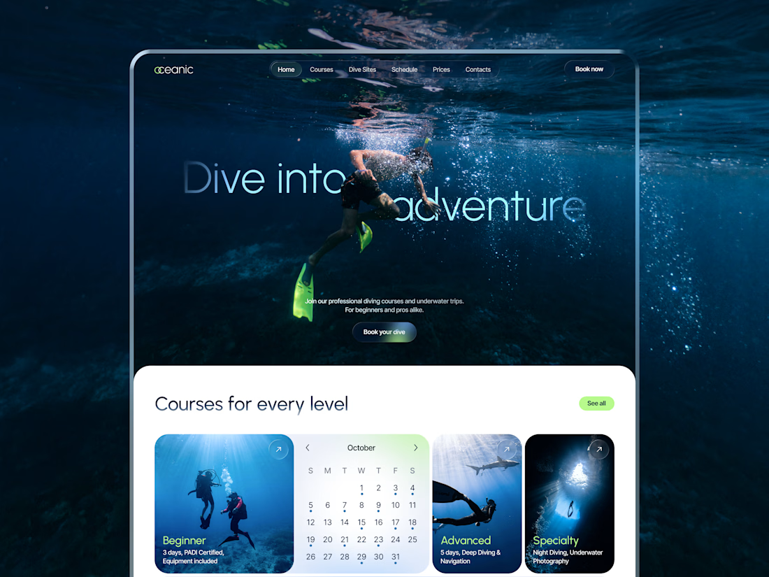
New concept for diving center 🌊
What do you think?


nice work!


I built this site with AI. Try to spot where. 🔥
Ardor is a concept marketing agency in Amsterdam, built on Wix Headless. Astro draws every page. Wix runs everything behind it: the Work and Journal content live in Wix CMS collections, every brief lands in a Wix collection, and Wix hosts the site.
AI is a fast builder and a poor art director. It helped me build this. The direction was mine.
Ardor is a concept, so the clients and numbers are demo content. The build is real.
What’s your quickest tell that a site was AI-generated? 👇