The network for creativity
Join 1.25M professional creatives like you
Connect with clients, get discovered, and run your business 100% commission-free
Creatives on Contra have earned over $150M and we are just getting started
Back to feedPost

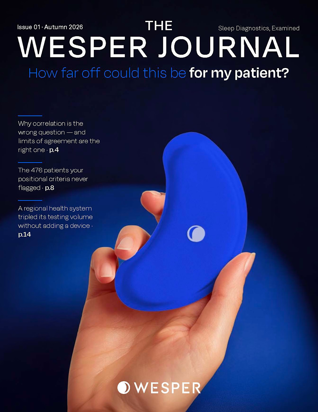
Designing for clinical audiences demands a completely different discipline than consumer magazines. There is zero room for decorative fluff.
For The Wesper Journal, the challenge was balancing high-density medical data—diagnostic accuracy, Bland–Altman limits of agreement, and FDA-cleared biosensor signals—with an authoritative, collectible editorial pace.
Key structure behind this cover and issue:
Deep Navy & high-contrast dark palette to evoke clinical precision without feeling cold.
High-contrast typography pairing: disciplined Light + Bold weights for instant hierarchy.
Hero imagery bridging real hardware ergonomics with real human physiology.
Layout crafted from raw manuscripts and clinical briefs in Adobe InDesign.
Full spread breakdowns, grid systems, and data visualisations linked in the first comment below. 👇
#EditorialDesign #MedicalJournal #PublicationDesign #InDesign #ArtDirection #InformationArchitecture #PrintDesign


Bland–Altman plots in a collectible journal, that's brave 😄 Biotech decks have the same tension: the science team wants every data point, investors want one clear chart. How did you decide what stays on the spread and what goes to the appendix?
The network for creativity
Join 1.25M professional creatives like you
Connect with clients, get discovered, and run your business 100% commission-free
Creatives on Contra have earned over $150M and we are just getting started



Related posts

A few months ago I got to work with Coderhouse, one of the leading education brands in Argentina, and the place where I took several courses myself.
So this one feels like a full circle. A brand that shaped my career and helped me grow as a designer, and now I got to design for it.
The funny part is Chris had no idea I was a former student when he reached out. I was really happy when that message came in.
I built a visual system for their 60+ course covers, made so their team can keep producing them on their own. Today it lives across their app, website and Meta ads.
Thanks Chris for trusting my work and for the opportunity 🧡 And thanks @Contra HQ for making connections like this one possible.


This looks great

Headquaters landing page web design 3D animation website icons


This clean design give a great vibes!!

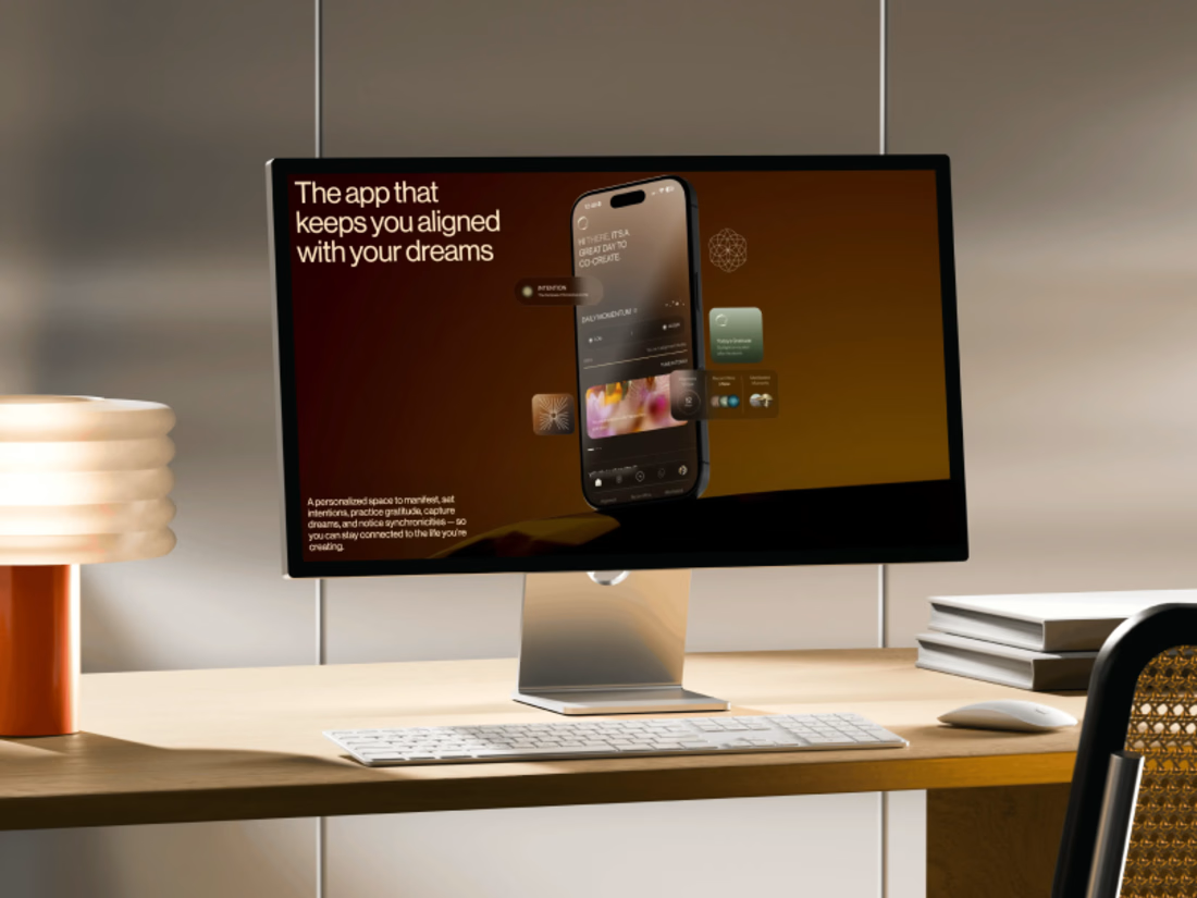
Promo video for a manifestation and wellness app. 48 seconds of kinetic type, UI motion and warm footage that show what the app does.


The warm footage really suits a wellness app, it keeps the kinetic type from feeling too techy. Lovely pacing for 48 seconds