The network for creativity
Join 1.25M professional creatives like you
Connect with clients, get discovered, and run your business 100% commission-free
Creatives on Contra have earned over $150M and we are just getting started


The network for creativity
Join 1.25M professional creatives like you
Connect with clients, get discovered, and run your business 100% commission-free
Creatives on Contra have earned over $150M and we are just getting started





Related posts

Two perfume ads, two completely different moods.
Same tagline, opposite directions. Which one feels more like a luxury fragrance to you? Vote and tell me why!
2 voted
50%
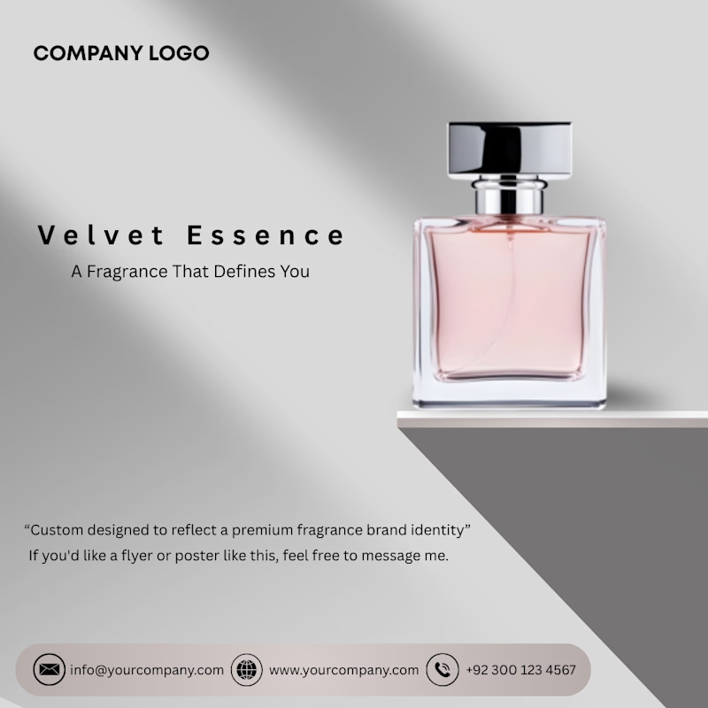
2 voted
50%
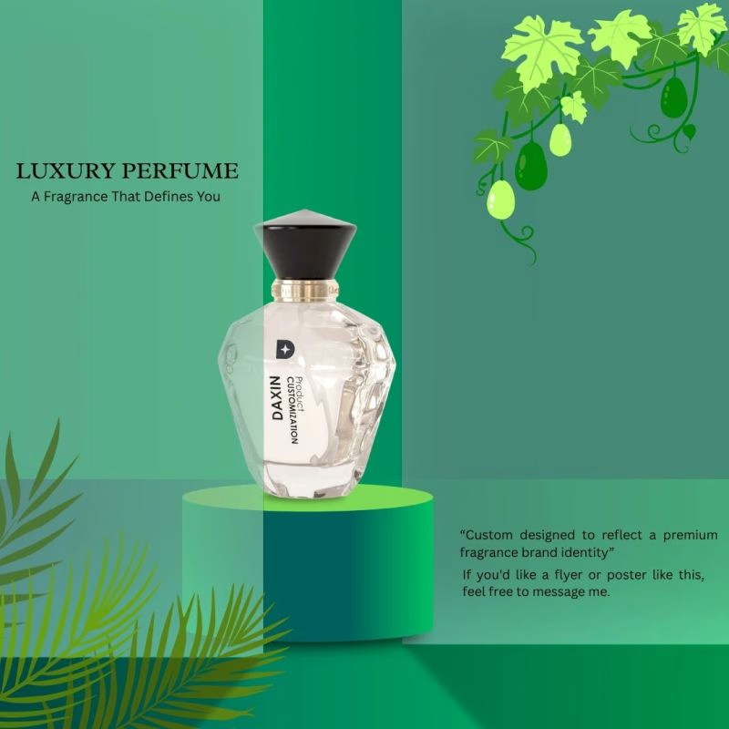
4 votes
Closed

The first one does it for me

09 XL — From a Portrait to a Visual Story.
This one started with a simple black-and-white portrait, but I wanted to give it a little more personality. I began experimenting with contrast, grain, and shadows to build a raw, almost cinematic atmosphere.
Then came the fun part — playing around with typography, adding the black strip across the eyes, and using minimal details like 09 and XL to give the composition a subtle editorial feel.
Once the poster came together, I placed it in a real-world bus stop mockup to see how it would live outside the screen.
A little experimentation, a few happy accidents, and lots of tiny adjustments later — this was the result.


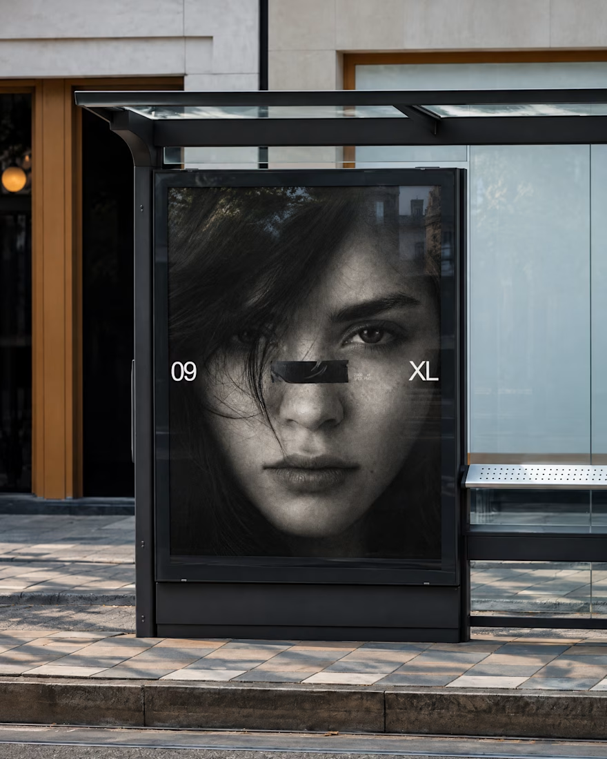
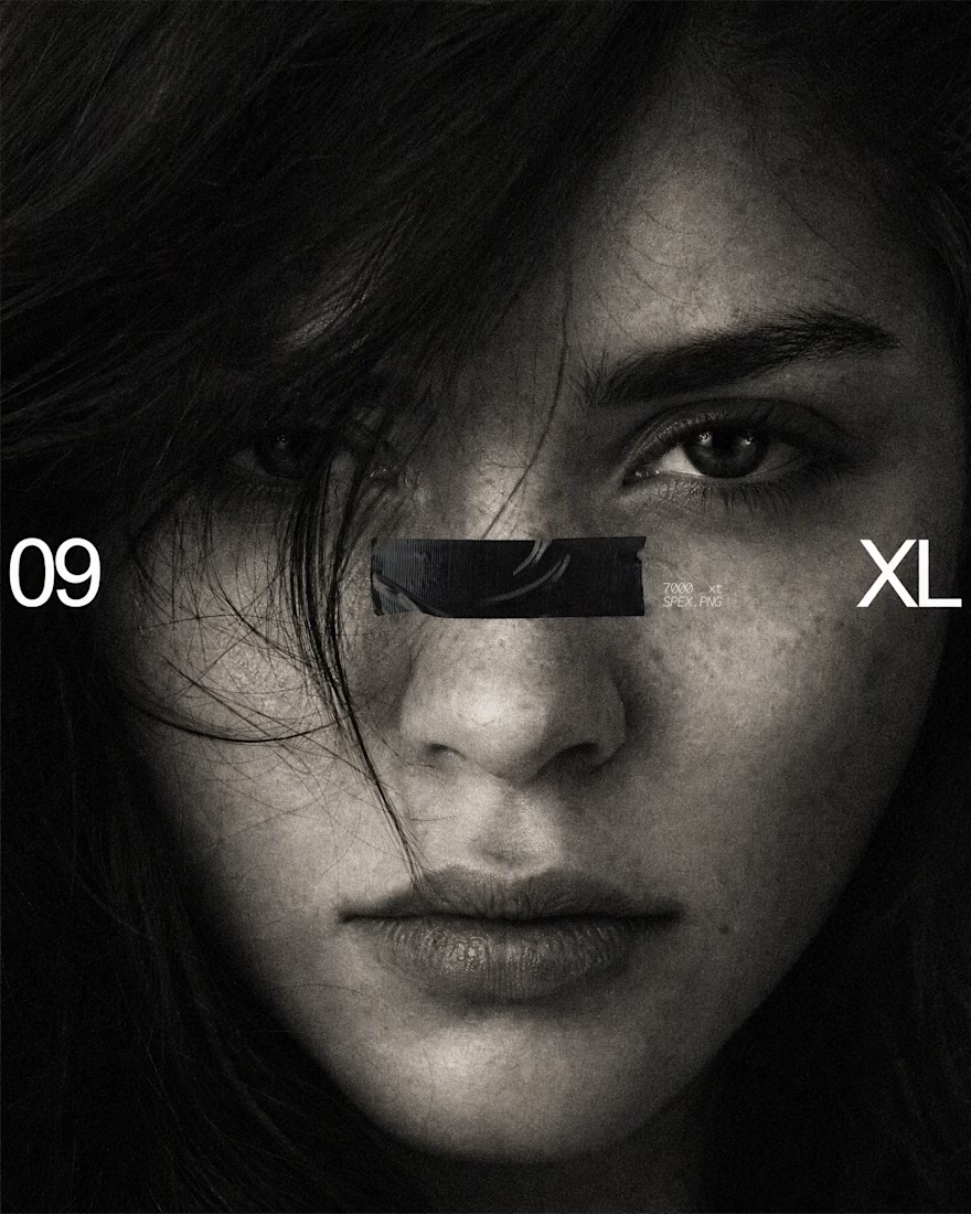

The black bar across the eyes with 09 and XL on the sides turns a simple portrait into a bold poster, and the bus stop mockup shows it works at street scale. Is the grain added in Photoshop or part of the original photo?

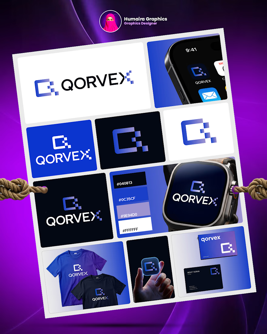
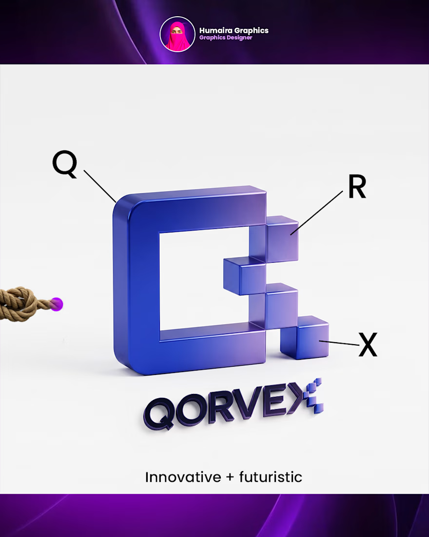
Is logo design really that easy?
Honestly, I used to find logo design really challenging. Coming up with a meaningful concept and turning it into a strong visual identity wasn’t easy for me.
But they say, “Practice makes perfect.”
That’s why I kept practicing, exploring ideas, and learning from every design. And today, I can see how much I’ve improved.
I’m still learning, still experimenting, and always trying to make my next design better than the last.
What was the most challenging part of logo design when you started?
Have a branding project in mind? Let’s connect!

Great concept and a very strong visual direction.