The network for creativity
Join 1.25M professional creatives like you
Connect with clients, get discovered, and run your business 100% commission-free
Creatives on Contra have earned over $150M and we are just getting started
Back to feedPost

The network for creativity
Join 1.25M professional creatives like you
Connect with clients, get discovered, and run your business 100% commission-free
Creatives on Contra have earned over $150M and we are just getting started







Related posts


Hot take: aesthetics and clinical results should walk hand in hand.
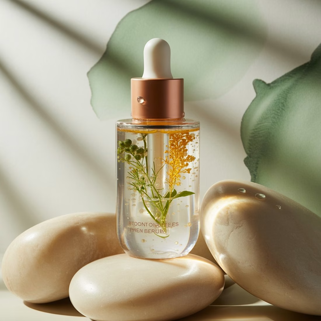
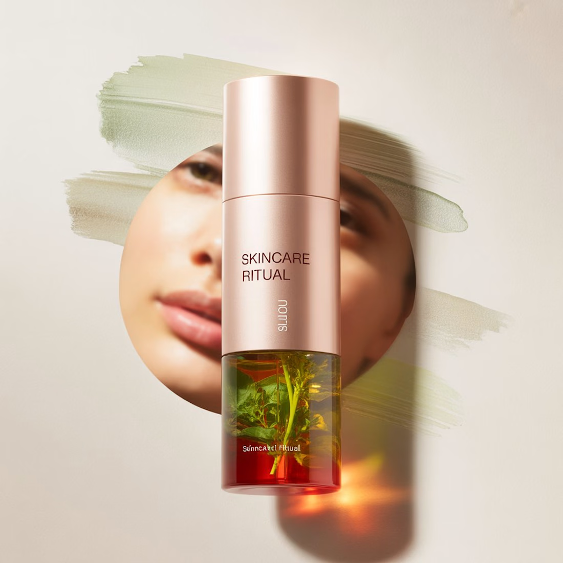
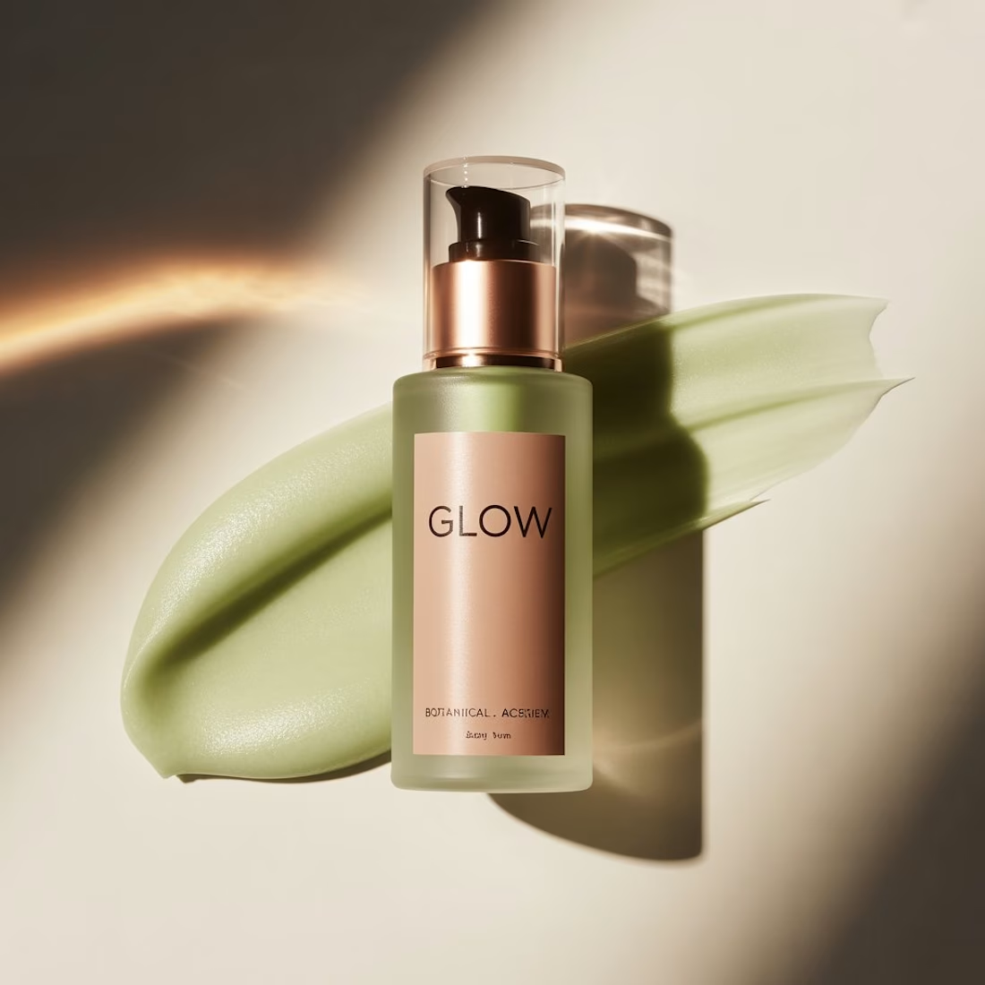
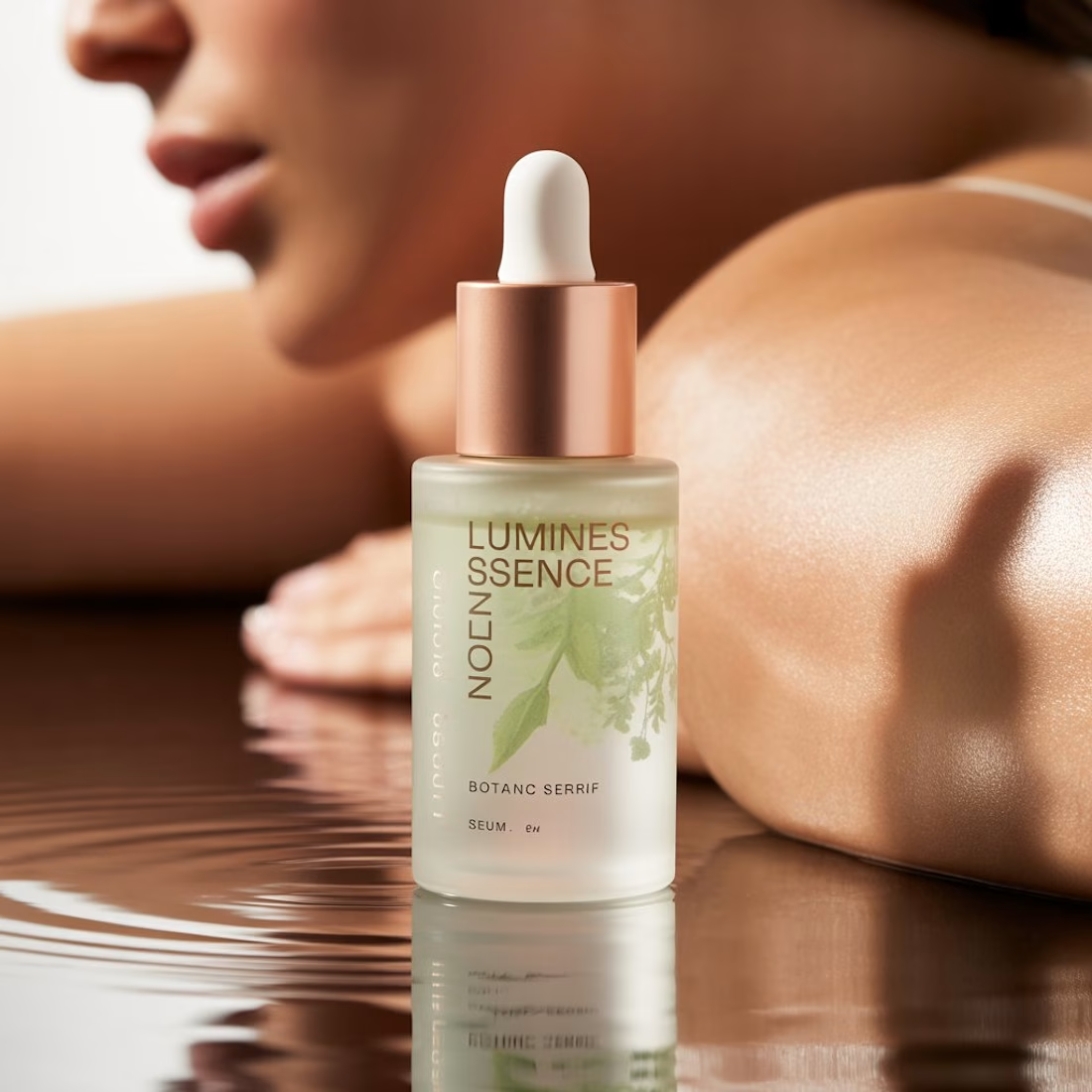
Most brands in this space lean into cold, sterile whites or aggressive dark tones. It reads functional, but it also feels like something you'd hide in a medicine cabinet, not display on your vanity.
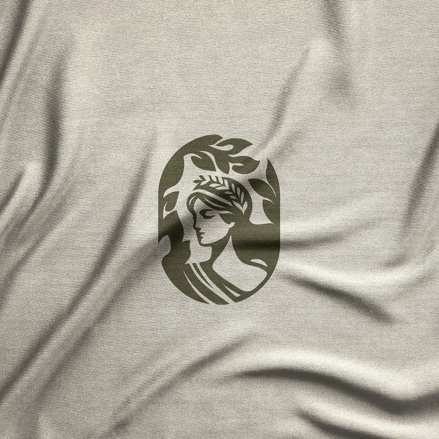
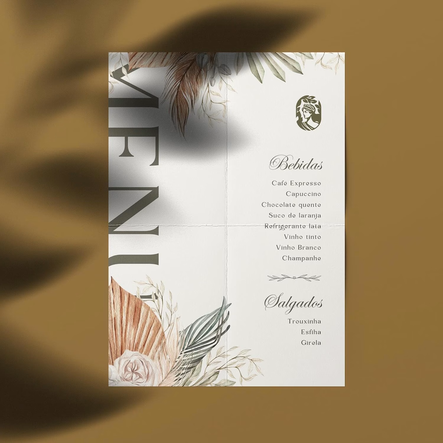
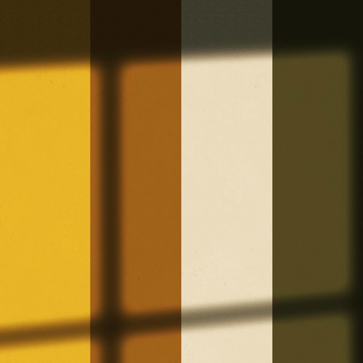
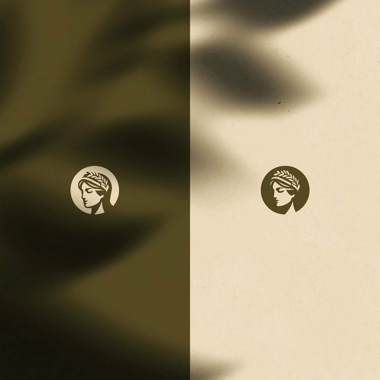
For this rebrand, we anchored the identity in classical beauty and organic sophistication. By combining warm earthy tones, botanical cues, and timeless iconography, we moved away from the "pharmacy product" feel into true high-end personal care.
It was a deliberate shift: positioning the brand not for someone who feels like they are treating a flaw, but for someone investing in a premium daily ritual.
Would a piece like this deserve a spot on your display shelf?



This is brilliant!

⁕ Full Brand Identity for Trace™
One of the project's greatest challenges was creating an identity that is instantly recognizable and inspires investor confidence, while balancing a futuristic aesthetic with the sense of reliability intrinsic to the brand's values.
The core concept draws inspiration from the cosmos and the brand's drive to transcend boundaries; no matter the distance, the delivery is guaranteed. We translated this visually through patterns forming paths that lead to a destination, a motif that extends to every corner of the visual language.


"The Trace" is one of your best branding works. fantastic execution man

Brand Identity delivered by paper.

Love it🙌