The network for creativity
Join 1.25M professional creatives like you
Connect with clients, get discovered, and run your business 100% commission-free
Creatives on Contra have earned over $150M and we are just getting started
Back to feedPost


The network for creativity
Join 1.25M professional creatives like you
Connect with clients, get discovered, and run your business 100% commission-free
Creatives on Contra have earned over $150M and we are just getting started
Related posts


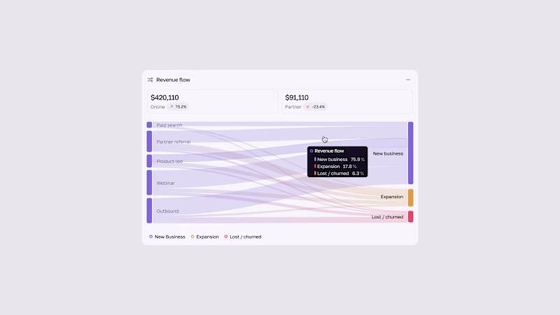
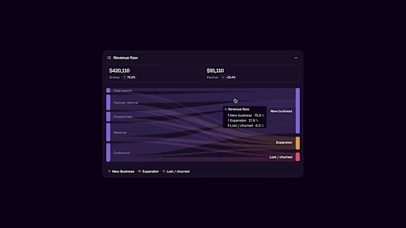


The contact page is usually the last page anyone designs.
We made it one of the best
Recent client work: a contact section UI design for a company with offices across cities. Globe in the back, every location up front, and small interactions that make the whole web design feel alive.


Impressive work

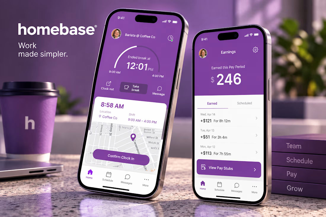
I collaborated as a Staff Product Designer on Homebase, working through the Hakuna studio. I contributed to designing experiences for a workforce management platform, focusing on modules such as employee scheduling and payroll to make everyday tasks clearer and easier to manage. 👉 https://www.joinhomebase.com/



scheduling AND payroll in one project is a lot of screens. how long were you on it?