The network for creativity
Join 1.25M professional creatives like you
Connect with clients, get discovered, and run your business 100% commission-free
Creatives on Contra have earned over $150M and we are just getting started
Back to feedPost

I went through it as if I were a founder deciding whether to hire you. This is the version I would publish.
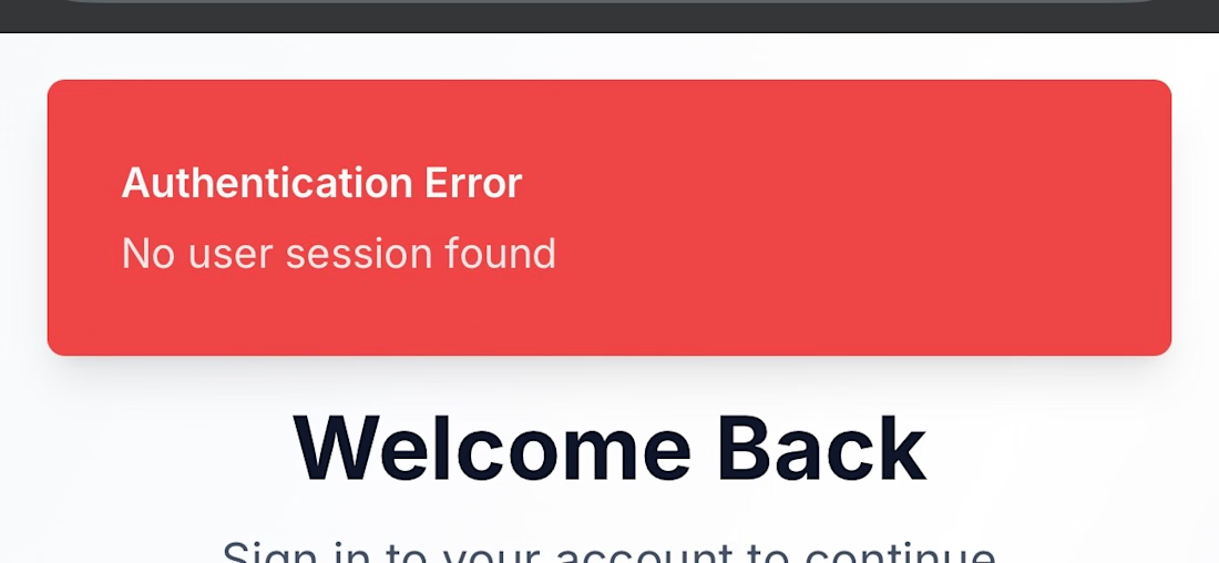
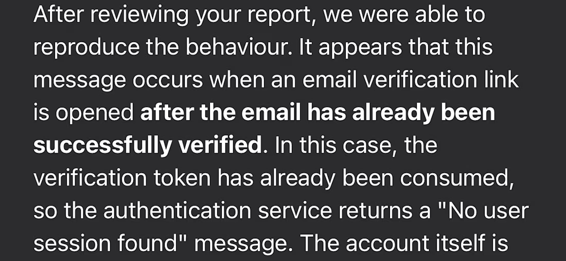
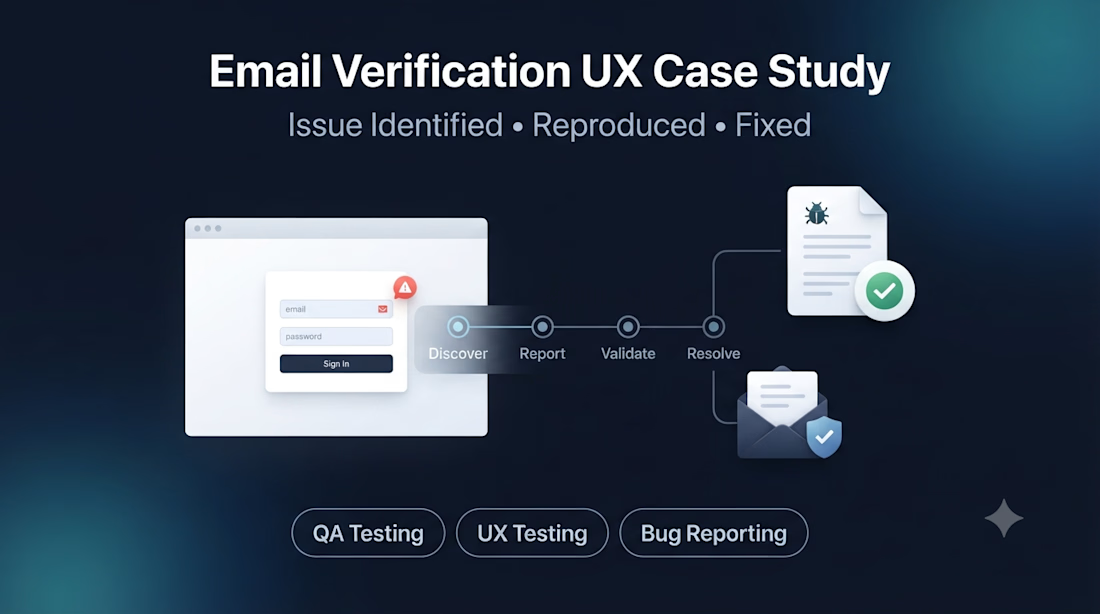
While testing Expirel as a public user, I identified a usability issue in the email verification flow that resulted in a confusing authentication error after successful verification.
I documented the issue with clear reproduction steps, expected behavior, actual behavior, and testing environment details before submitting it to the product team.
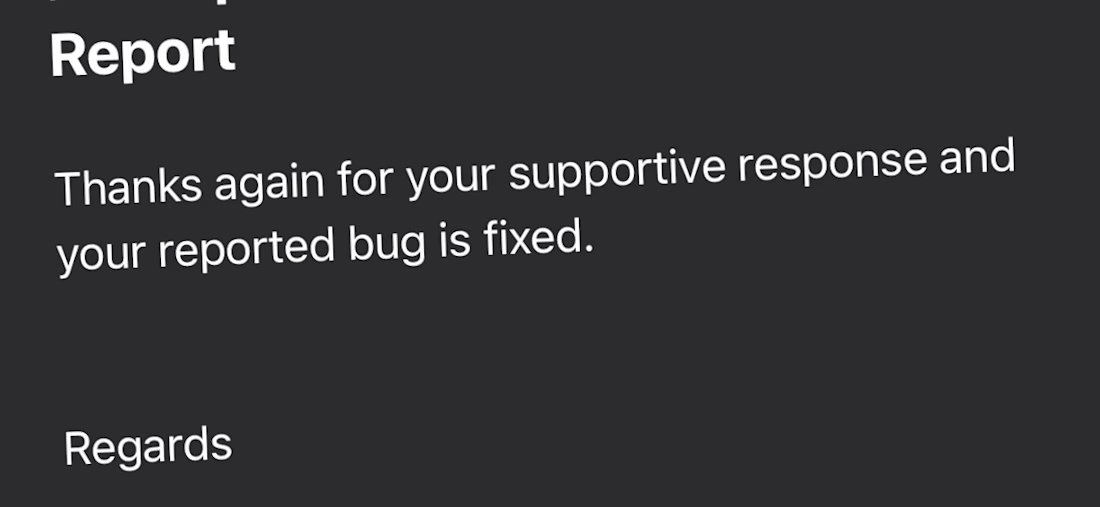
The team successfully reproduced the issue, acknowledged the UX concern, and later confirmed that the reported bug had been fixed.
This case study demonstrates my approach to identifying reproducible issues, communicating them clearly, and contributing to product quality through structured QA and UX testing.
If you’re building a SaaS, mobile, or Web3 product and want critical issues identified before your users find them, I’d be happy to help.

The network for creativity
Join 1.25M professional creatives like you
Connect with clients, get discovered, and run your business 100% commission-free
Creatives on Contra have earned over $150M and we are just getting started








Related posts

SpeedPulse AI V1.2 Update: 1-Click "Save to Gmail Drafts" is Live! 🚀
Huge thank you to the Contra community for pushing SpeedPulse AI to #1 Worldwide with 6,100+ views and 68 likes!
Over the last 48 hours, I gathered feedback from freelancers and agency owners using the live demo. While generating instant audit briefs was a massive time-saver, copying and pasting pitches into email was still creating friction.
Today I just shipped a new workflow integration inside the Agency CRM:
✨ 1-Click "Save to Gmail Draft ↗"
How it works:
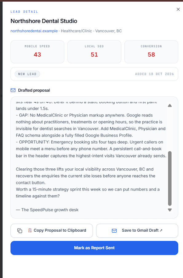
Run an instant website audit or select any lead from the Agency CRM.
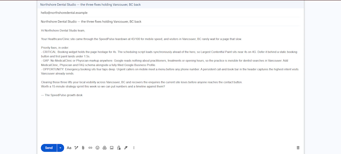
SpeedPulse AI automatically generates a high-converting, personalized teardown email.
Click "Save to Gmail Draft ↗" — it launches your Gmail with the client's email, subject line, and full audit points already filled in and auto-saved into your Drafts folder!
Zero manual copy-pasting. From audit to outreach in under 30 seconds.
Built entirely on Base44. Test out the new live integration in Entry 1 and let me know your thoughts! 🙌
#base44challenge #base44 #webdevelopment #automation



Love seeing how you’re improving the tool based on community feedback! The one-click Gmail drafts feature sounds really useful for saving time.

Title: Nexa Electronics: Premium E-Commerce Website with Interactive 3D Exploded Views
Description:
Nexa Electronics is a demo e-commerce website I designed and built to show my skills in modern web design, front-end development and interactive 3D experiences. This video is a walkthrough of the site.
What’s in the vedio.
The home page, with a cinematic hero section and a 3D device showcase
Browsing by category: Smartphones, Laptops, Audio, Gaming, Smartwatches, Smart Home and Accessories
Product pages with configuration and colour options, a zoom inspection view, pricing, stock status and customer reviews
The interactive 3D exploded view (“Explore Inside in 3D”), where you can take products apart layer by layer to see their internal components
Quick View, the device comparison matrix, the shopping bag and a full checkout flow (shipping details, payment, order review and confirmation)
Customer sign-in and an admin dashboard for managing the store
Website features
Interactive 3D exploded views of products, with labelled internal parts and an explode slider
A mega-menu navigation and fast category browsing
Product configuration (storage and colour variants) with live pricing
Wishlist, compare and shopping bag functionality
Device comparison matrix
A simulated checkout with order confirmation
Customer accounts (sign-in)
An admin dashboard with store stats and inventory and price management
A newsletter signup section
A toggle to turn the 3D experience on or off
A responsive, dark and light themed premium UI
Note: I made this video with the help of AI, and it is just a demo to show my skills. To see my work properly, I recommend visiting live website.


serif on that roma details card is a nice surprise in a dev tool shot. what did you end up fixing first?