The network for creativity
Join 1.25M professional creatives like you
Connect with clients, get discovered, and run your business 100% commission-free
Creatives on Contra have earned over $150M and we are just getting started
Back to feedPost
A beautiful Shopify store can still be frustrating to use if the navigation isn't clear.
Here are 5 common mistakes I look out for:
1. Too many menu items
More options don't always make browsing easier.
2. Unclear categories
Customers shouldn't have to guess where a product belongs.
3. Hiding important pages
Key collections and shopping paths should be easy to discover.
4. Ignoring mobile navigation
A menu that works on desktop may not work well on a small screen.
5. No clear product path
Customers should be able to move naturally from browsing → finding a product → shopping.
Good navigation isn't about adding more links.
It's about making the right things easier to find.
What would you check first when reviewing a Shopify store's navigation?

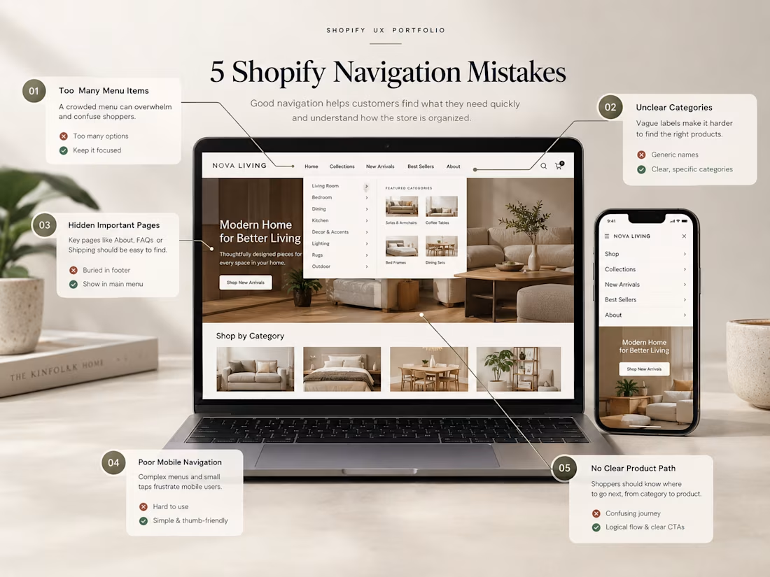

Clear navigation makes the shopping journey much easier.
Customers should be able to find the right products without guessing where to go.

Yes that's the truth

Clear navigation makes the shopping journey much easier.
Nice insight
The network for creativity
Join 1.25M professional creatives like you
Connect with clients, get discovered, and run your business 100% commission-free
Creatives on Contra have earned over $150M and we are just getting started











Related posts

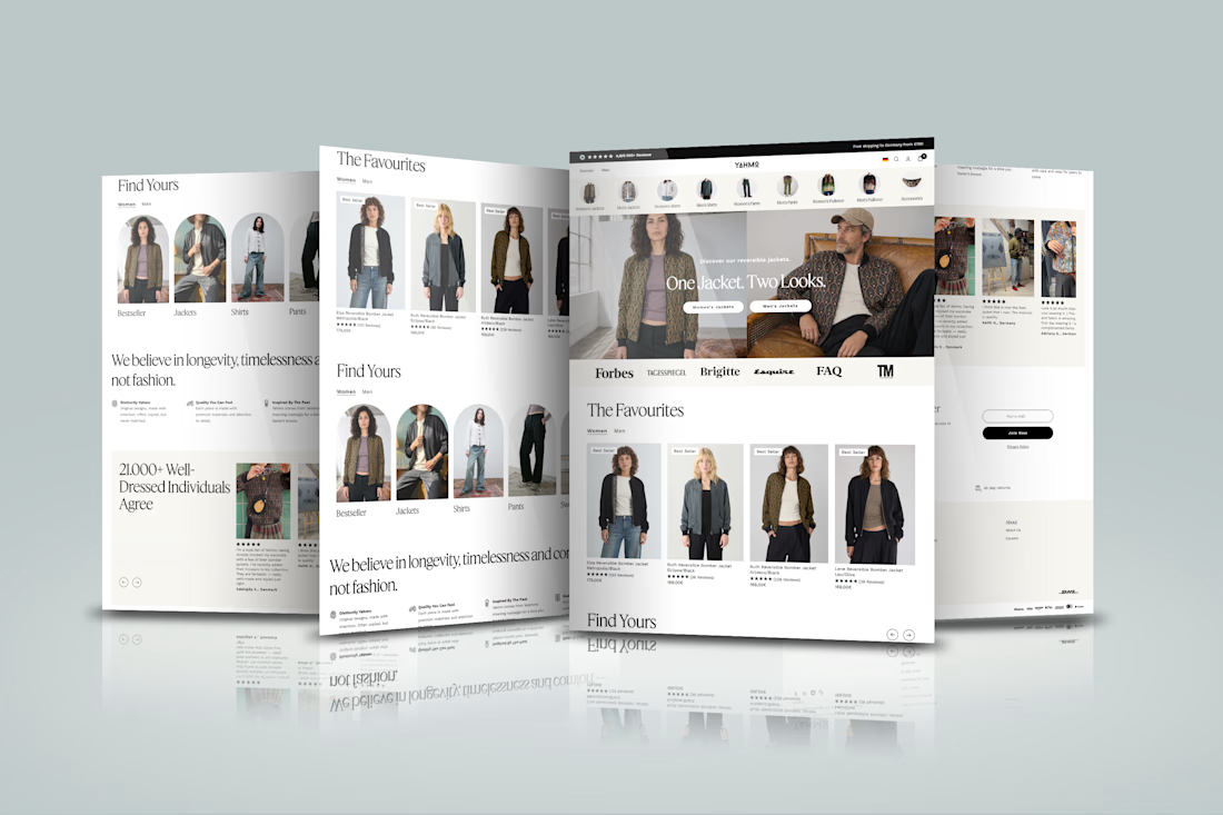
Designed a modern Shopify ecommerce experience for Yahmo, a sustainable fashion brand combining vintage-inspired designs with contemporary styles. The storefront showcases clothing collections, product imagery, category navigation, customer reviews, sustainability messaging, and shopping features that help customers explore products and shop with confidence.
The goal was to create a smooth shopping journey that reflects the brand’s colorful identity and ethical values while making product discovery simple and the buying experience seamless across devices.

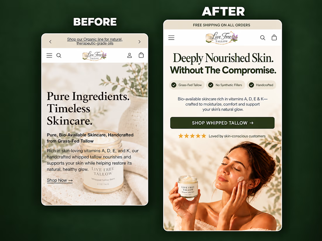
A self-initiated homepage hero redesign concept for Live Free Tallow, created to demonstrate how stronger visual hierarchy and clearer messaging can improve the mobile shopping experience.
The original hero had a compelling product, but the copy competed with the imagery, the product lacked visual prominence, and the next action wasn’t immediately clear.
For the redesign, I focused on:
• A sharper product-in-use lifestyle visual
• A clear, benefit-led headline
• Scannable product differentiators
• Improved spacing and visual hierarchy
• Social proof positioned near the CTA
• A prominent, action-focused shopping button
• Keeping the product and CTA visible above the fold
The result is a cleaner and more premium hero section that helps visitors quickly understand what the product is, why it is different, and where to go next.
I design and build conversion-focused Shopify landing pages, product pages and homepage sections for DTC brands.
Need help improving your store’s customer journey? Let’s work together.



Putting the proof next to the CTA is the right call on mobile. Did you check how much of the hero fits above the fold on a 390px-wide screen once the browser bar is counted? That's usually where the review stars get pushed out.

Shopify Store Design, Redesign & E-commerce Development
Looking to launch a professional Shopify store or transform your existing store into a more engaging shopping experience?
I help entrepreneurs, startups, and established brands build modern, responsive Shopify stores designed to showcase their products, strengthen their brand identity, and support business growth.
With over 5 years of e-commerce experience, I combine strategic store design, Shopify development, and conversion-focused improvements to help businesses create a stronger online presence.
What's Included
Shopify Store Setup: Store configuration, essential pages, navigation, and collections.
Custom Store Design: Professional layouts aligned with your brand identity.
Shopify Redesign: Improve the look, usability, and structure of your existing store.
Theme Customization: Customize Shopify themes to match your business requirements.
Product Uploads: Organize product listings, descriptions, images, and variants.
Mobile Optimization: Create a seamless shopping experience across devices.
App Integration: Set up relevant Shopify apps and essential store features.
Payment & Shipping Setup: Configure supported payment methods and shipping settings.
Shopify SEO: Improve on-page SEO foundations, metadata, and store structure.
Conversion Optimization: Identify opportunities to improve product pages and the customer journey.
Why Work With Me?
A tailored solution based on your business goals.
Clear communication and organized project delivery.
Attention to design quality, usability, and functionality.
A store structure designed to support your future growth.
My Process
Discovery: Understand your brand, products, goals, and requirements.
Planning: Establish the store structure, design direction, and project scope.
Design & Development: Build or customize your Shopify store.
Testing: Check responsiveness, navigation, and agreed functionality.
Handover: Deliver the completed project with guidance on managing your store.
Let's Build Your Shopify Store
Whether you're starting from scratch, redesigning an existing store, or preparing your brand for its next stage of growth, let's discuss your project.
Contact me to receive a tailored quote for your Shopify store.