The network for creativity
Join 1.25M professional creatives like you
Connect with clients, get discovered, and run your business 100% commission-free
Creatives on Contra have earned over $150M and we are just getting started
Back to feedPost

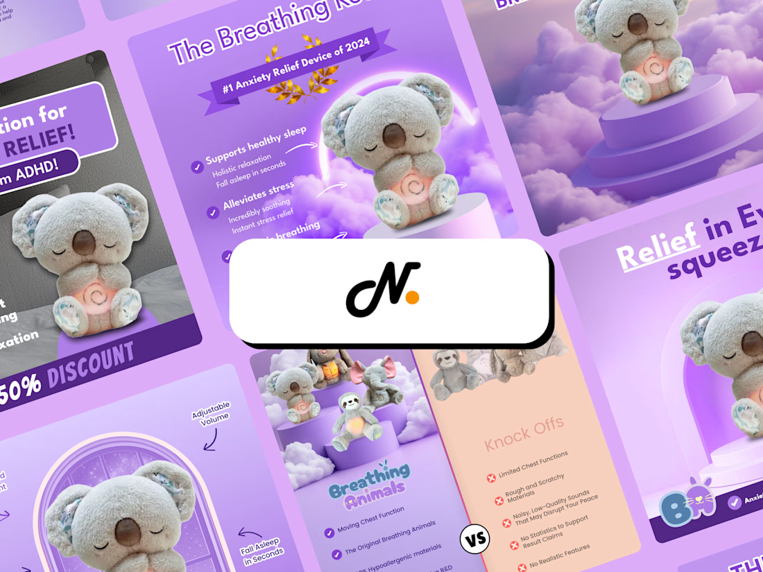
Static ad suite built for a DTC anxiety relief brand.
Identity angle. Social proof. Competitor comparison. Feature-led.
Four angles. One cohesive creative suite. Every ad built with a reason to exist.
The network for creativity
Join 1.25M professional creatives like you
Connect with clients, get discovered, and run your business 100% commission-free
Creatives on Contra have earned over $150M and we are just getting started




Related posts

Falling for my own design. Red flag or perfect match?
A closer look at the Amorado mark, combining a heart, a tornado and an arrow in one simple symbol.
A fictional identity concept made just for fun
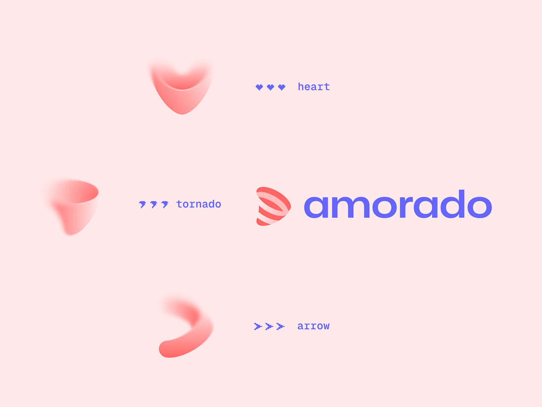

Breaking the mark down into its three building blocks like that is a great way to show the logic without just saying "trust me it means something." Did the heart or the tornado come first, or did it only click once all three were together?

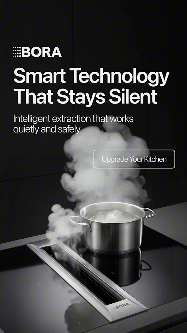
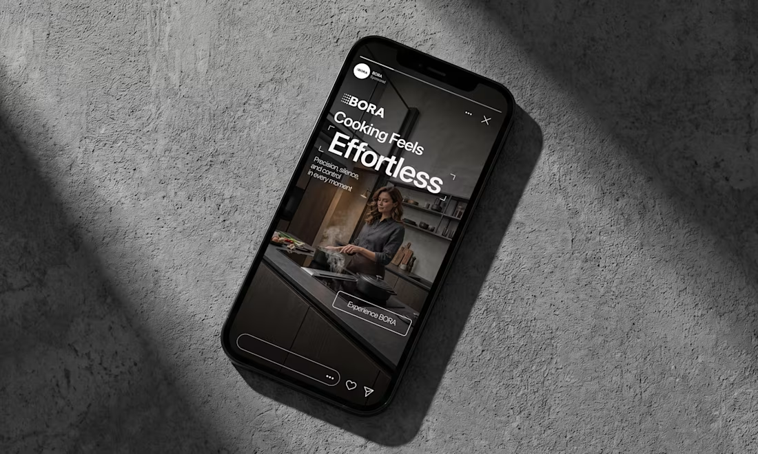
BORA – Ad Creative Concept
Most kitchen appliance ads sell you the warm family dinner. I wanted to try the opposite.
Built this BORA concept as a portfolio piece, treating the product like architecture instead of tech – dark marble, concrete, no hands, no food styling. Just a pot, steam, and silence.
The steam does all the movement in the motion piece. Typography stays out of the way – one line, low CTA, nothing fighting the composition. Turns out when you strip out the lifestyle, the price point sells itself.