The network for creativity
Join 1.25M professional creatives like you
Connect with clients, get discovered, and run your business 100% commission-free
Creatives on Contra have earned over $150M and we are just getting started
Back to feedPost
Taste Test

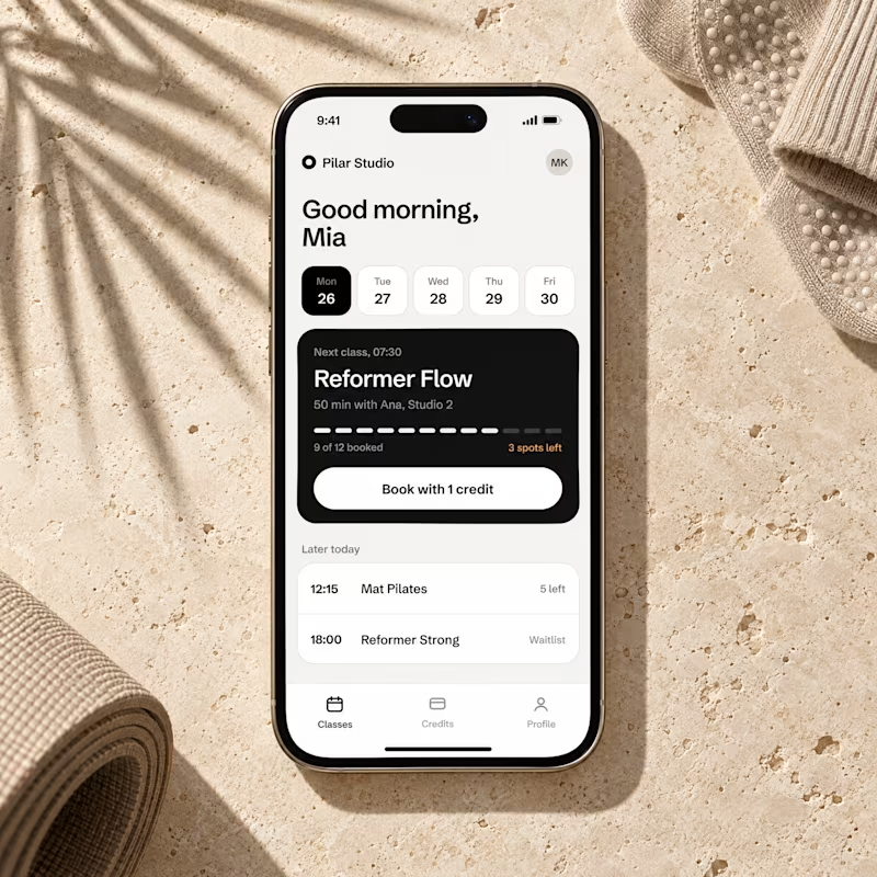
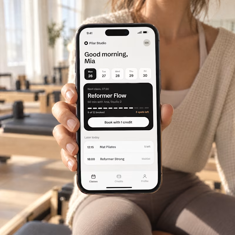
Designed a booking screen for a concept pilates studio app, then gave GPT Image 2.5 just that one screenshot.
Two launch shots came back. Which one makes you want to book a class, A or B?

3 voted
20%
12 voted
80%
15 votes
Closed

I don't know both of them are the same
But Great job 🎉🎉

Both renders look crazy realistic for a single screenshot prompt, but B connects better with human intent. That dark class card in the UI pops really well against both the warm studio lighting and neutral workout wear!


Went with B. Seeing the phone in a hand makes the booking screen feel like something I'd actually use.
The network for creativity
Join 1.25M professional creatives like you
Connect with clients, get discovered, and run your business 100% commission-free
Creatives on Contra have earned over $150M and we are just getting started





Related posts

Lime Cream or Peach Fuzz? 🍋🟩🍑
Two animated isometric sets — same system, different mood. Cast your vote 👇
68 voted
78%
19 voted
22%
87 votes
Closed
Lime Cream. The dark linework pops more on it.

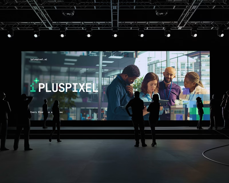
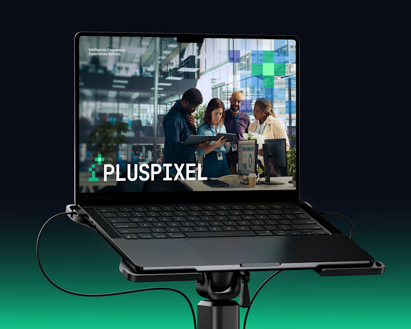
Same content, two different settings.
One designed to be seen on a big conference screen, the other experienced through a compact device. It's interesting how the same visuals can feel different depending on where they show up.
Which setting do you think brings the content to life better?
4 voted
57%
3 voted
43%
7 votes
Closed

Big screen 🔥


Should a personal brand hero lead with the name or the promise?
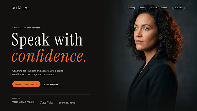
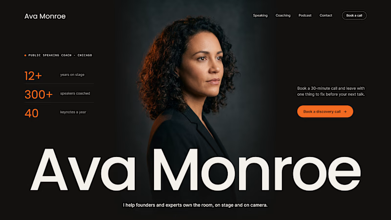
A client of ours is a speaking coach. People find her by name: podcasts, stages, word of mouth. Yet her first hero hid that name in the top-left corner.
We tested two directions:
The promise first. "Speak with confidence" in big type, the name small in the nav. Clear, but it could be any coach on the internet.
The name first. Her name at billboard scale, the promise in one line above it, her face right behind. Someone arriving from a podcast knows instantly they're in the right place.
When people search for you, your name is the headline.
Which one would you ship for a personal brand?
43 voted
51%
42 voted
49%
85 votes
Closed

Name first — podcast listeners arrive looking for her.