The network for creativity
Join 1.25M professional creatives like you
Connect with clients, get discovered, and run your business 100% commission-free
Creatives on Contra have earned over $150M and we are just getting started
Back to feedPost

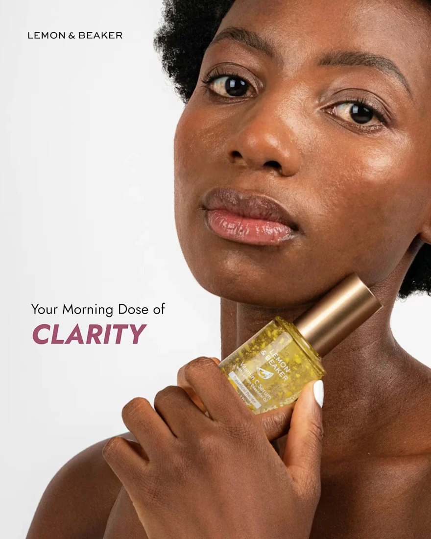
Typography does more than communicate. It sets the mood. 🎨
Look at this design. The bold, italic lettering in “CLARITY” instantly draws attention, while the simple, lightweight font above it keeps the layout calm and balanced.
That contrast is what makes the text work so well. One line sets the scene, and the other delivers the message.
As a social media content creator, I love how small design choices like font pairing, weight, spacing, and hierarchy can change how people experience a post.
Good typography doesn't need to be complicated. It needs to know where to lead the eye. ✨
What's your go-to style: bold statement fonts or clean, minimal typography?
The network for creativity
Join 1.25M professional creatives like you
Connect with clients, get discovered, and run your business 100% commission-free
Creatives on Contra have earned over $150M and we are just getting started











Related posts


Every app ships new features all the time, and every one needs a clean, quick way to announce it on social.
This is a universal launch template: swap the logo, screen, text and colors, keep the motion, and your feature post is ready.
The design was brought over from Figma with Figma MCP, and the whole animation was built with SVGator MCP, driven by Claude.

Amaizing♥️

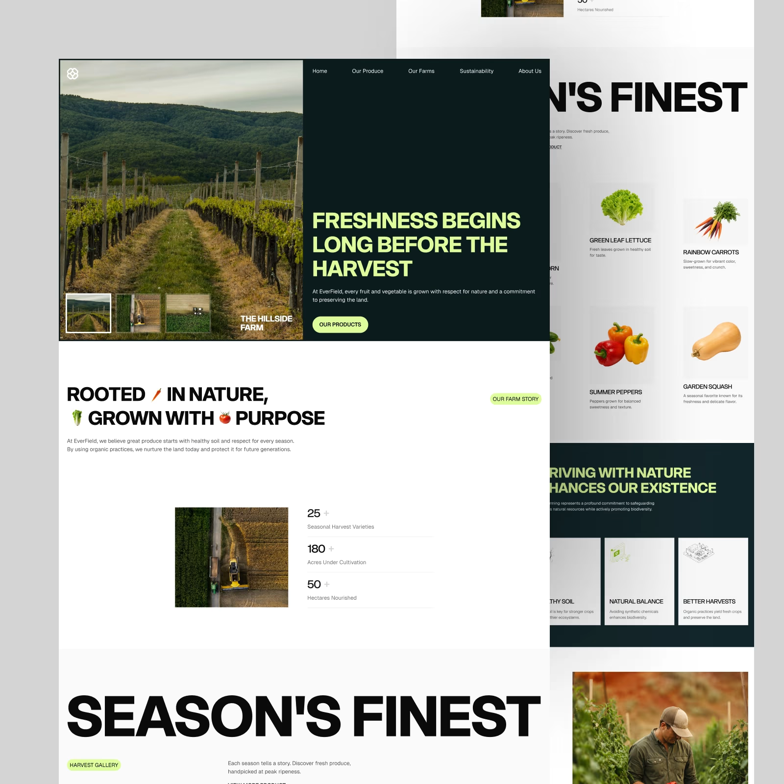
EverField — Farm & Produce Website. One of the favorite hero sections from this exploration.
Big imagery, bold type, and a simple split layout. Does this direction work for an agriculture brand?

New to Contra, but not new to design🚀
Hi, I’m a designer with 7+ years of experience. As a Top Rated Seller on Fiverr, I’ve completed over 3,500 projects for clients around the world.
Now I’m bringing my experience to Contra!
My team and I create Canva and Figma design systems, social media content, brand identities, and AI images and videos. We help businesses look consistent and make everyday content creation easier.

Wow Vladyslav that's cute❤️❤️