The network for creativity
Join 1.25M professional creatives like you
Connect with clients, get discovered, and run your business 100% commission-free
Creatives on Contra have earned over $150M and we are just getting started
Back to feedPost

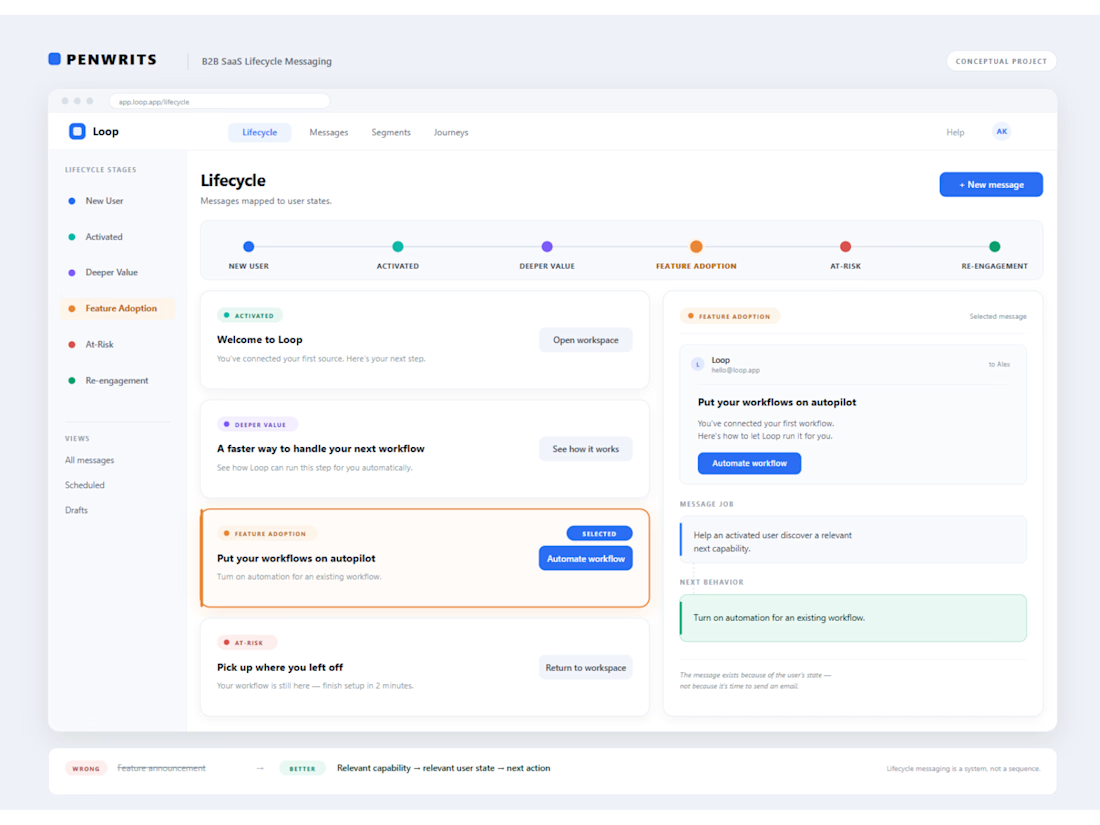
The tricky part wasn't writing more lifecycle emails. It was figuring out what each user actually needed next.
This fictional B2B SaaS example looks at what happens after the first useful product experience, how users move toward deeper adoption, where momentum can fade, and when a re-engagement message actually makes sense.
I mapped the lifecycle around user states and built the messaging around the transition from one state to the next, rather than treating every email as a separate campaign.


The network for creativity
Join 1.25M professional creatives like you
Connect with clients, get discovered, and run your business 100% commission-free
Creatives on Contra have earned over $150M and we are just getting started

Challenges
View all


Related posts


“Or similar” leaves a lot to the imagination.
A few billboard designs I made for Sync as part of the rebrand. The campaign centres on a simple promise: the car you see is the car you drive.
I kept that message big and direct, with the cars up close and enough pink to make you look twice.
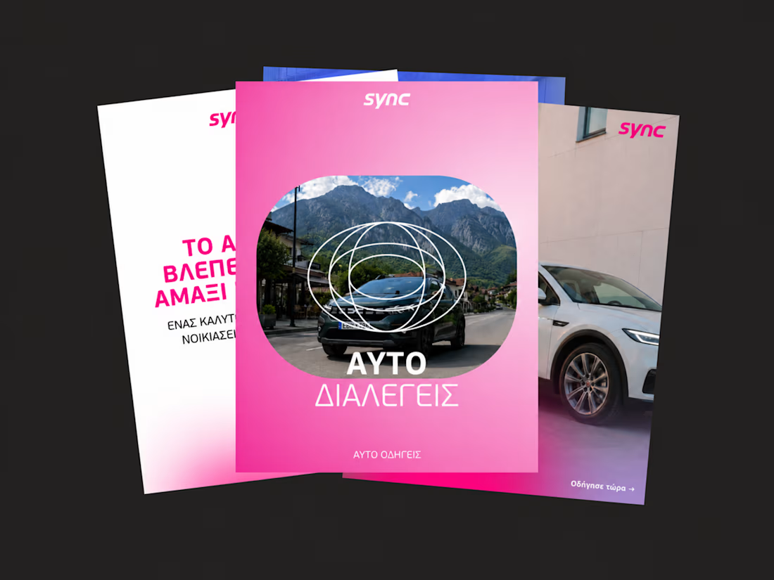
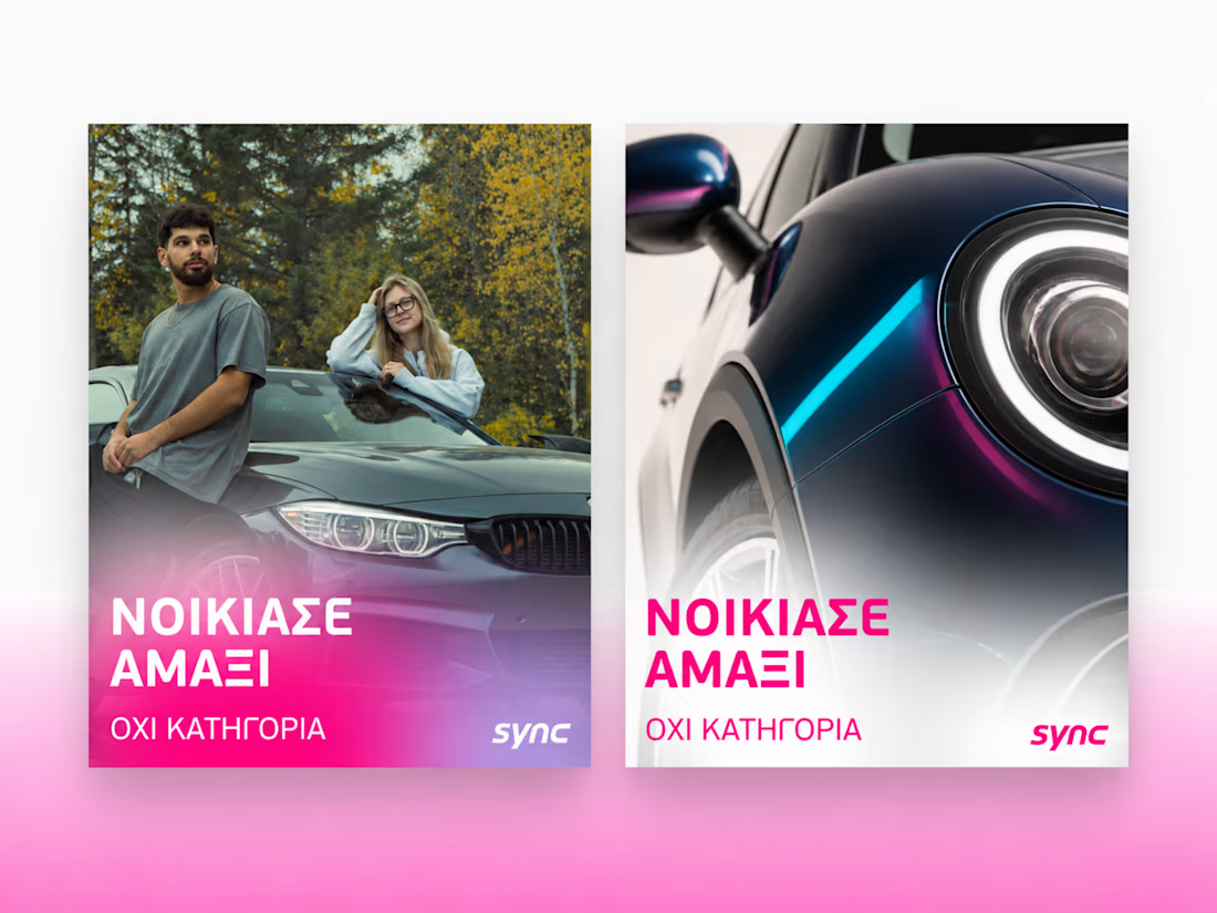
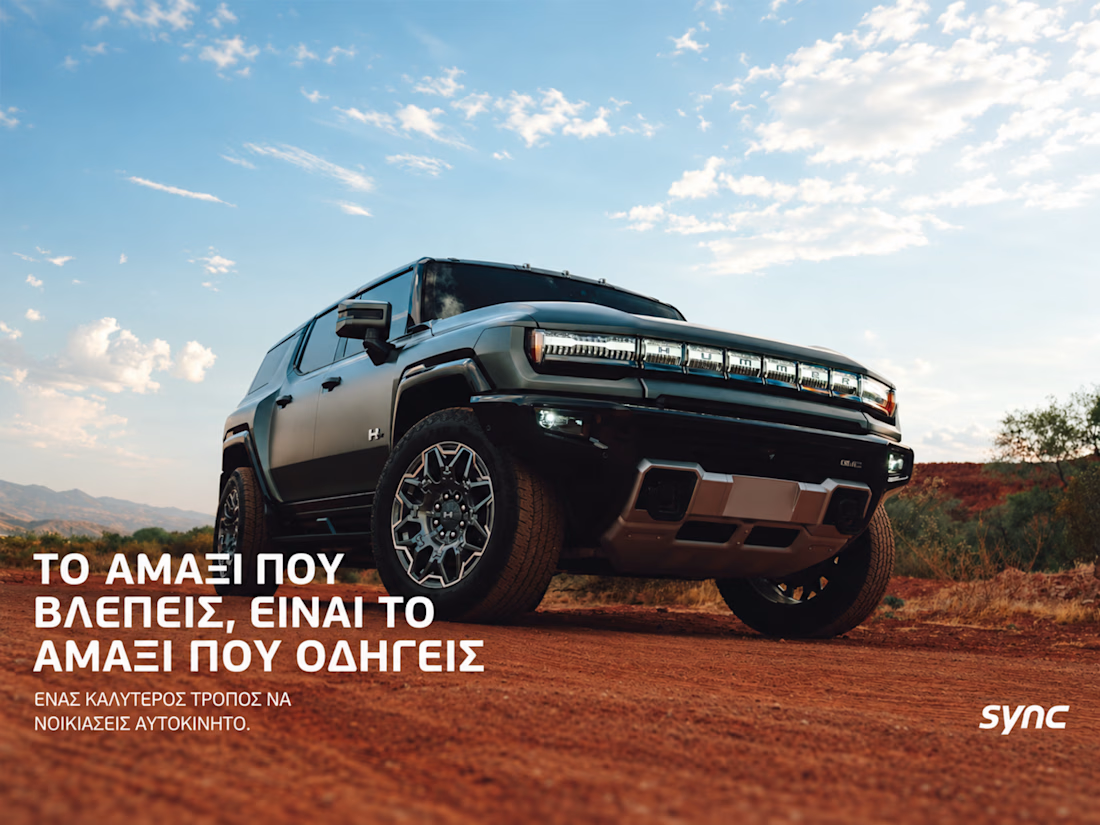
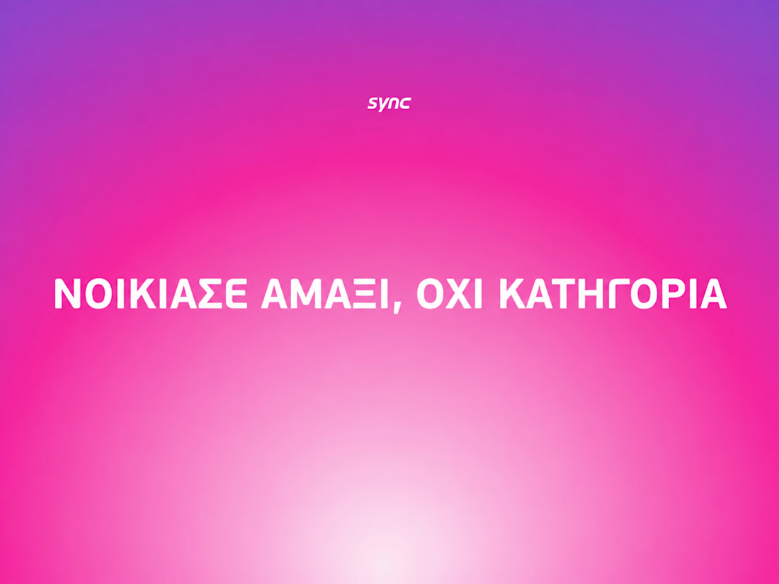

The way the oversized promise carries through the pink palette is really effective—the close-up crops make the car feel immediate without losing the campaign idea.

Someone said FOOTER?
If you need a website that reflects your brand, I got one spot available for September 🙌


Boooom Mattia this is one crazy footer!! 🙌

A SaaS website can explain every feature perfectly and still leave one question unanswered:
Why should I care?
That's why CORESPACE includes Stories.
Instead of only describing what the product does, Stories give those features context — showing how they're used and what they make possible.
Features explain the product.
Stories make it relatable.

The “why should I care?” framing is exactly the right antidote to feature tours. Turning real team stories into the connective tissue between the product and its impact makes the homepage feel human, not just informative.